Entries filed under
Observations
Denver, Colorado, has been a hotbed of activity related to typography and letterpress printing this month, with a series of type-centric events and exhibits. Designer and printer Rick Griffith of Matter has worked with the Design Council at the Denver Art Museum, AIGA Colorado, and Mohawk Paper, to organize Pressed, an exhibition of letterpress printed ephemera.
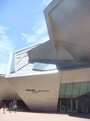
The Denver Art Museum's Frederic C. Hamilton building
To kick off the show, the Denver Art Museum hosted two events, including a night of printing demonstrations and a “letterpress typography symposium” with screenings of Jack Stauffacher, Printer about the San Francisco publisher Jack Stauffacher; and the recent Typeface documentary about the Hamilton Wood Type Museum.
I was honored to speak after the screenings on a panel with Jim Sherraden & Brad Vetter from the much-loved Hatch Show Print, Denver’s resident letterpress guru, Tom Parson, and Rick Griffith as moderator. As you might imagine, the discussion covered a variety of typographic topics, but seemed to have an emphasis on the history and culture of letterpress as it relates to contemporary typeface design, design education, and poster printing.
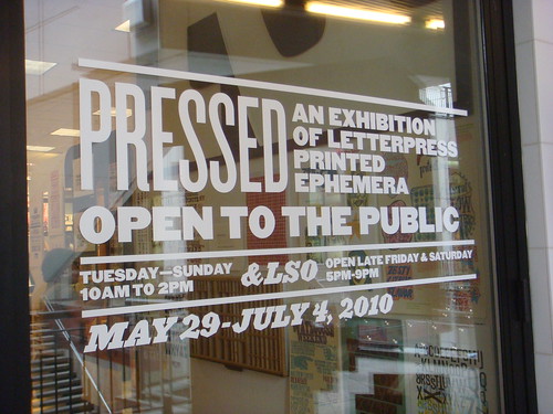
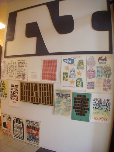
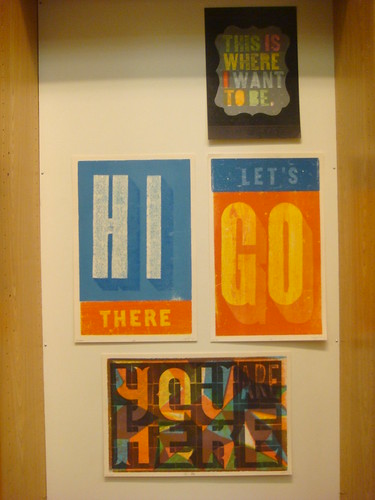
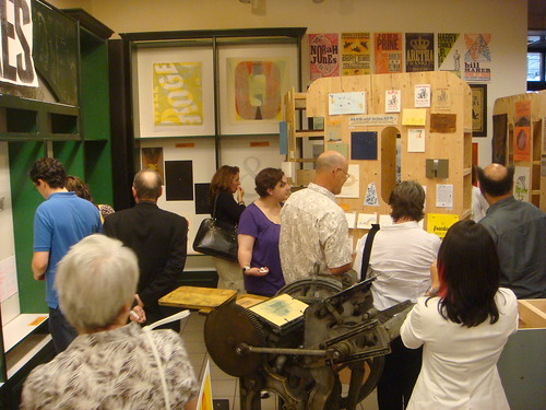
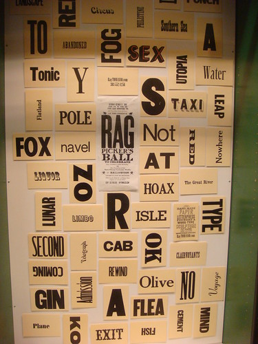
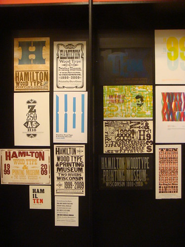
The highlight of the weekend was the opening of the Pressed exhibit and store in the Denver Pavillions. Rick and his team have collected a huge amount of contemporary letterpress work from all over the US and beyond, and presented it in an impressive gallery with giant 8-foot-tall wooden letters. Just about every inch of wall space is covered with colorful prints from Hatch Show Print, Amos Paul Kennedy Jr, the Hamilton 10th Anniversary Show, Yee-Haw Industries, and many, many, more artists/designers/printers.
The show will remain up in Denver through July 4th, after which it will continue on as a traveling show. A catalog is also being produced for the show. For more information and updates check DesignArtArtDesign, the Pressed project page on Kickstarter, and Matter on Twitter.


The treasure trove of vintage photography featured on Shorpy provides endless samples of commercial sign painting and architectural lettering from the 1850s through the 1950s. Though the site doesn’t specifically focus on the topic of graphic art, the abundance of lettering isn’t surprising considering the amount of images from the so-called Second Industrial Revolution – a period of dramatic growth in consumer culture, fueled in part by public advertising.
The high resolution of the images (most of which were extracted and adjusted from reference images in the Library of Congress research archive) makes thorough inspection a rewarding task. A surprising number of photographs that appear barren of lettering in their low-resolution form often reveal impressive examples when viewed at full size. In some instances you can even make out the signature of the lettering artist.
Many images on Shorpy show not only interesting lettering, but a high concentration of it. Any one scene may contain dozens of notable examples, stacked and layered as far as the eye (or camera) can see. This illustrates the volume as well as variety of lettering that was being crafted at the turn of the 20th century. Before mechanized sign production was the norm, lettering artists weren’t tempted by the same shortcuts that so many of today’s sign makers have succumbed to. Templates were used regularly for letterforms and layouts, but the variety of swashy scripts, catchwords, shading, punctuation, lightbulb illumination, and other such techniques added a certain character to the urban landscape which only survives today as ghost signs or in the work of a small number of specialized artists.
This post is the first in a series showing highlights of lettering on Shorpy. Each image links to the original photo page on Shorpy where full-sized, uncropped views can be accessed.


The amazing Leeds Playbills website contains nearly 5,000 medium-to-high resolution scans of vibrant playbills dating from the late 1700s up through the 1990s. The database, part of the Leodis digitization project, represents all the playbills in the Local Studies Library collection, with samples from a variety of historic theatres in the city of Leeds, as well as a group of related circus bills. Interestingly, the project is funded by the UK National Lottery‘s Big Lottery Fund (formerly the New Opportunities Fund).
Many of the prints showcase an impressive array of large and ornamented types. Not surprisingly, the circus bills are among the most vibrant on the site, many utilizing multiple colors with chromatic typefaces, illustrations, and sensationalist prose. There are also a few non-typographic lithographs with elaborately colored lettering and illustration.
Other than the obvious wow factor (!!!), the prints are interesting for several typo-historic reasons. First of all, they show many typefaces that aren’t seen as frequently on this side of the Atlantic, and perhaps even in the UK. Furthermore, it shows the type in real-world use (not as in self conscious type specimens), revealing how the printers organized the information through variations in letter style and layout. One advantage of the higher resolution enlargements is that you can get a sense of how much care was put in to the printing of each piece (the range is wide). Many of the bills also have a credit line citing which print shop ran the job, allowing an evaluation of each shop in comparison with others, and giving info about which venues employed which printers. Finally, some of the items give an interesting view in to the practice of updating information by pasting on additional slips of paper or overprinting.
Unfortunately the small thumbnail images make browsing a bit tedious, and some of the full-resolution images show streaking from faulty scanning equipment. The site does have some useful functionality though, including the ability to filter content according to dates, keywords, and venues.
While wide time range is represented, the most interesting material to me, typographically, is that from the mid-to-late 1800s — coincidentally also the same period in which wood type was at its height of production and use. I’ve compiled a collection of details from some of the more interesting samples below, each linked back to the original page where you can access an enlarged, un-cropped, view.


")


, 'Ali Baba' (or, 'The Forty Thieves')")


")


A portion of Bethany Heck's wood type collection

Bethany Heck is a student currently in her senior year in the Graphic Design program at Auburn University in Alabama. She has been collecting wood type since her freshman year there — a fact that seems to make sense considering her design pedigree (her father teaches graphic design). To date, she estimates her collection at about 600 wood type blocks — some as part of complete fonts and some as miscellaneous sorts.
End Grain is Bethany’s new website which showcases her collection, as well as other letterpress-related content. She describes its inception thus…
The End Grain was born out of my desire to have some sort of letterpress website […] I was frustrated by the lack of sites dedicated to letterpress and I wanted a place I could go and just get lots of great examples of letterpressed works and hear from others who shared my passion for wood type.

I have been advising Bethany with some of her work on the site so far, which includes several distinct features. First, the Daily Letters and Character Studies series of posts highlight Bethany’s growing collection of type, piece by piece. She provides historical details about the typefaces and manufacturers, but the most prominent and interesting aspect of the write-ups is her attention to the details of each particular block as its own unique object. Her reflections on specific scratch marks, manufacturing irregularities, specks of dried ink, etc often border on archaeological examinations. The posts are appropriately accompanied by high-resolution scans to show all the details.


Details from wood type scans at End Grain
Some blocks are also presented side-by-side with their prints for comparison. The prints aren’t necessarily the cleanest proofs possible, but this is partially forgivable considering the limitations of Bethany’s on-press experience so far.

Beyond showing Bethany’s type collection, the site functions as a resource for others interested in letterpress printing, with growing reference info on print shops, websites, retail stores, etc. Relevant content is also aggregated from sites like Flickr, Etsy, eBay, and Twitter.
Another element of interest on End Grain is a series of posts documenting Bethany’s experiments with movable type production. The projects so far have ranged in scope from replacing missing characters in an incomplete font, to creating blocks of a digital typeface that hadn’t previously been available as movable type.
Up until now, all of the projects have been executed by affixing thin laser-cut plexiglass to a wooden base, emulating the veneer type production process.

Plexiglass veneer cuts and wooden base blocks for a set of Futura Condensed printing type. Note the guidelines inscribed on the base blocks to assist in aligninment when affixing the veneer cuts.

Futura Condensed with plexiglass veneer replacement blocks

Print made with the completed Futura Condensed font

Replica blocks of № 504 made with clear plexiglass

Print made with replica blocks of № 504

Plexiglass veneer blocks of Matinee Gothic

Print made with the Matinee Gothic blocks
These projects on their own are enough to warrant recognition, but the fact that they’re all done by the same student and presented the way they are makes them that much more notable. Furthermore, knowing that Bethany’s printing experience has been relatively limited, it’s impressive that she’s enthusiastic enough to initiate her own projects. This comes as no surprise though, knowing her strong personality and enthusiasm. It’ll be interesting to see what other things she does in the future and beyond graduation.

Image courtesy of Tillamook Air Museum
While driving up the West Coast last summer, I passed what is probably the largest example of typography that I have ever seen. Off Pacific Coast Highway 101, the blimp hangar at the Tillamook Air Museum stands 192 feet tall, and is reportedly the world’s largest clear-span wooden structure.

Photo from TheRogue on Flickr
Emblazoned on the side of the hangar are the words AIR MUSEUM, set huge in what appears to be Helvetica Bold (or is that Helvetica Neue Medium?) — easily legible from thousands of feet away.
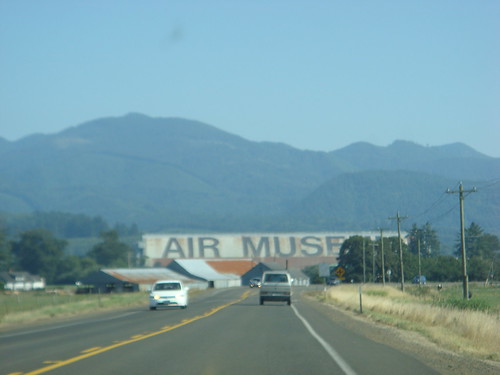
After seeing the hangar and making my own estimates, I confirmed with the museum’s curator, Christian Gurling, that the glyphs measure 100 feet from baseline to cap-height. That’s ≈120,000 pt Helvetica!*

Depiction of the scale of the Tillamook Air Museum letters relative to a 6-foot tall person
Christian also told me that 500 gallons of paint were used for the job, which was done in the summer of 1994. Unfortunately, he didn’t have any details about how the letters were applied. I’m guessing they were enlarged by superimposition on a scaled grid, outlined, and then filled in (not everyone can hand-paint Helvetica from memory, after all). I only saw the hangar from afar, but I’d guess a closer inspection of the letters would reveal more clues.
Larger typographic lettering may exist somewhere else in the world — most likely as part of an air traffic guidance system, if so — but I’ve yet to see it in person. Feel free to cite any relevant examples in the comments.


