New Year's Eve digits being delivered to Times Square. Photo via the Times Square Alliance
Next week, the most important glyphs in the United States will be numbers hanging above One Times Square, welcoming a new decade at midnight on New Year’s Eve. The two most crucial digits, 1 and 0, were delivered to Times Square last week in true New York style: by pedicab.
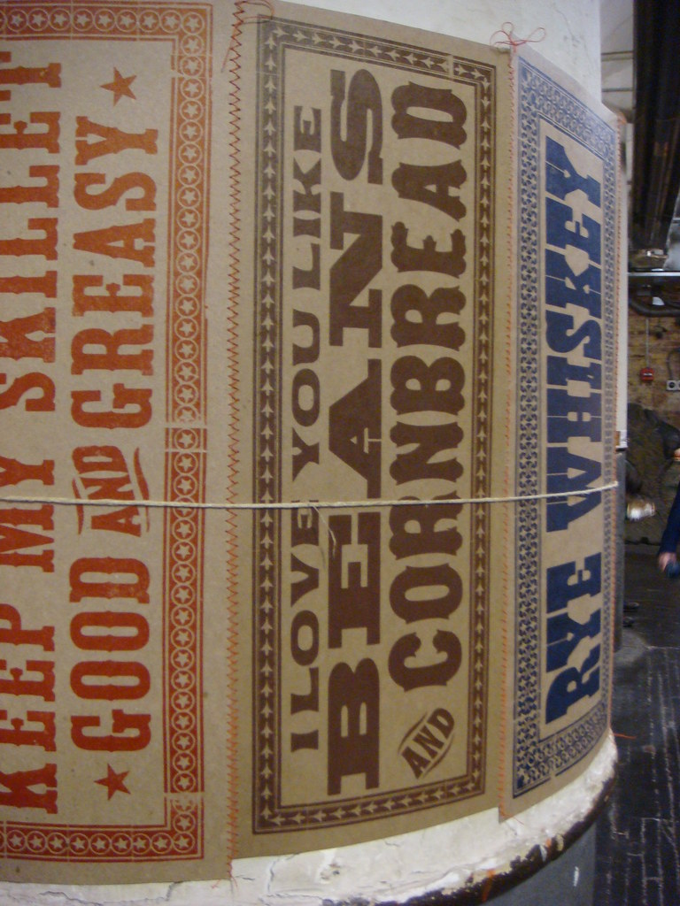
The complete 2010 display stands 7 feet tall and is covered with 545 scalloped LED flood light bulbs, which are being hyped up for their superior energy-efficiency over the halogen lights used on previous years’ displays. A representative for lexiphane.com commented on a related Gothamist article with some entertaining / insightful (if slightly vulgar) thoughts regarding “green” lighting for the display:
I love the irony of energy-efficient lighting in Times Square. It’s like spraying Febreeze on a piss-soaked bum and then patting yourself on the back for improving the environment.
For your sake, I will refrain from making jokes about illumination in this entry.
I’m not sure which typeface was used to fabricate the numbers (if they were indeed based on a typeface), but the choice of a “chamfered” industrial style works well with the marquee-esque bulb lighting. It also has historical ties with large-scale lettering: traditional sign painters often use simple polygonal letterforms when working large, since they can be scaled up more easily using a systematic grid, requiring fewer calculations for curves.
The "2010" New Year's Eve sign on display at the Duracell SmartPower Lab in Times Square. Photo via the Times Square Alliance
I have a soft spot in my heart for this method of building / filling letterforms with lightbulbs. Though certainly a universal practice in sign fabrication, it’s especially prevalent in New York City. In particular, the Theatre District surrounding Times Square is an epicenter of examples — rivaled only perhaps by The Strip in Las Vegas.
"NYC" lightbulb lettering Illustration by Jeff Rogers
With that said, the decidedly dotted stylization (as opposed to solidly-lit forms or high-tech flatscreen displays) works perfectly in the cultural context of Times Square. It evokes the bright-light lettering tradition that has inspired people to refer to the section of Broadway near Times Square as the “white-light district”, “Street of the Midnight Sun”, “Great White Way”, etc. This lightbulb lettering seemed to parallel New York City’s prosperity in general, reaching a pinnacle during the 1920s — just before the prevalence of neon tube lighting and the Great Depression.
The lightbulb lettering for the title screen of "The Roaring Twenties" (1939) epitomizes a specific time and place in the history of the USA and New York City. Screenshot image via the Movie Title Stills Collection
Similar connections to iconic marquee signage could be pushed even further with the New Year’s display if its lights followed the classic “chase” blinking pattern. Whether or not the designers behind the Times Square numbers consciously consider these kinds of cultural connections… I couldn’t say. Either way, the end product seems to honor relevant lettering traditions, even while using modern lighting technology and being presented in the world’s premiere location for high-tech signage.
The giant digits are currently on view at the Duracell SmartPower Lab in Times Square, where visitors can pedal bikes to charge the batteries that will light the display when the ball drops next week.
It’s getting to be a bit late for holiday gift suggestion lists, but I figured I’d do one of wood type / decorative lettering wares. Many of these items have been shown elsewhere, and the list is nowhere near complete, but it’s a good starting point. With that said, here are a few suggestions…
Greeting cards from RIT
I’ll start with a topic very close to my heart: the book Specimens of Chromatic Wood Type, Borders, &c., Manufactured by Wm. H. Page & Co… This mind-blowing object, published in 1874, is something that I have much, much, much, more to talk about than I will go in to now. Instead, in the interest of time, I’ll just note a great set of greeting cards published by the RIT Cary Graphic Arts Press that feature scaled-down reproductions from the book.
Also available are similar cards featuring reproductions from a great French lettering manual, Nouvel Album de Letters Peintes.
You might as well check out all the cool stuff that the press sells related to printing history. It’s a great source of cheap but awesome gifts.
Both sets of 4.25″ × 6″ cards are sold in packs of 8 — 2 each of 4 designs, with envelopes. I’ve purchased several batches myself over the past few years.
There are tons of products available online that are printed using wood type (I’ll show some more below). The thing I personally like about this set of coasters from Marquand Books is that the type isn’t intentionally “distressed”, as is so common with many similar products. Instead, the letters are printed cleanly in solid black.
I can’t say that I would ever really use my own set of hand-printed coasters; but whatever, it’s wood type!
They also offer some wood type doorknob hangers, but I like the coasters much better myself.
The 3.5″ square coasters come in a nice little packaged set of 9 — 3 each of 3 colors (orange, green, and blue).
Similar to the cards show above, this bag from Blue Q reproduces alphabets from beautifully colored French chromolithograph lettering samples. Unfortunately it’s sold without any proper credit to the original source, but I think it might be from Modeles de Lettres, 1884.
This calendar was printed by Allen Stump at his a Mano Press. Calendars are great for end-of-year gifts, but they’re ten times better if printed with the same wood type collection I encountered on my visit with Allen over the summer.
There are other worthy items from the a Mano Press available on their Etsy shop.
The wirebound caledars are 12½″ square, printed in multiple colors on a pair of Vandercooks.
House Industries has been doing some great stuff with the prestigious library of Photo-Lettering Inc since they acquired the materials in 2003. One highlight of such work is this silkscreen-printed poster featuring a chromatic glyph from PLINC’s Eventide alphabet, originally designed by Paul Carlyle, digitized by Jeremy Mickel, and printed on this poster by hand with metallic inks by David Dodde.
The hand-numbered 26″ × 20″ poster is printed on 130# acid-free cover weight paper. I picked up a copy for myself when House was selling them at the TDC recently.
For people looking for kid-related gifts, this poster from Richard Ardagh and New North Press shows three variations of the traditional nursery rhyme, each set in a variety of 19th-century display type styles.
They made a video showing the process of printing the posters, accompanied with an endearingly British singsong take on the rhyme.
There are a few other prints offered from the same collaboration that are worth checking out too.
The 560 mm × 760 mm (≈22″ × 30″) poster was hand-set and printed in an edition of 200.
We enter a higher price bracket with these large-scale lighted marquee letters from Urban Outfitters. I promote this item somewhat begrudgingly since I’m not particularly a fan of some of the practices of Urban Outfitters. However, these letters are too cool to leave out and I couldn’t find any info about how to get them otherwise.
The particular shape of serifs used for these letters designate them as being of a “mansard” style. William Page patented and sold wood fonts of this style in 1879 as “№ 121”, but a thorough history requires more details than I’ll go in to here.
The metal letters vary in width from character to character, but are all 24″ high × 4″ deep.
I don’t have any expectation that anyone will actually buy this after reading about it here, but I include it for the sake of relevance. The top of this table from Crate & Barrel is composed of wood type — or, actually, a solid piece of wood that’s been carved, painted, and finished to make it look like wood type. According to the product description, the table was designed by “a London graphic designer with a penchant for, and a large personal collection of, antique printers’ blocks”. I can’t say I know who that is, but if I don’t know them already, they sound like someone I could have a good conversation with.
The table has a steel base and glass top that covers the letters; it measures 36″ wide × 36″ deep × 17″ high.
Also in the realm of things I know people will think is cool but won’t actually ever buy is this big chest of wood type inspired drawers from Kent & London. In fact, there’s a good chance you may have already seen this on design and type blogs already, but I’m including it here for its notable relevance.
The letter style used on the front of each drawer approximates one offered in wood type by a huge number of manufacturers, most of them calling it, simply, “Gothic“. Similar to the “mansard” mentioned above, a whole article could be written about this style, but I’ll refrain for now.
The solid oak chest measures 800 mm high × 1200 mm wide × 300mm deep (≈32″ × 47″ × 12″)
Coming back to the real world… if conspicuous consumption and material possessions aren’t your thing, you can always take the charity route and support this deserving organization on someone else’s behalf.
Membership to the Hamilton Wood Type & Printing Museum is available on a number of levels which include things that you can wrap and give to people if you want, like digital fonts, printed specimen sheets, books, shirts, etc. Members also get reduced studio rental cost incentives.
If you aren’t the membership kind of gift giver, the museum also sells a variety of other wood type products.
Another charity gift option is to help fund the restoration of Lou Dorfsman‘s amazing wall of lettering. I won’t go in to much detail describing it here (I’m hoping to do a related report at some point in the future), but this piece of wood type-ish design is more than worthy of the care and restoration that the Center for Design Study is working towards giving it.
This short interview with Dorfsman gives a good idea about what you’d be helping to preserve.
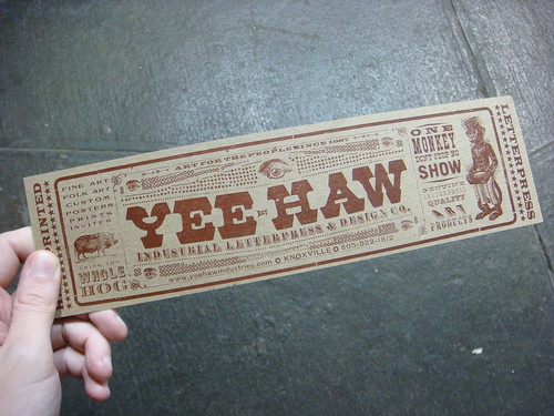
I’ll end this list of gift ideas with the items I’d like the most… This series of 3 specimen posters (1, 2, 3) was printed by Yee-Haw Industries and features a huge variety of wood type faces. I saw all 3 of the prints at Yee-Haw’s Chelea market show in October, and have been wanting them ever since. They definitely aren’t cheap, but after having printed a similar specimen poster myself over the summer, I can fully appreciate the amount of work it takes to produce something like this. These images definitely don’t do the prints proper justice, but I’ll show them all regardless.
Yee-Haw has tons of other wood type stuff in their Etsy store (18 pages worth!), so definitely check that out as well.
Also, if you’re in the New York City area this month, Yee-Haw will be up from their home in Knoxville to sell stuff at a bunch of different craft fairs, flea markets, etc, including a pop-up shop at Chelsea Market (where their show is still up). Instead of repeating all the details, I’ll just direct you to their official announcement.
The color posters above are printed 2-color on 30″ × 42″ archival acid-free 100% cotton paper with deckled edges.
I could keep going with more suggestions, but this list is already too long. If you’re left still wanting more, try a search on Etsy for “wood type” and you’re bound to find something good. Please feel free to share any other suggestions you might have in the comments.
Woodtype Now! is Kühne’s bachelor thesis project that explores experimental production methods for letterpress printing. It is one of the more interesting efforts from a handful of contemporary wood type projects I’ve come across recently, and stands out in its decidedly theoretical approach to the idea of wood type in a modern context…
Wood Type Now! seeks to transform […] traditional mechanical production methods into the 21st century by revolutionizing the way that prints are designed and produced by incorporating new peripheral hardware (i.e. lasercutter). Through the process of exploring the possibilities in regards to materials used and the way the classic printing block and set up are interpreted, the project redefines the conventional boundaries of the subject matter — as opposed to recreating a status quo with new means — and unlocks new frontiers.
Woodtype Now! dissertation
The project, mentored by Prof Rudolf Barmettler and Kurt Eckert, consists of several related parts. First, a 30-page dissertation, Woodtype Now! — An Analysis of Application Range, Possibilities and Potential of Woodtype for Graphic Design in the 21st Century was written under the mentorship of Margarete von Lupin.
Eight interviews were conducted during research for the dissertation. The subjects of the interviews include…
Alfred Hoffmann: Former CEO of Haa’sche Schriftgiesserei Münchenstein (his father made the “Helvetica Deal” in the ’50s). Haas bought Roman Scherer, the only Swiss wood type manufacturer, in 1966.
Adelbert Müller: former worker at Haas; he cut wood type.
Urs Lehni: graphic designer and publisher, Rollo Press
The interview document contains a lot of what Dafi describes as “blah blah”, but there is also some interesting information on the history of European wood type (a topic that has been relatively under-represented in the significant publications to date).
Anyone interested in reading the full dissertation or interview documents are encouraged to contact Dafi directly via e-mail at hello@woodtype-now.ch.
The next aspect of Woodtype Now! is the webpage which presents experimental prints (single-color, 10 cm × 10 cm) using various letterpress production techniques, including lasercutting, “shimming”, adhesive foil application, wrapping with string, etc (selected images shown below; explore the webpage for a more comprehensive overview).
Finally, Dafi produced What is Woodtype Now?, a 9-page, 23-colour letterpress newspaper interpretation/expansion of the experimental exercises (again, only a small sampling is shown here; see the webpage for more).
While none of the material from the Woodtype Now! project is technically even wood type in the strictest sense of the term — it would be more accurately described as “typography printed from composite woodblocks” than proper movable type — Dafi has also done some extensive wood type production leading up to his dissertation. In 2008, he used a lasercutter to produce a full 10-cicero (≈128 pt) wood type veneer font of Univers with 250 individual sorts, as well as some larger sample letters of Railroad Gothic.
When I asked Dafi about the use of composite plates compared to movable type, his thoughts seemed to echo points from the ongoing debate about whether relief printing from digitally conceived photopolymer plates is any more or less valid than using traditional movable type…
[Producing movable type] was an important test before Woodtype Now! because I learned that it isn’t hard to make wood type in a traditional sense. There’s a lot of industrial art and woodworking knowledge involved, but from the present technical point of view, it’s not a big problem with a lasercutter.
More important for me was the question: What is wood type today? What can I do with a lasercutter that you can’t do with a pantograph and router? What do wood type prints look like today, without generating old-school or retro posters? Movable wood type has the huge advantage that it is reusable and it gives the analog layout and design process a boost, but it can’t be produced instantly (even with lasercutting there are two component constructions, so it takes a long time to produce). For Woodtype Now! I needed to do something fast! And now, after this work, I can decide if I want to do something with movable, reusable type or just a single-use woodblock. I can also decide if I want to use sustainable or cheap material … It all just depends on the project.
I believe his logic is mostly valid, and am glad he utilizes the technology as he sees fit, without any dogmatic reservations. I would be interested, however, to see how his experiments with movable type might progress if he were experimenting more with the fundamental concept of how a piece of type can be physically constructed today, potentially altering how it is composed with other pieces of type. Either way, the work he’s accomplished thus far is impressive as is and exists on a conceptual and academic level above most undergraduate design work.
After graduating, Dafi still prints from his personal studio in Zürich. I wouldn’t be surprised to see him on the list of speakers at a future type or printing conference.
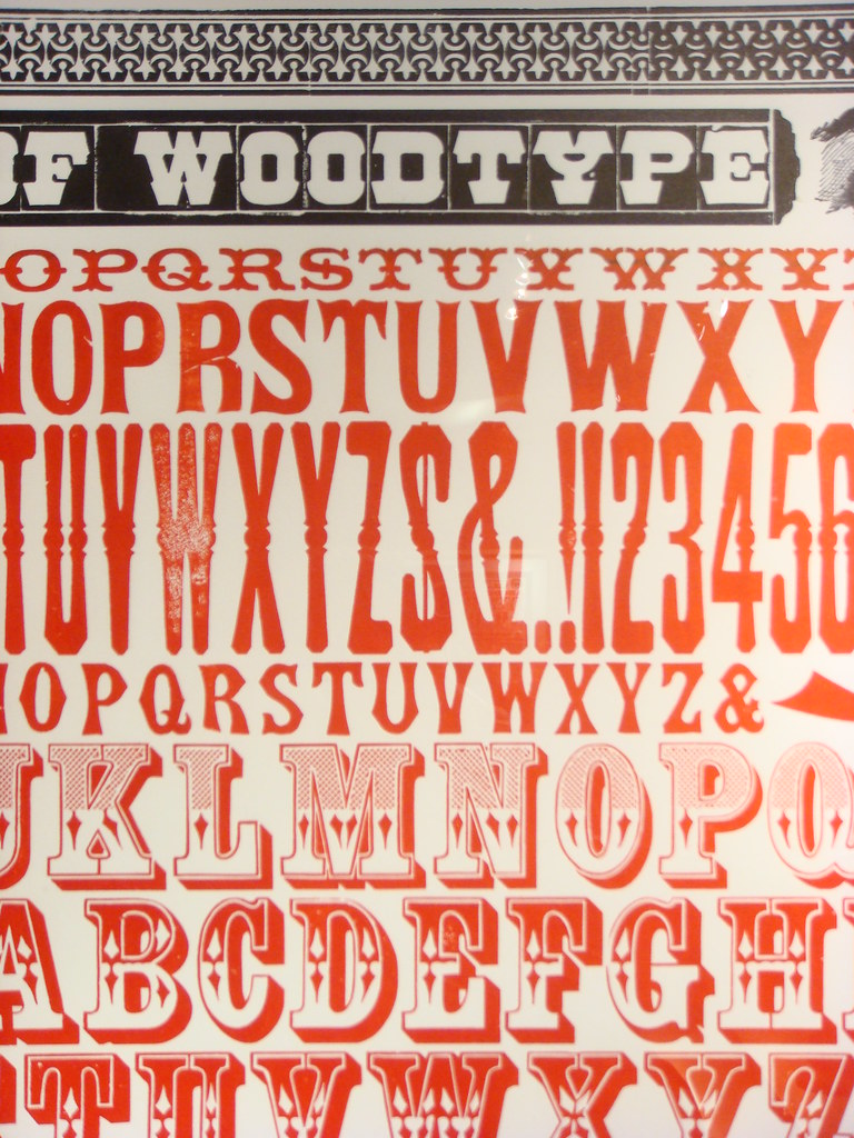
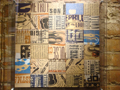
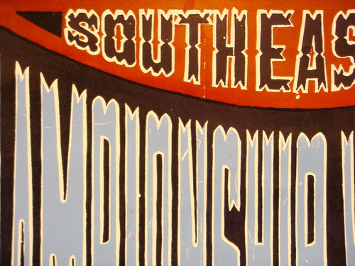
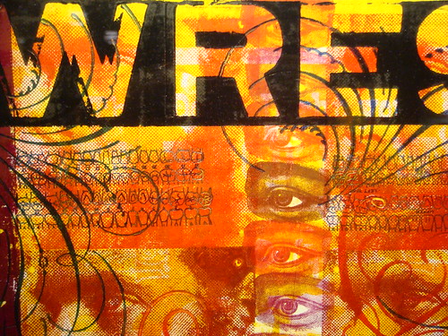
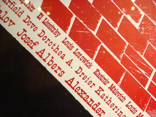
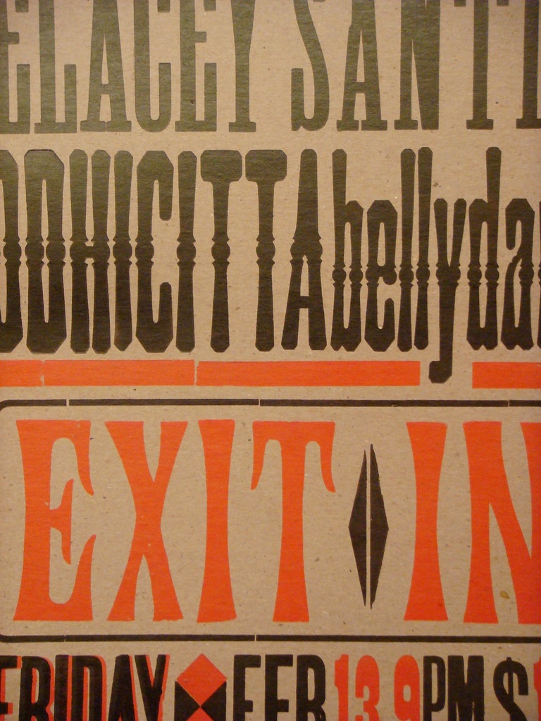
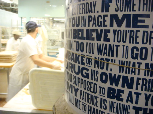
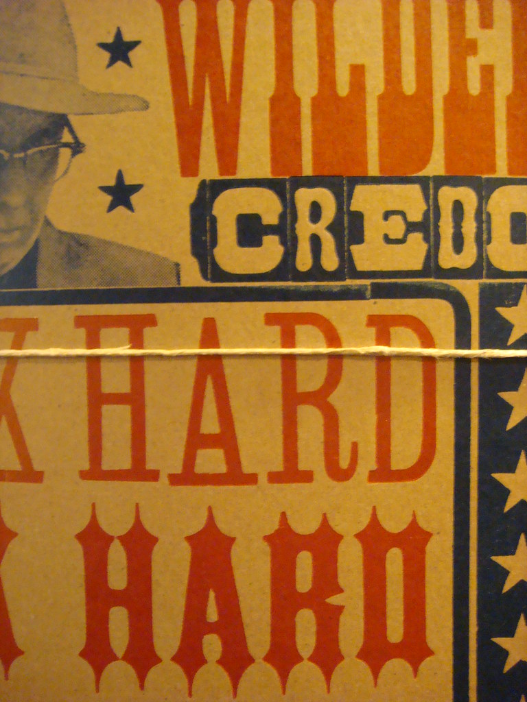
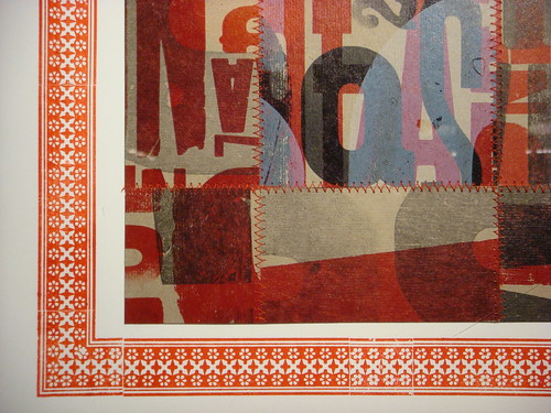
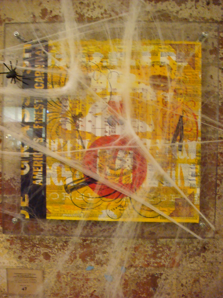
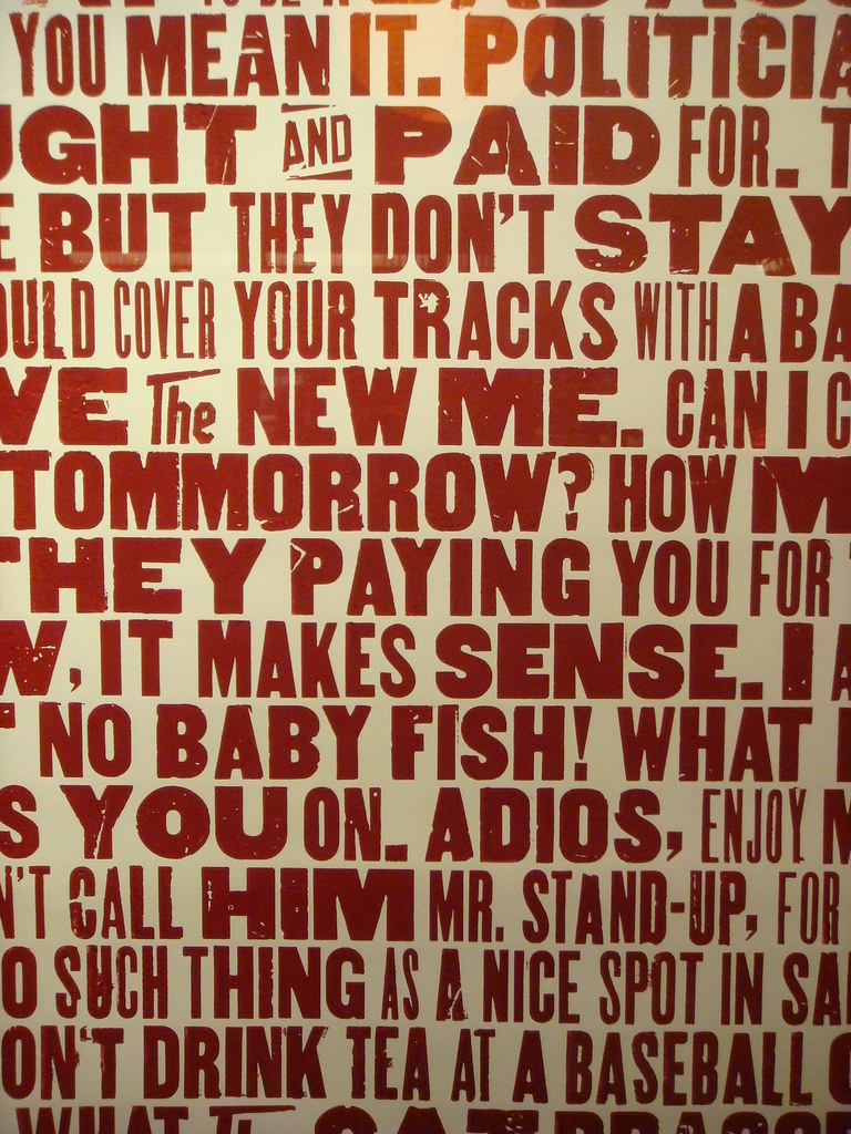
This winter, any typophile finding themselves in the New York City area is advised to make a trip to Chelsea Market to see the exhibition of work by Tennessee’s Yee-Haw Industries, up until January 2. I saw the show just before Halloween and was not disappointed to find the significant presence of wood type printing that I expected.
Chelsea Market has retained much of its historical brick-and-iron factory atmosphere, so it acts as a perfect backdrop for the work described as “industrial” letterpress. When I made my visit, there were all kinds of Halloween displays interrupting the show — some ghosts and cobwebs even draped over the art — but perhaps upcoming holiday decorations will be less distracting.
Yee-Haw’s work will adorn the vast and cavernous Chelsea Market, located in the Meat Packing District in Manhattan’s West Village. Over 100 letterpress pieces all hand-printed from our wood cuts & antique type in our Tennessee studio. We made over 50 sewn paper “quilt squares” specifically for this show and brought along some old favorites. Chelsea Market is an enclosed, urban food court and shopping mall in New York City. It is housed within the former Nabisco factory complex where the Oreo cookie was invented and produced. The 22-building complex fills two entire blocks bound by 9th and 11th Avenues from 15th to 16th Street.
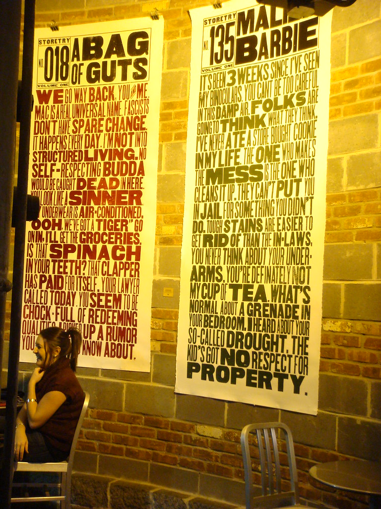
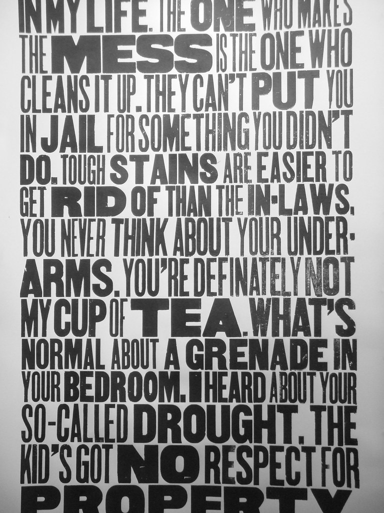
The fact that I haven’t yet mentioned Yee-Haw on Woodtyper is surprising, since they are among the top users of wood type in the world, alongside shops like Hatch Show Print. They clearly embrace the aesthetic and charm of wood type, and even have produced an amazing poster series with specimens from their collection (probably the highlights of the show at Chelsea Market, in my biased opinion).
Below you’ll find photos I captured of the work from the show, but I’ve consciously only shown enough of the details to whet your appetite. You’ll have to visit in person to get the full experience of the pieces in this unique setting.
What: Yee-Haw Industries industrial letterpress exhibition When: October 4, 2009–January 2, 2010 Where: Chelsea Market; 75 9th Avenue, New York, NY 10011 [map] Admission: Free and open to the public
(These images are also gathered together as a set on Flickr)
Illustrator, lettering artist, and designer Jessica Hische (also the designer behind the recent Buttermilk typeface) just launched a new website project called The Daily Drop Cap, where she aims to post a new decorative initial — or versal — every day. She’s also generously offering them for usage under a Creative Commons license, ” for the beautification of blog posts everywhere”.
If Jessica’s servings aren’t enough for you, the Briar Press letterpress community website hosts a large collection of digitized initial caps, almost all available for free download.
Historically, some of the earliest decorated letters were large woodcut initials; their use in early printing lead to the first complete ornamented typefaces and, eventually, the entire field of display typography. I won’t get in to the specifics of versal history and terminology (e.g. illuminated manuscripts, historiated initials, inhabited initials, initiums, lettrine, rubrication, drop caps, elevated caps, etc, etc, etc), or how they evolved toward the first decorated typefaces. For those details, see the first chapter of Rob Roy Kelly’s American Wood Type: 1828–1900, the related pages in Robert Bringhurst’s The Elements of Typographic Style, or, for a breezer course, the Wikipedia page on initials.
What I will share here is an interesting example of initials that I encountered recently: Last week I had the pleasure of experiencing a page from the Gutenberg Bible first-hand (in the private library of David Rose). As you can see in the photo I took (below), empty spaces were built in to the bible’s printed typography that could later be filled with hand-scribed initials.
Page from the Gutenberg Bible with hand-scribed initials, in the private library of David Rose.
Skipping ahead several hundreds of years to a completely different set of stylistic norms, I figured I would also share an example of a typeface that seems like it’s just asking for the job of the proverbial “ten-gallon hat” [see Bringhurst, §4.1.4] — ornately marking the beginning of text blocks.
1838 showing of Wood & Sharwoods' "Ornamented No. 1" in 16-line size, as reproduced in Rob Roy Kelly's "American Wood Type: 1828–1900".


")


