Leeds Playbills website
The amazing Leeds Playbills website contains nearly 5,000 medium-to-high resolution scans of vibrant playbills dating from the late 1700s up through the 1990s. The database, part of the Leodis digitization project, represents all the playbills in the Local Studies Library collection, with samples from a variety of historic theatres in the city of Leeds, as well as a group of related circus bills. Interestingly, the project is funded by the UK National Lottery‘s Big Lottery Fund (formerly the New Opportunities Fund).
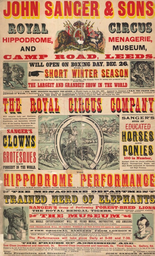
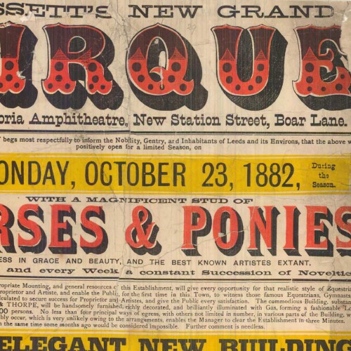
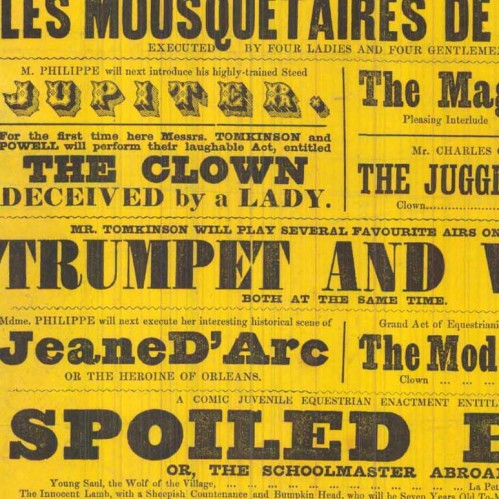
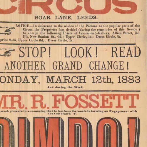
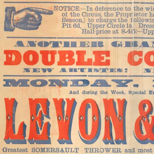
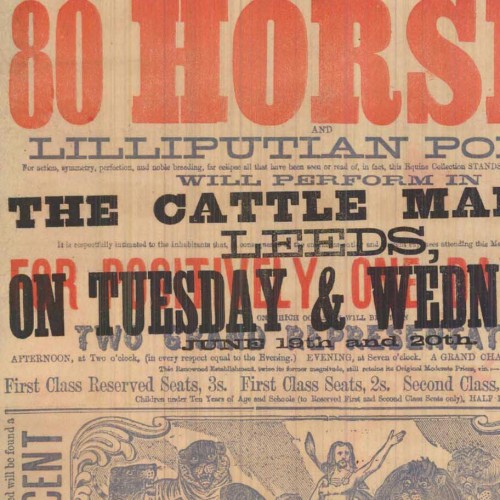
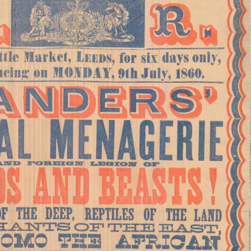
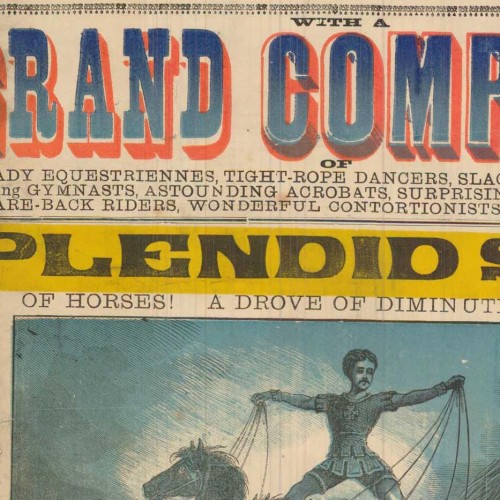
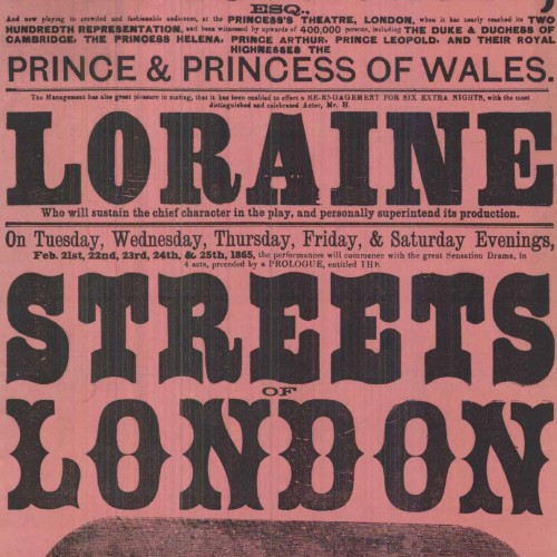
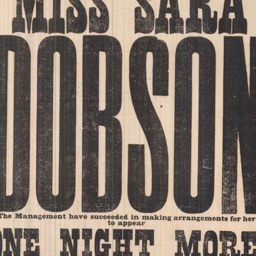
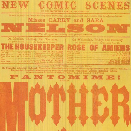
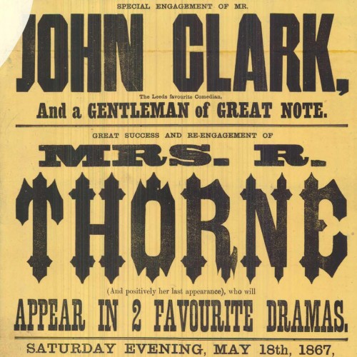
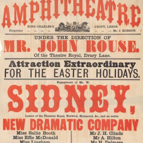
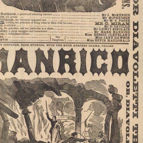
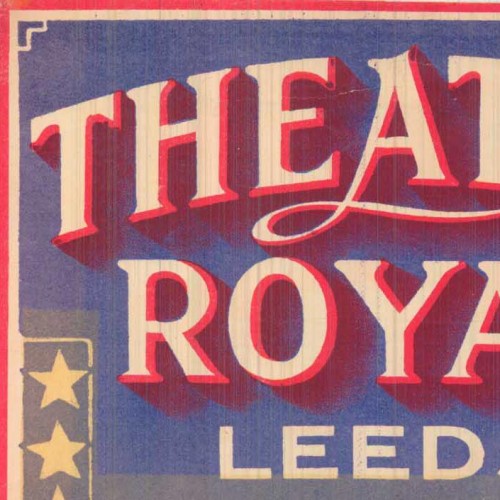
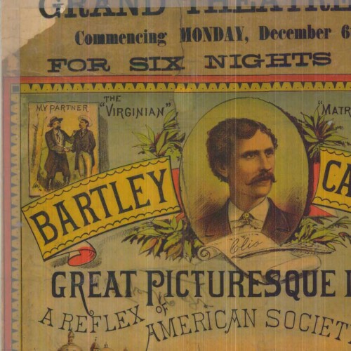
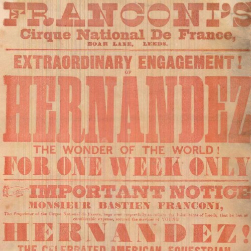
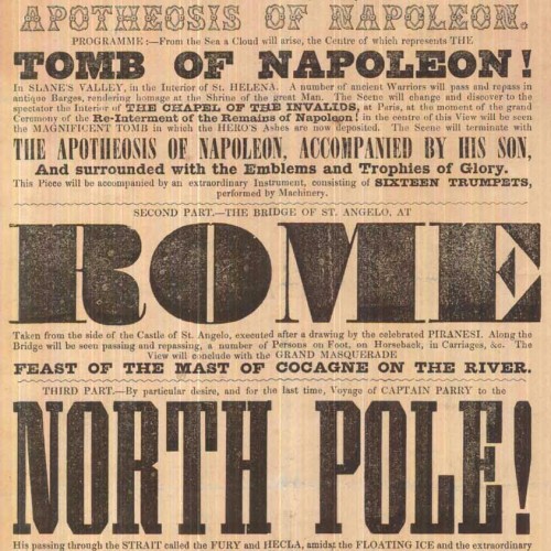
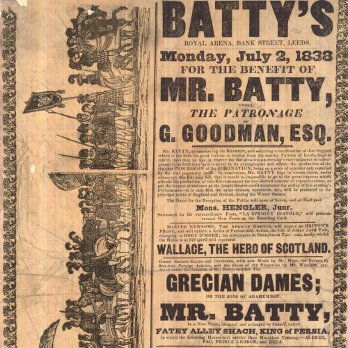
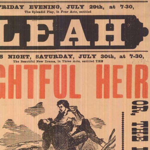
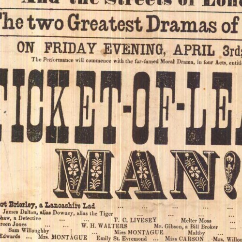
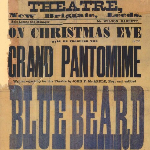
Many of the prints showcase an impressive array of large and ornamented types. Not surprisingly, the circus bills are among the most vibrant on the site, many utilizing multiple colors with chromatic typefaces, illustrations, and sensationalist prose. There are also a few non-typographic lithographs with elaborately colored lettering and illustration.
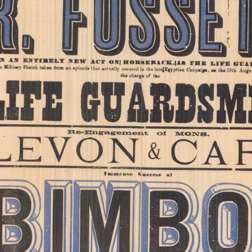
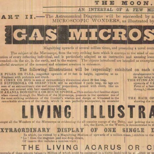
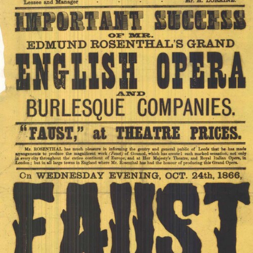
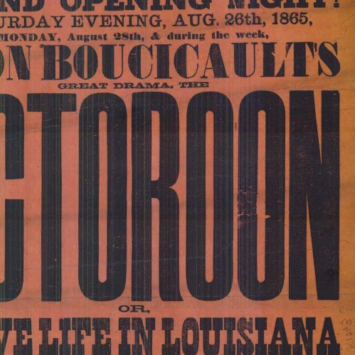
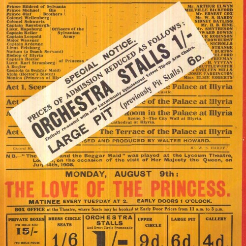
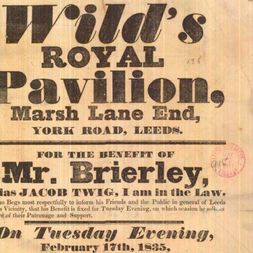
Other than the obvious wow factor (!!!), the prints are interesting for several typo-historic reasons. First of all, they show many typefaces that aren’t seen as frequently on this side of the Atlantic, and perhaps even in the UK. Furthermore, it shows the type in real-world use (not as in self conscious type specimens), revealing how the printers organized the information through variations in letter style and layout. One advantage of the higher resolution enlargements is that you can get a sense of how much care was put in to the printing of each piece (the range is wide). Many of the bills also have a credit line citing which print shop ran the job, allowing an evaluation of each shop in comparison with others, and giving info about which venues employed which printers. Finally, some of the items give an interesting view in to the practice of updating information by pasting on additional slips of paper or overprinting.
Unfortunately the small thumbnail images make browsing a bit tedious, and some of the full-resolution images show streaking from faulty scanning equipment. The site does have some useful functionality though, including the ability to filter content according to dates, keywords, and venues.
While wide time range is represented, the most interesting material to me, typographically, is that from the mid-to-late 1800s — coincidentally also the same period in which wood type was at its height of production and use. I’ve compiled a collection of details from some of the more interesting samples below, each linked back to the original page where you can access an enlarged, un-cropped, view.

