The amazing Leeds Playbills website contains nearly 5,000 medium-to-high resolution scans of vibrant playbills dating from the late 1700s up through the 1990s. The database, part of the Leodis digitization project, represents all the playbills in the Local Studies Library collection, with samples from a variety of historic theatres in the city of Leeds, as well as a group of related circus bills. Interestingly, the project is funded by the UK National Lottery‘s Big Lottery Fund (formerly the New Opportunities Fund).
Many of the prints showcase an impressive array of large and ornamented types. Not surprisingly, the circus bills are among the most vibrant on the site, many utilizing multiple colors with chromatic typefaces, illustrations, and sensationalist prose. There are also a few non-typographic lithographs with elaborately colored lettering and illustration.
Other than the obvious wow factor (!!!), the prints are interesting for several typo-historic reasons. First of all, they show many typefaces that aren’t seen as frequently on this side of the Atlantic, and perhaps even in the UK. Furthermore, it shows the type in real-world use (not as in self conscious type specimens), revealing how the printers organized the information through variations in letter style and layout. One advantage of the higher resolution enlargements is that you can get a sense of how much care was put in to the printing of each piece (the range is wide). Many of the bills also have a credit line citing which print shop ran the job, allowing an evaluation of each shop in comparison with others, and giving info about which venues employed which printers. Finally, some of the items give an interesting view in to the practice of updating information by pasting on additional slips of paper or overprinting.
Unfortunately the small thumbnail images make browsing a bit tedious, and some of the full-resolution images show streaking from faulty scanning equipment. The site does have some useful functionality though, including the ability to filter content according to dates, keywords, and venues.
While wide time range is represented, the most interesting material to me, typographically, is that from the mid-to-late 1800s — coincidentally also the same period in which wood type was at its height of production and use. I’ve compiled a collection of details from some of the more interesting samples below, each linked back to the original page where you can access an enlarged, un-cropped, view.
It’s getting to be a bit late for holiday gift suggestion lists, but I figured I’d do one of wood type / decorative lettering wares. Many of these items have been shown elsewhere, and the list is nowhere near complete, but it’s a good starting point. With that said, here are a few suggestions…
Greeting cards from RIT
I’ll start with a topic very close to my heart: the book Specimens of Chromatic Wood Type, Borders, &c., Manufactured by Wm. H. Page & Co… This mind-blowing object, published in 1874, is something that I have much, much, much, more to talk about than I will go in to now. Instead, in the interest of time, I’ll just note a great set of greeting cards published by the RIT Cary Graphic Arts Press that feature scaled-down reproductions from the book.
Also available are similar cards featuring reproductions from a great French lettering manual, Nouvel Album de Letters Peintes.
You might as well check out all the cool stuff that the press sells related to printing history. It’s a great source of cheap but awesome gifts.
Both sets of 4.25″ × 6″ cards are sold in packs of 8 — 2 each of 4 designs, with envelopes. I’ve purchased several batches myself over the past few years.
There are tons of products available online that are printed using wood type (I’ll show some more below). The thing I personally like about this set of coasters from Marquand Books is that the type isn’t intentionally “distressed”, as is so common with many similar products. Instead, the letters are printed cleanly in solid black.
I can’t say that I would ever really use my own set of hand-printed coasters; but whatever, it’s wood type!
They also offer some wood type doorknob hangers, but I like the coasters much better myself.
The 3.5″ square coasters come in a nice little packaged set of 9 — 3 each of 3 colors (orange, green, and blue).
Similar to the cards show above, this bag from Blue Q reproduces alphabets from beautifully colored French chromolithograph lettering samples. Unfortunately it’s sold without any proper credit to the original source, but I think it might be from Modeles de Lettres, 1884.
This calendar was printed by Allen Stump at his a Mano Press. Calendars are great for end-of-year gifts, but they’re ten times better if printed with the same wood type collection I encountered on my visit with Allen over the summer.
There are other worthy items from the a Mano Press available on their Etsy shop.
The wirebound caledars are 12½″ square, printed in multiple colors on a pair of Vandercooks.
House Industries has been doing some great stuff with the prestigious library of Photo-Lettering Inc since they acquired the materials in 2003. One highlight of such work is this silkscreen-printed poster featuring a chromatic glyph from PLINC’s Eventide alphabet, originally designed by Paul Carlyle, digitized by Jeremy Mickel, and printed on this poster by hand with metallic inks by David Dodde.
The hand-numbered 26″ × 20″ poster is printed on 130# acid-free cover weight paper. I picked up a copy for myself when House was selling them at the TDC recently.
For people looking for kid-related gifts, this poster from Richard Ardagh and New North Press shows three variations of the traditional nursery rhyme, each set in a variety of 19th-century display type styles.
They made a video showing the process of printing the posters, accompanied with an endearingly British singsong take on the rhyme.
There are a few other prints offered from the same collaboration that are worth checking out too.
The 560 mm × 760 mm (≈22″ × 30″) poster was hand-set and printed in an edition of 200.
We enter a higher price bracket with these large-scale lighted marquee letters from Urban Outfitters. I promote this item somewhat begrudgingly since I’m not particularly a fan of some of the practices of Urban Outfitters. However, these letters are too cool to leave out and I couldn’t find any info about how to get them otherwise.
The particular shape of serifs used for these letters designate them as being of a “mansard” style. William Page patented and sold wood fonts of this style in 1879 as “№ 121”, but a thorough history requires more details than I’ll go in to here.
The metal letters vary in width from character to character, but are all 24″ high × 4″ deep.
I don’t have any expectation that anyone will actually buy this after reading about it here, but I include it for the sake of relevance. The top of this table from Crate & Barrel is composed of wood type — or, actually, a solid piece of wood that’s been carved, painted, and finished to make it look like wood type. According to the product description, the table was designed by “a London graphic designer with a penchant for, and a large personal collection of, antique printers’ blocks”. I can’t say I know who that is, but if I don’t know them already, they sound like someone I could have a good conversation with.
The table has a steel base and glass top that covers the letters; it measures 36″ wide × 36″ deep × 17″ high.
Also in the realm of things I know people will think is cool but won’t actually ever buy is this big chest of wood type inspired drawers from Kent & London. In fact, there’s a good chance you may have already seen this on design and type blogs already, but I’m including it here for its notable relevance.
The letter style used on the front of each drawer approximates one offered in wood type by a huge number of manufacturers, most of them calling it, simply, “Gothic“. Similar to the “mansard” mentioned above, a whole article could be written about this style, but I’ll refrain for now.
The solid oak chest measures 800 mm high × 1200 mm wide × 300mm deep (≈32″ × 47″ × 12″)
Coming back to the real world… if conspicuous consumption and material possessions aren’t your thing, you can always take the charity route and support this deserving organization on someone else’s behalf.
Membership to the Hamilton Wood Type & Printing Museum is available on a number of levels which include things that you can wrap and give to people if you want, like digital fonts, printed specimen sheets, books, shirts, etc. Members also get reduced studio rental cost incentives.
If you aren’t the membership kind of gift giver, the museum also sells a variety of other wood type products.
Another charity gift option is to help fund the restoration of Lou Dorfsman‘s amazing wall of lettering. I won’t go in to much detail describing it here (I’m hoping to do a related report at some point in the future), but this piece of wood type-ish design is more than worthy of the care and restoration that the Center for Design Study is working towards giving it.
This short interview with Dorfsman gives a good idea about what you’d be helping to preserve.
I’ll end this list of gift ideas with the items I’d like the most… This series of 3 specimen posters (1, 2, 3) was printed by Yee-Haw Industries and features a huge variety of wood type faces. I saw all 3 of the prints at Yee-Haw’s Chelea market show in October, and have been wanting them ever since. They definitely aren’t cheap, but after having printed a similar specimen poster myself over the summer, I can fully appreciate the amount of work it takes to produce something like this. These images definitely don’t do the prints proper justice, but I’ll show them all regardless.
Yee-Haw has tons of other wood type stuff in their Etsy store (18 pages worth!), so definitely check that out as well.
Also, if you’re in the New York City area this month, Yee-Haw will be up from their home in Knoxville to sell stuff at a bunch of different craft fairs, flea markets, etc, including a pop-up shop at Chelsea Market (where their show is still up). Instead of repeating all the details, I’ll just direct you to their official announcement.
The color posters above are printed 2-color on 30″ × 42″ archival acid-free 100% cotton paper with deckled edges.
I could keep going with more suggestions, but this list is already too long. If you’re left still wanting more, try a search on Etsy for “wood type” and you’re bound to find something good. Please feel free to share any other suggestions you might have in the comments.
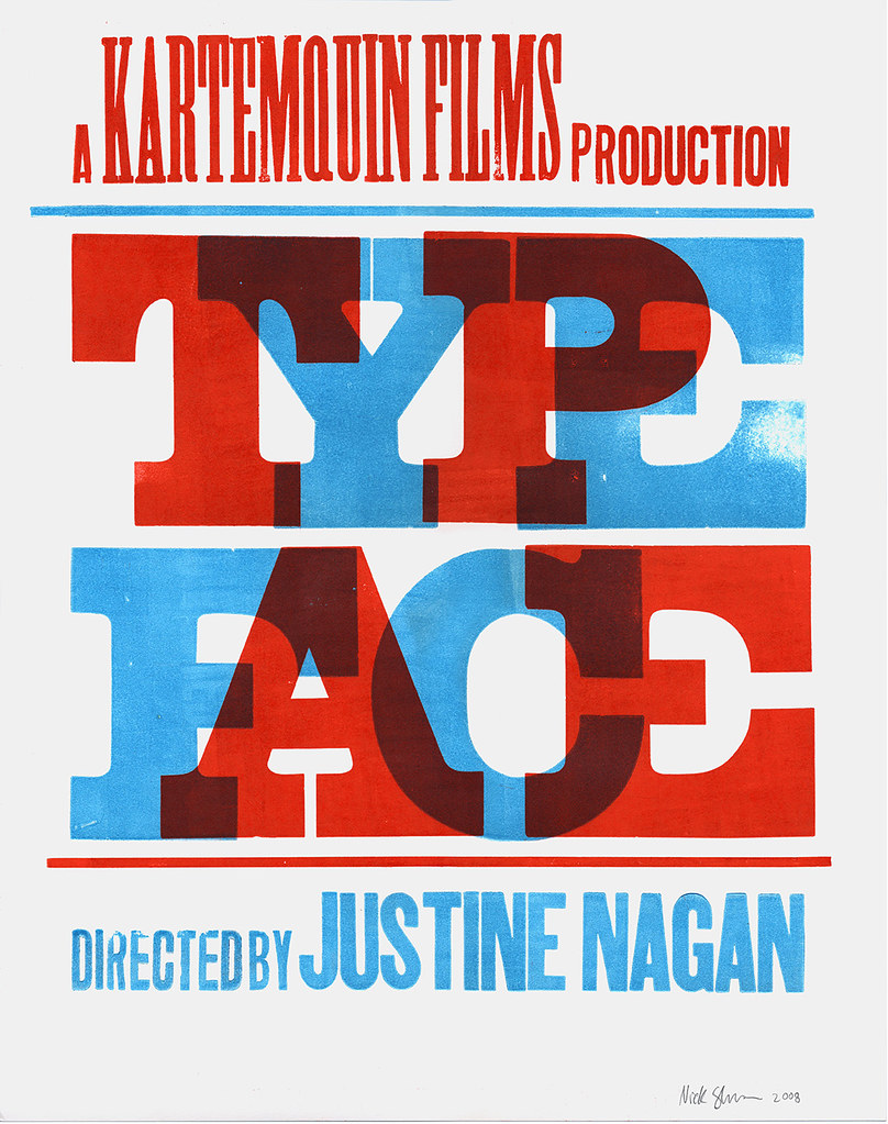
I designed and printed a poster last year (pictured above) to promote the film and help raise money for the production; I’ve also done some advising on rough edits of the film. Justine and the team working on the documentary are dedicated and skilled filmmakers (not to mention great all-around people), and the edits I’ve seen so far are very promising. After having spent much time at Hamilton, I anxiously look forward to a broader public release to help spread the word about the museum.
To get info about when and where to see the film (including a screening next week in Atlanta!), buy limited-edition posters, read news updates and info on the project, and more, see the official Typeface site.
4⅛″ × 5¾″ card printed by Alan Brignull of the Hedgehog Press as part of the "Rambling Urchin" keepsake series
I received a packet in the mail the other day from Mr. Alan Brignull of the Hedgehog Press, Wivenhoe, Essex, England. The parcel, whose exterior bore samples of Alan’s calligraphy and masterfully printed artistamps, contained some pieces from the Hedgehog Press’ Rambling Urchin series of postcard-sized keepsakes, including the one pictured above.
Other than the fact that it was beautifully printed, I wanted to feature this specific card because it speaks perfectly to the focus of this newly founded journal — indeed in form, but more importantly in content, by introspectively pondering the mystique of wood type (or “woodletter” if you prefer a more British tongue).
… And besides, what’s not to love about something that uses a term like “Vandercookery”?
Alan sent the prints after coming across a poster I printed a few months earlier which employed similar red/blue wood type overprinting (apparently great minds do think alike!). It wasn’t the first keepsake he’s been generous enough to send me, and with any luck won’t be the last.
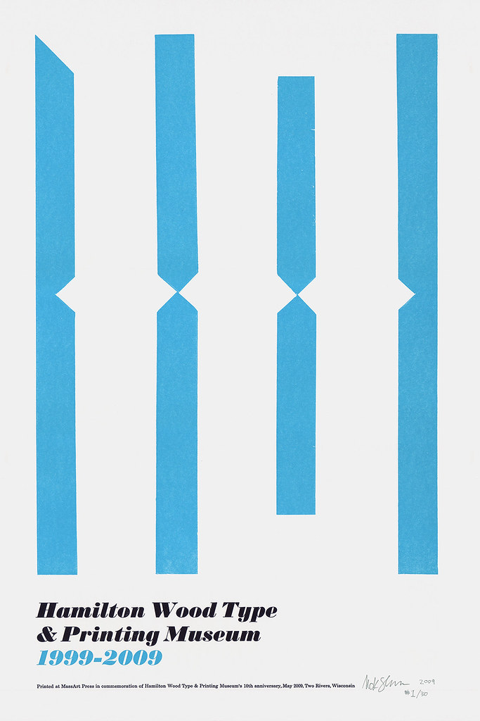
12″ × 18″ poster printed to commemorate the Hamilton Wood Type & Printing Museum's 10-year anniversary.
On the weekend of May 29, the Hamilton Wood Type & Printing Museum in Two Rivers, Wisconsin, is hosting a series of events celebrating their 10-year anniversary. The celebrations include a preview screening of Typeface (the upcoming documentary on the museum), an open house at the museum, a commemorative poster show, and more.
Hamilton asked me to contribute a limited edition of prints for the poster show, and I was honored to oblige. The result is shown above.
I’ll be going out to Two Rivers a week before the show to do some work at the museum, and will probably stick around a bit afterwords too.
For more info, check out Hamilton’s official Events page.


")


, 'Ali Baba' (or, 'The Forty Thieves')")


")


")


