Entries filed under
History

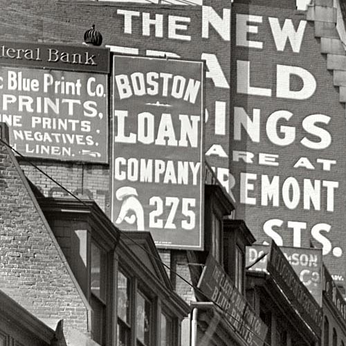
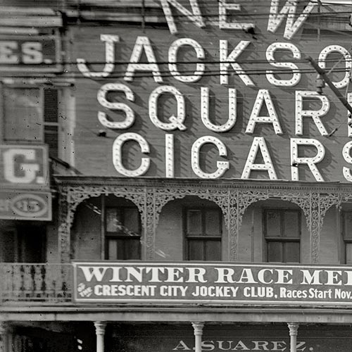
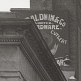
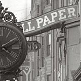
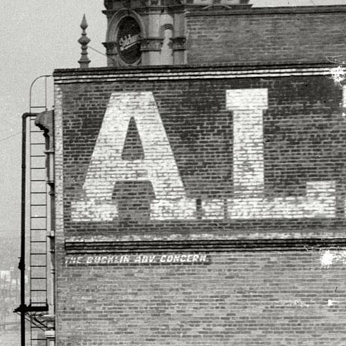
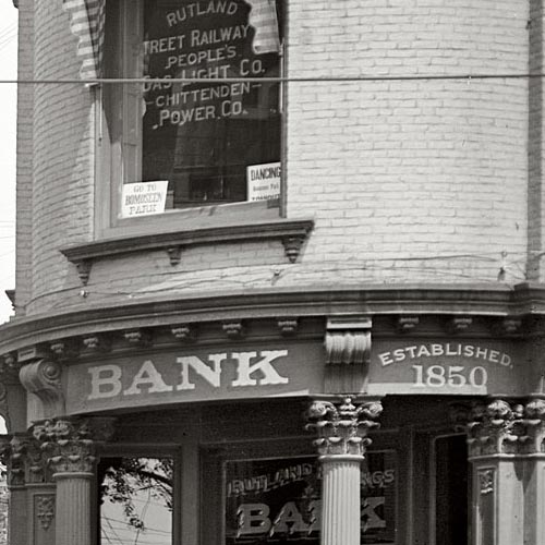
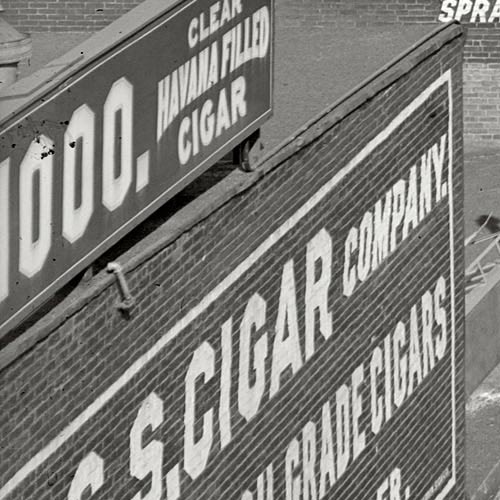
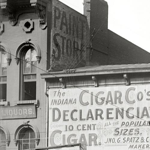
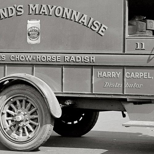
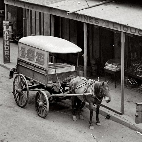
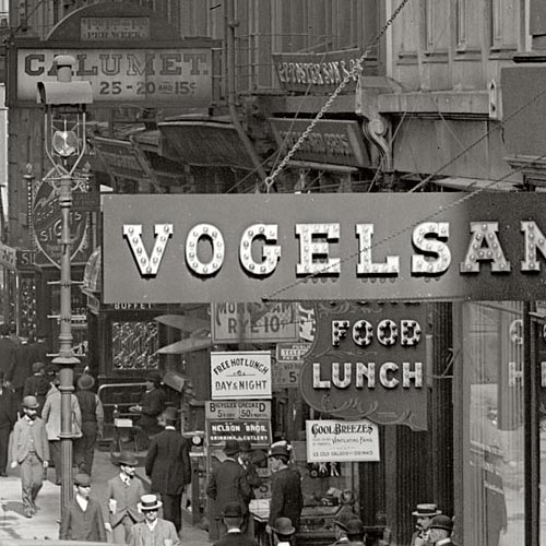
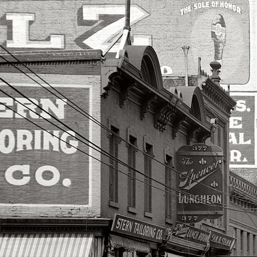
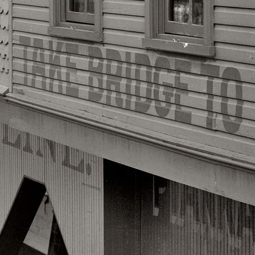
The treasure trove of vintage photography featured on Shorpy provides endless samples of commercial sign painting and architectural lettering from the 1850s through the 1950s. Though the site doesn’t specifically focus on the topic of graphic art, the abundance of lettering isn’t surprising considering the amount of images from the so-called Second Industrial Revolution – a period of dramatic growth in consumer culture, fueled in part by public advertising.
The high resolution of the images (most of which were extracted and adjusted from reference images in the Library of Congress research archive) makes thorough inspection a rewarding task. A surprising number of photographs that appear barren of lettering in their low-resolution form often reveal impressive examples when viewed at full size. In some instances you can even make out the signature of the lettering artist.
Many images on Shorpy show not only interesting lettering, but a high concentration of it. Any one scene may contain dozens of notable examples, stacked and layered as far as the eye (or camera) can see. This illustrates the volume as well as variety of lettering that was being crafted at the turn of the 20th century. Before mechanized sign production was the norm, lettering artists weren’t tempted by the same shortcuts that so many of today’s sign makers have succumbed to. Templates were used regularly for letterforms and layouts, but the variety of swashy scripts, catchwords, shading, punctuation, lightbulb illumination, and other such techniques added a certain character to the urban landscape which only survives today as ghost signs or in the work of a small number of specialized artists.
This post is the first in a series showing highlights of lettering on Shorpy. Each image links to the original photo page on Shorpy where full-sized, uncropped views can be accessed.


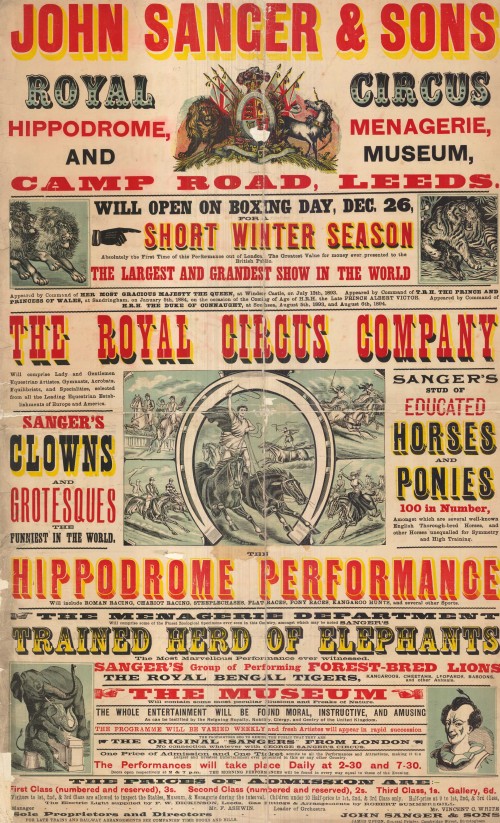
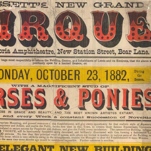
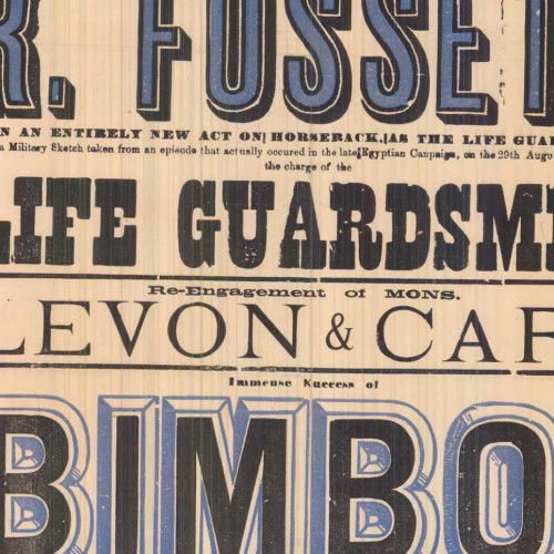
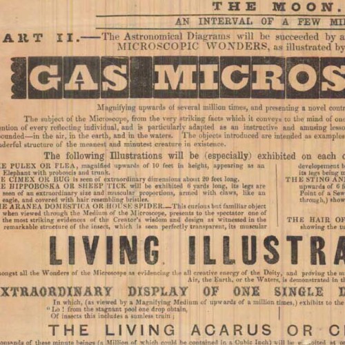
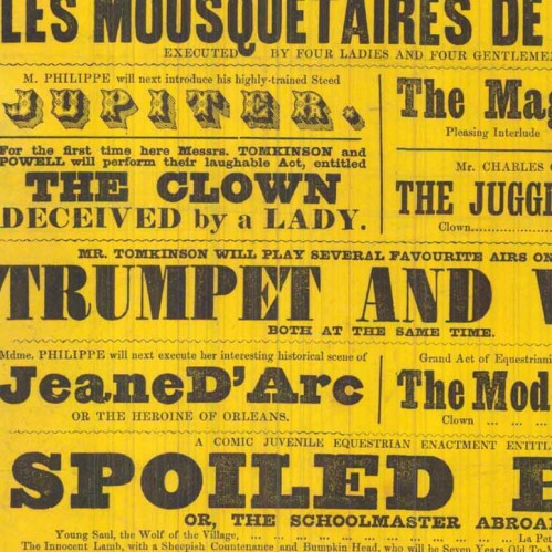
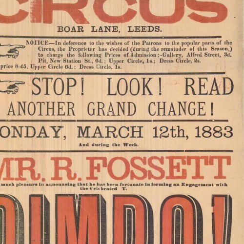
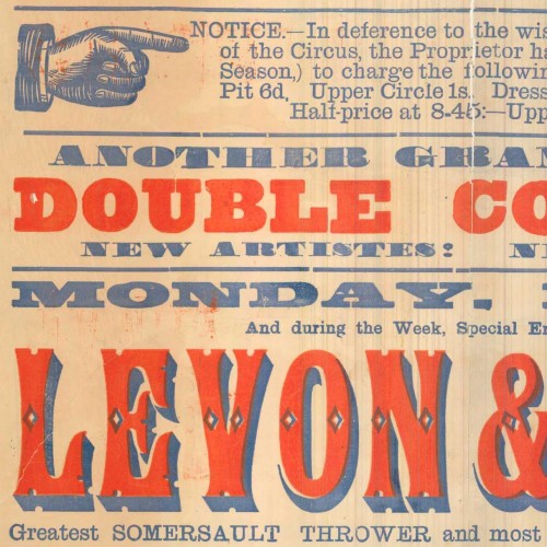
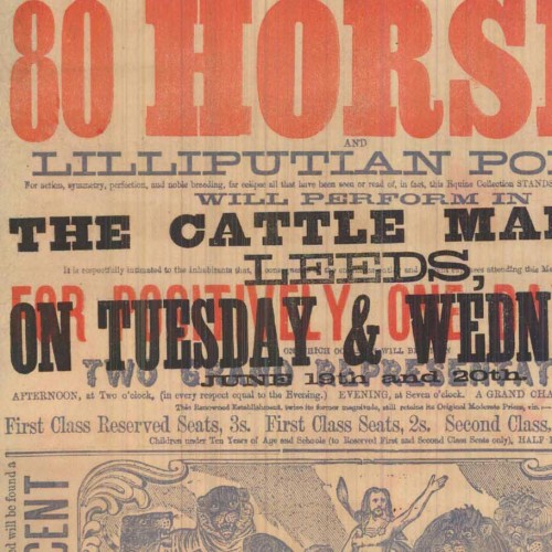
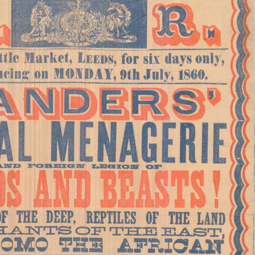
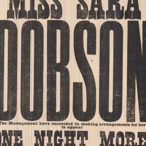
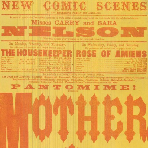
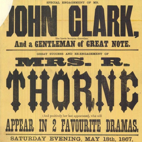
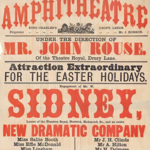
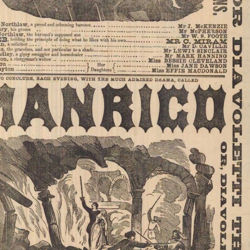
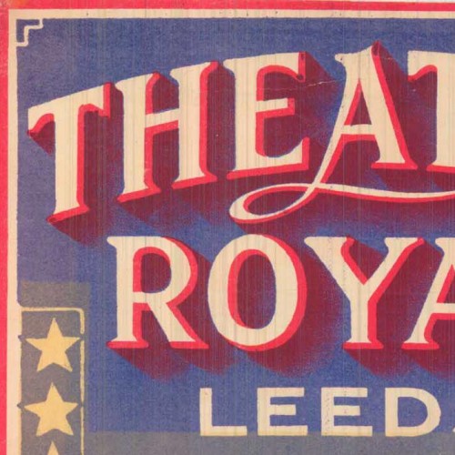
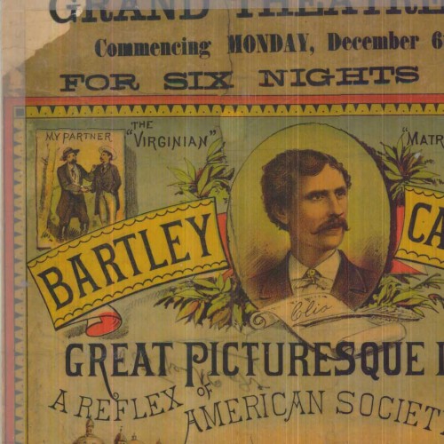
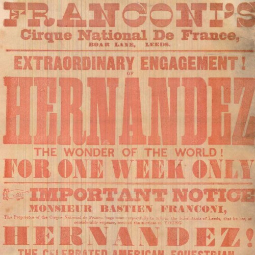
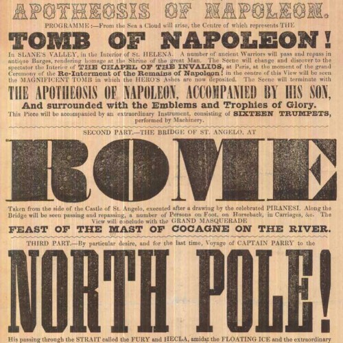
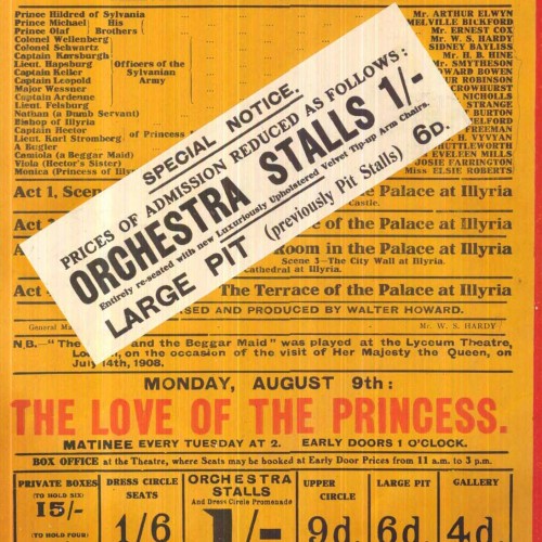
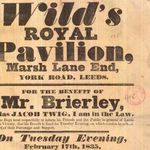
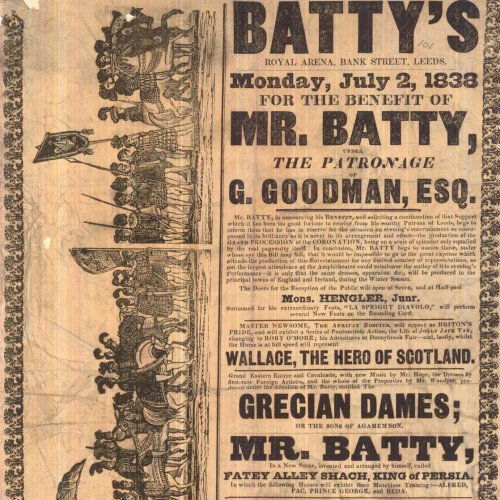
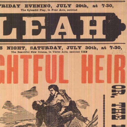
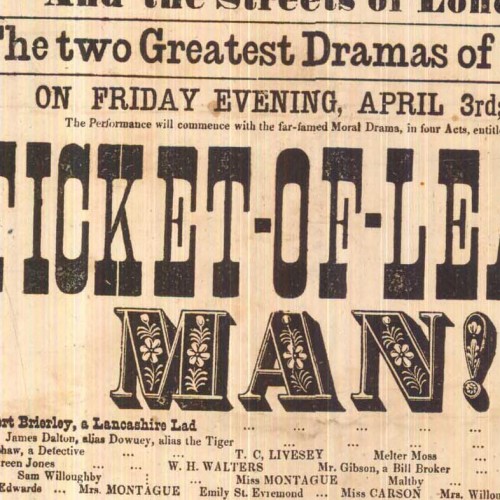
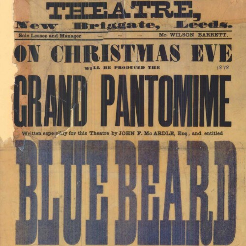
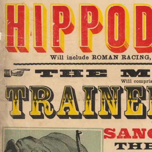
The amazing Leeds Playbills website contains nearly 5,000 medium-to-high resolution scans of vibrant playbills dating from the late 1700s up through the 1990s. The database, part of the Leodis digitization project, represents all the playbills in the Local Studies Library collection, with samples from a variety of historic theatres in the city of Leeds, as well as a group of related circus bills. Interestingly, the project is funded by the UK National Lottery‘s Big Lottery Fund (formerly the New Opportunities Fund).
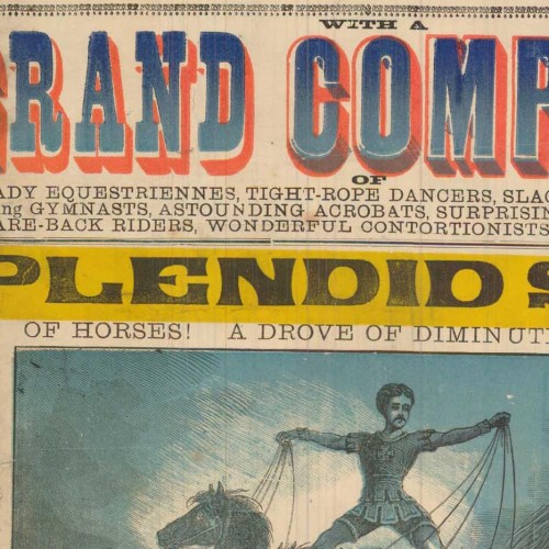
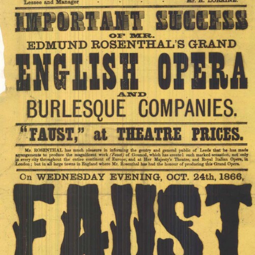
Many of the prints showcase an impressive array of large and ornamented types. Not surprisingly, the circus bills are among the most vibrant on the site, many utilizing multiple colors with chromatic typefaces, illustrations, and sensationalist prose. There are also a few non-typographic lithographs with elaborately colored lettering and illustration.
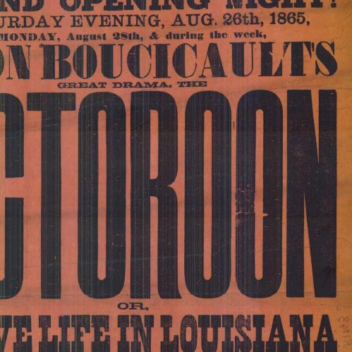
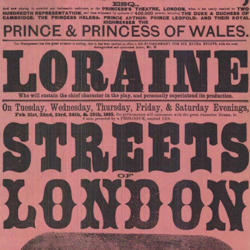
Other than the obvious wow factor (!!!), the prints are interesting for several typo-historic reasons. First of all, they show many typefaces that aren’t seen as frequently on this side of the Atlantic, and perhaps even in the UK. Furthermore, it shows the type in real-world use (not as in self conscious type specimens), revealing how the printers organized the information through variations in letter style and layout. One advantage of the higher resolution enlargements is that you can get a sense of how much care was put in to the printing of each piece (the range is wide). Many of the bills also have a credit line citing which print shop ran the job, allowing an evaluation of each shop in comparison with others, and giving info about which venues employed which printers. Finally, some of the items give an interesting view in to the practice of updating information by pasting on additional slips of paper or overprinting.
Unfortunately the small thumbnail images make browsing a bit tedious, and some of the full-resolution images show streaking from faulty scanning equipment. The site does have some useful functionality though, including the ability to filter content according to dates, keywords, and venues.
While wide time range is represented, the most interesting material to me, typographically, is that from the mid-to-late 1800s — coincidentally also the same period in which wood type was at its height of production and use. I’ve compiled a collection of details from some of the more interesting samples below, each linked back to the original page where you can access an enlarged, un-cropped, view.


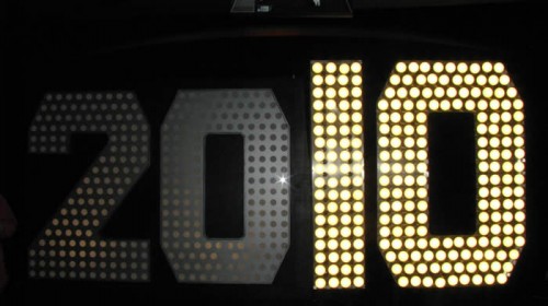
New Year's Eve digits being delivered to Times Square. Photo via the Times Square Alliance
Next week, the most important glyphs in the United States will be numbers hanging above One Times Square, welcoming a new decade at midnight on New Year’s Eve. The two most crucial digits, 1 and 0, were delivered to Times Square last week in true New York style: by pedicab.
The complete 2010 display stands 7 feet tall and is covered with 545 scalloped LED flood light bulbs, which are being hyped up for their superior energy-efficiency over the halogen lights used on previous years’ displays. A representative for lexiphane.com commented on a related Gothamist article with some entertaining / insightful (if slightly vulgar) thoughts regarding “green” lighting for the display:
I love the irony of energy-efficient lighting in Times Square. It’s like spraying Febreeze on a piss-soaked bum and then patting yourself on the back for improving the environment.
For your sake, I will refrain from making jokes about illumination in this entry.
I’m not sure which typeface was used to fabricate the numbers (if they were indeed based on a typeface), but the choice of a “chamfered” industrial style works well with the marquee-esque bulb lighting. It also has historical ties with large-scale lettering: traditional sign painters often use simple polygonal letterforms when working large, since they can be scaled up more easily using a systematic grid, requiring fewer calculations for curves.

The "2010" New Year's Eve sign on display at the Duracell SmartPower Lab in Times Square. Photo via the Times Square Alliance
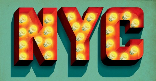
I have a soft spot in my heart for this method of building / filling letterforms with lightbulbs. Though certainly a universal practice in sign fabrication, it’s especially prevalent in New York City. In particular, the Theatre District surrounding Times Square is an epicenter of examples — rivaled only perhaps by The Strip in Las Vegas.

"NYC" lightbulb lettering Illustration by Jeff Rogers
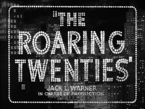
With that said, the decidedly dotted stylization (as opposed to solidly-lit forms or high-tech flatscreen displays) works perfectly in the cultural context of Times Square. It evokes the bright-light lettering tradition that has inspired people to refer to the section of Broadway near Times Square as the “white-light district”, “Street of the Midnight Sun”, “Great White Way”, etc. This lightbulb lettering seemed to parallel New York City’s prosperity in general, reaching a pinnacle during the 1920s — just before the prevalence of neon tube lighting and the Great Depression.

The lightbulb lettering for the title screen of "The Roaring Twenties" (1939) epitomizes a specific time and place in the history of the USA and New York City. Screenshot image via the Movie Title Stills Collection
Similar connections to iconic marquee signage could be pushed even further with the New Year’s display if its lights followed the classic “chase” blinking pattern. Whether or not the designers behind the Times Square numbers consciously consider these kinds of cultural connections… I couldn’t say. Either way, the end product seems to honor relevant lettering traditions, even while using modern lighting technology and being presented in the world’s premiere location for high-tech signage.
The giant digits are currently on view at the Duracell SmartPower Lab in Times Square, where visitors can pedal bikes to charge the batteries that will light the display when the ball drops next week.

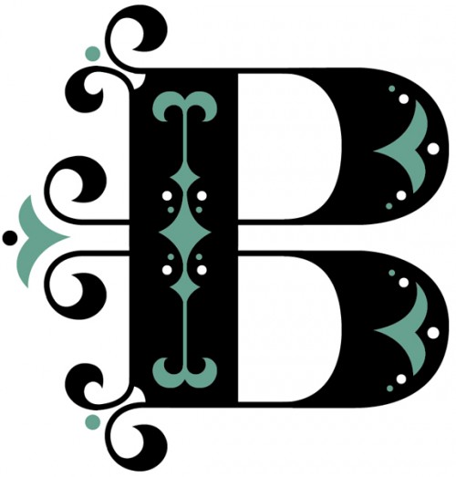
Illustrator, lettering artist, and designer Jessica Hische (also the designer behind the recent Buttermilk typeface) just launched a new website project called The Daily Drop Cap, where she aims to post a new decorative initial — or versal — every day. She’s also generously offering them for usage under a Creative Commons license, ” for the beautification of blog posts everywhere”.
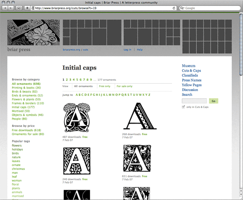
If Jessica’s servings aren’t enough for you, the Briar Press letterpress community website hosts a large collection of digitized initial caps, almost all available for free download.

Historically, some of the earliest decorated letters were large woodcut initials; their use in early printing lead to the first complete ornamented typefaces and, eventually, the entire field of display typography. I won’t get in to the specifics of versal history and terminology (e.g. illuminated manuscripts, historiated initials, inhabited initials, initiums, lettrine, rubrication, drop caps, elevated caps, etc, etc, etc), or how they evolved toward the first decorated typefaces. For those details, see the first chapter of Rob Roy Kelly’s American Wood Type: 1828–1900, the related pages in Robert Bringhurst’s The Elements of Typographic Style, or, for a breezer course, the Wikipedia page on initials.
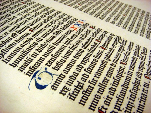
What I will share here is an interesting example of initials that I encountered recently: Last week I had the pleasure of experiencing a page from the Gutenberg Bible first-hand (in the private library of David Rose). As you can see in the photo I took (below), empty spaces were built in to the bible’s printed typography that could later be filled with hand-scribed initials.

Page from the Gutenberg Bible with hand-scribed initials, in the private library of David Rose.
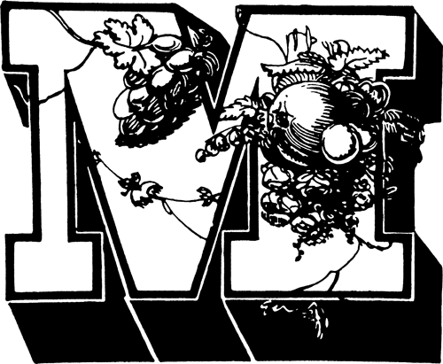
Skipping ahead several hundreds of years to a completely different set of stylistic norms, I figured I would also share an example of a typeface that seems like it’s just asking for the job of the proverbial “ten-gallon hat” [see Bringhurst, §4.1.4] — ornately marking the beginning of text blocks.

1838 showing of Wood & Sharwoods' "Ornamented No. 1" in 16-line size, as reproduced in Rob Roy Kelly's "American Wood Type: 1828–1900".
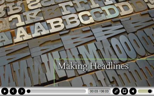
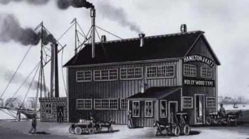
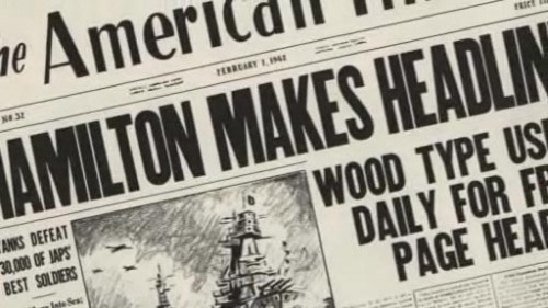
Wisconsin Public Television recently produced a short (8 minutes) documentary on the Hamilton wood type manufacturing company, titled Making Headlines, for the Two Rivers / Manitowoc installment of its Hometown Stories series.
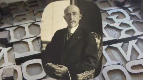
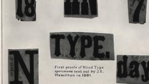
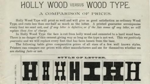
The documentary presents a succinct history of the empire that James Edward Hamilton started with wood type in Two Rivers, Wisconsin. Included are interviews with David Shields, Greg Corrigan, and Bill Moran. Also, I couldn’t help but notice many of my own wood type photos from Flickr used to illustrate the production. Naturally, I’m glad to have been able to help the cause.
The video acts as a good primer for the feature-length documentary, Typeface, which focuses more on the modern Hamilton Wood Type & Printing Museum (as opposed to the original Hamilton Manufacturing Company). It would make for a great DVD bonus feature.
The documentary can be seen on this page by clicking the Making Headlines thumbnail from the listing of clips. It is also available in DVD format from the Wisconsin Public Television Store.
