“Pressed” show and other typographic goings-on in Denver
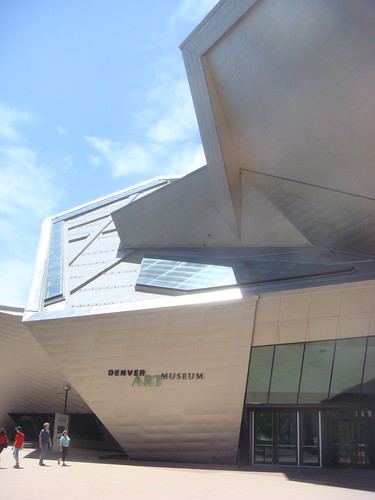
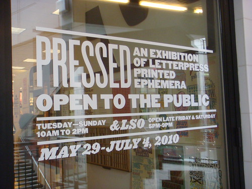
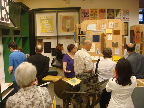
Denver, Colorado, has been a hotbed of activity related to typography and letterpress printing this month, with a series of type-centric events and exhibits. Designer and printer Rick Griffith of Matter has worked with the Design Council at the Denver Art Museum, AIGA Colorado, and Mohawk Paper, to organize Pressed, an exhibition of letterpress printed ephemera.
To kick off the show, the Denver Art Museum hosted two events, including a night of printing demonstrations and a “letterpress typography symposium” with screenings of Jack Stauffacher, Printer about the San Francisco publisher Jack Stauffacher; and the recent Typeface documentary about the Hamilton Wood Type Museum.
I was honored to speak after the screenings on a panel with Jim Sherraden & Brad Vetter from the much-loved Hatch Show Print, Denver’s resident letterpress guru, Tom Parson, and Rick Griffith as moderator. As you might imagine, the discussion covered a variety of typographic topics, but seemed to have an emphasis on the history and culture of letterpress as it relates to contemporary typeface design, design education, and poster printing.
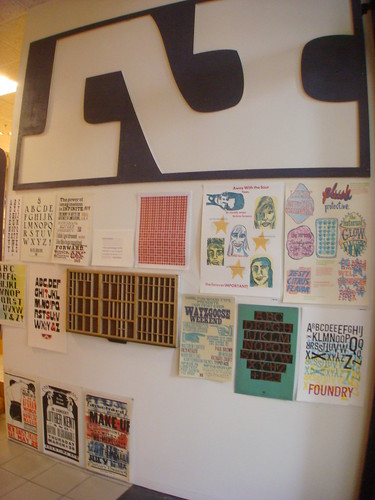
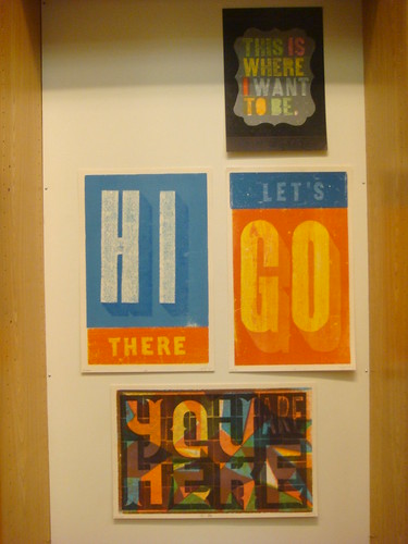
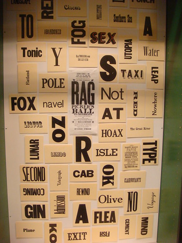
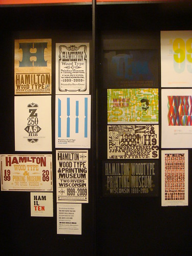
The highlight of the weekend was the opening of the Pressed exhibit and store in the Denver Pavillions. Rick and his team have collected a huge amount of contemporary letterpress work from all over the US and beyond, and presented it in an impressive gallery with giant 8-foot-tall wooden letters. Just about every inch of wall space is covered with colorful prints from Hatch Show Print, Amos Paul Kennedy Jr, the Hamilton 10th Anniversary Show, Yee-Haw Industries, and many, many, more artists/designers/printers.
The show will remain up in Denver through July 4th, after which it will continue on as a traveling show. A catalog is also being produced for the show. For more information and updates check DesignArtArtDesign, the Pressed project page on Kickstarter, and Matter on Twitter.



4 comments on “Pressed” show and other typographic goings-on in Denver.
2010/06/21, 8:05am #
I couldn’t help but notice how much of the work in this show is cluttered and busy, is that what passes for design in the letterpress community these days?
2010/06/21, 4:52pm #
Wesley,
I personally tend to prefer clean and well-executed printing, but cluttered and busy work definitely isn’t anything new in letterpress printing either.
I’m really a grumpy old stickler of a man inside, and I may quietly grumble to myself about the aesthetic and craftsmanship of work I see which isn’t exactly pristine; however, the concept which pleases me about even the crudest work is that it represents someone’s act of personal self-expression. And that’s the last thing I want to discourage.
2010/06/21, 6:23pm #
Is something that is busy somehow lesser design? One of the wonderful facets of letterpress printing is the tactile nature of it and the physical aspect of inks overlapping. It doesn’t make the craft any less, and it certainly isn’t any “less designed”. In addition, there are obvious references broadside printing in the show, so the business and clutter have a point.
Broadsides printed on letterpresses were effective because they were big and loud. If design is communication, what better way to communicate is there? Don’t mistake aesthetic for design.
2011/01/24, 9:48am #
[…] I designed and printed this poster at Hatch Show Print for a concert with the Black Crowes at the Ryman Auditorium. It was such a successful poster that the Ryman doubled their order! This poster has also been featured at the Country Music Hall of Fame with Hatch Show Print’s end of the year show. It was also recently featured in a print show at the Denver Art Museum. […]