Why wood?

I recently came across the Star-cooked blog by Johanna Knox, where she discussed her realization that she prefers lead type over wood:
I was talking to another woman about how using wood type feels very different from using lead type. Without thinking why it was so, I told her I was enjoying working with the lead type a lot more. She said she was the opposite; she was naturally attracted to working with wood type — and loved its comparative warmth and smoothness.
After the course was over, I wondered more about why I had fallen in love with working with lead type (because that’s how it did feel), and why for days afterwards all I wanted to do was hop back into that studio and get my fingers into those lead type cases again.
She goes on to relate her love for metal to her past experiences in life with metalworking and jewellry making.
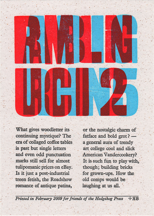
Knox’s ponderings, as well as Alan Brignull’s related inquiry of “what gives woodletter its continuing mystique”, got me thinking about how my personal experiences with wood might have led to my interest in wood type. When I was growing up, my father built and restored classic wooden sailboats. At our house, we had a boat shed and woodworking shop on the property, and I was constantly working on my own wood projects — tree houses, toy swords, skateboard decks, etc. As a teenager, my friends and I built a fairly massive wooden half-pipe in my back yard, and I have since been involved in the construction of countless other such skateboard ramps.
But is the connection to my later interest in wood type just a romantic notion? I have similar experiences that might just as easily counter my current preference. For example, some of my childhood experiences with metal are more relevant to type production than anything mentioned above: I vividly remember casting lead paperweights of my handprint in molding sand while my father cast blocks of sailboat ballast.
Thinking more on the topic, I don’t fit the profile of the typical 21st-century wood type enthusiast at all: unlike the wood type protagonist in Johanna Knox’s story above, the “warmth” and “smoothness” now associated with the medium don’t have much to do with my specific interest in it. On the contrary, I am more drawn to type — wood or otherwise — with crisp, hard, and sharp edges. If I exhibit any of the “post-industrial treen fetish” alluded to by Brignull it is only coincidental. I don’t hold any particular affection for the rough “distressed” design aesthetic. I generally aim to eliminate the imperfections inherent in wood type from my printing. I don’t embrace the “debossed” effect achieved by excessive impression of type into paper… Most of the modern stylistic stereotypes (no pun intended) of wood type don’t excite me much; and, to be totally honest, I even see the underlying design of many typefaces developed for production in wood as downright grotesque (again, no pun intended) — like 19th-century equivalents of the “grunge” typefaces from the 1990s, when advances in technology seemed to encourage people to design the most garish typefaces they could.
So what is it about wood type that intrigues me? First of all: the extreme scale. For whatever reason, I am drawn to large graphic forms. Visual figure-ground interaction, subtlety of contour, and solid, broad, flat shapes all become so potent with increases in scale. Despite the comparison with digital grunge fonts above, even the most naïve or gimmicky wood typefaces can be oddly hypnotizing in their boldness. There is something about the hyper-graphic, ornate, and novel letterforms common in wood type that I can only describe as fascinating.
Another major factor in my love for the topic is the history involved. Wood type is one of relatively few graphic arts phenomena identified as being specifically American in nature. It wasn’t invented here, and it certainly existed elsewhere, but — like so many other industries — it was in 19th-century USA that the wood type industry really came into its own. As an American, this is something that I can identify with, and perhaps even hold a sense of heritage for. Learning the obscure stories of no-nonsense wood type industrialist entrepreneurs (often with giant mustaches) is a perfect window into the larger view of the USA as it grew after the Industrial Revolution and came to be the culture in which I now reside.
Additionally, on a topic related to scale, wood type is a great tool for teaching. Its blunt tactility makes it much easier to convey ideas about typography and letterpress printing to students. The increased margin for error inherent in its large size and flexibility make it ideal for use by beginning printers. Similarly, due to its relative simplicity, wood type has a lower technical threshold than metal type as far as production. In more ways than one, it is easier for someone interested in making their own type to do so with wood at a large scale (as I did with my Intercut project) than it would be to master the intricacies of casting with molten metal at smaller sizes. As such, it presents more room for adaptation and experimentation.
With all that said, I do believe my interest in wood type has something to do with my personal upbringing, but it’s much more complicated than that and probably involves a whole slew of other factors I haven’t considered yet. Please also note that I have nothing against metal type, and am just as happy to nerd out about it when given the chance.


