Times Square’s New Year numbers and NYC lightbulb lettering
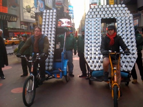
Next week, the most important glyphs in the United States will be numbers hanging above One Times Square, welcoming a new decade at midnight on New Year’s Eve. The two most crucial digits, 1 and 0, were delivered to Times Square last week in true New York style: by pedicab.
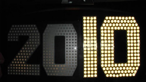
The complete 2010 display stands 7 feet tall and is covered with 545 scalloped LED flood light bulbs, which are being hyped up for their superior energy-efficiency over the halogen lights used on previous years’ displays. A representative for lexiphane.com commented on a related Gothamist article with some entertaining / insightful (if slightly vulgar) thoughts regarding “green” lighting for the display:
I love the irony of energy-efficient lighting in Times Square. It’s like spraying Febreeze on a piss-soaked bum and then patting yourself on the back for improving the environment.
For your sake, I will refrain from making jokes about illumination in this entry.
I’m not sure which typeface was used to fabricate the numbers (if they were indeed based on a typeface), but the choice of a “chamfered” industrial style works well with the marquee-esque bulb lighting. It also has historical ties with large-scale lettering: traditional sign painters often use simple polygonal letterforms when working large, since they can be scaled up more easily using a systematic grid, requiring fewer calculations for curves.

The "2010" New Year's Eve sign on display at the Duracell SmartPower Lab in Times Square. Photo via the Times Square Alliance
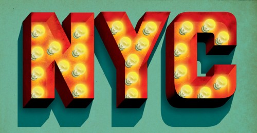
I have a soft spot in my heart for this method of building / filling letterforms with lightbulbs. Though certainly a universal practice in sign fabrication, it’s especially prevalent in New York City. In particular, the Theatre District surrounding Times Square is an epicenter of examples — rivaled only perhaps by The Strip in Las Vegas.
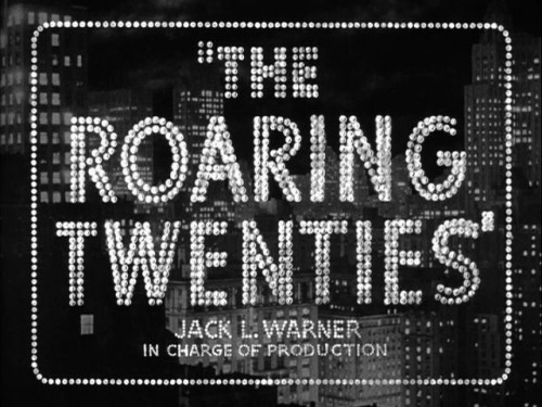
With that said, the decidedly dotted stylization (as opposed to solidly-lit forms or high-tech flatscreen displays) works perfectly in the cultural context of Times Square. It evokes the bright-light lettering tradition that has inspired people to refer to the section of Broadway near Times Square as the “white-light district”, “Street of the Midnight Sun”, “Great White Way”, etc. This lightbulb lettering seemed to parallel New York City’s prosperity in general, reaching a pinnacle during the 1920s — just before the prevalence of neon tube lighting and the Great Depression.

The lightbulb lettering for the title screen of "The Roaring Twenties" (1939) epitomizes a specific time and place in the history of the USA and New York City. Screenshot image via the Movie Title Stills Collection
Similar connections to iconic marquee signage could be pushed even further with the New Year’s display if its lights followed the classic “chase” blinking pattern. Whether or not the designers behind the Times Square numbers consciously consider these kinds of cultural connections… I couldn’t say. Either way, the end product seems to honor relevant lettering traditions, even while using modern lighting technology and being presented in the world’s premiere location for high-tech signage.
The giant digits are currently on view at the Duracell SmartPower Lab in Times Square, where visitors can pedal bikes to charge the batteries that will light the display when the ball drops next week.


