Entries filed under
New York City

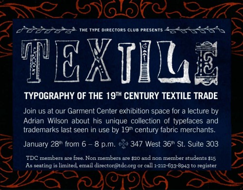
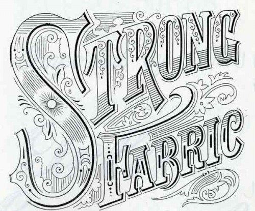
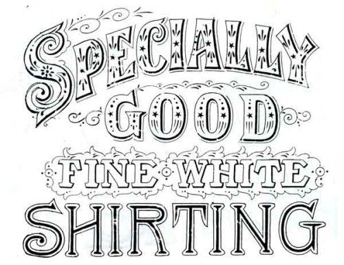
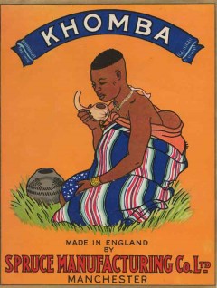
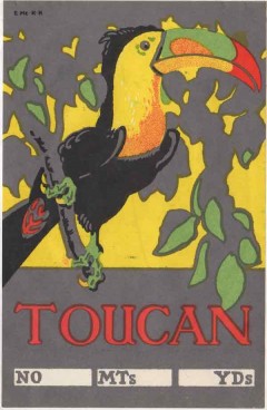
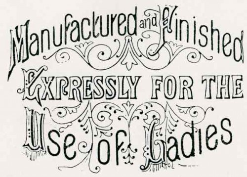
One week from today, the Type Directors Club in New York will host a lecture by Adrian Wilson about his collection of ephemeral lettering artifacts from the English textile trade of the 1800s and early 1900s. Wilson was kind enough to provide me with some sample images (below) and an interesting PDF describing the collection.
The topic of fabric merchant labels is an obscure one, but there seem to be many parallels with similarly intriguing fruit crate labels from roughly the same period. The text from the PDF gives some background on what Wilson will be discussing…
The 1842 Design and Copyright Act required that all pieces of cloth had to be clearly stamped of labeled with a “faceplate” that included the supplier’s identifying mark, and the cloth’s type and length.
Wilson’s collection — which he salvaged from cotton warehouses in Manchester, England — includes “over 2,000 hand-made wood and copper stamps used for printing the marks, around 4,000 unpublished printed stamp designs, and around 800 paper shippers’ tickets”. He was a guest on BBC’s Antiques Roadshow in 2005, but the collection has still yet to be shown publicly at any significant level.
Even after seeing all the background info and sample images, I’m still not 100% sure what to expect from the lecture. I am pretty confident, though, that it will include a lot of ornamented 19th-century lettering; and that’s enough for me.
What: TEXTile, a lecture about the typography of the 19th century textile trade
When: January 28, 2010; 6–8 PM
Where: Type Directors Club; 347 W 36th St, #603; New York, NY [map]
Cost: Free for TDC members; $20 for non-members; $15 for students
Registration: E-mail director@tdc.org or call 212-633-8943


19th century textile trade ephemera courtesy of Adrian Wilson

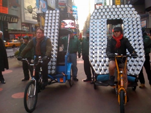
New Year's Eve digits being delivered to Times Square. Photo via the Times Square Alliance
Next week, the most important glyphs in the United States will be numbers hanging above One Times Square, welcoming a new decade at midnight on New Year’s Eve. The two most crucial digits, 1 and 0, were delivered to Times Square last week in true New York style: by pedicab.
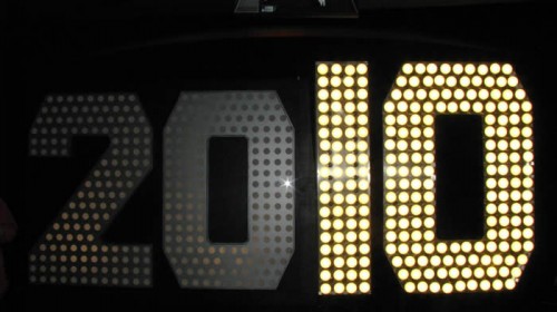
The complete 2010 display stands 7 feet tall and is covered with 545 scalloped LED flood light bulbs, which are being hyped up for their superior energy-efficiency over the halogen lights used on previous years’ displays. A representative for lexiphane.com commented on a related Gothamist article with some entertaining / insightful (if slightly vulgar) thoughts regarding “green” lighting for the display:
I love the irony of energy-efficient lighting in Times Square. It’s like spraying Febreeze on a piss-soaked bum and then patting yourself on the back for improving the environment.
For your sake, I will refrain from making jokes about illumination in this entry.
I’m not sure which typeface was used to fabricate the numbers (if they were indeed based on a typeface), but the choice of a “chamfered” industrial style works well with the marquee-esque bulb lighting. It also has historical ties with large-scale lettering: traditional sign painters often use simple polygonal letterforms when working large, since they can be scaled up more easily using a systematic grid, requiring fewer calculations for curves.

The "2010" New Year's Eve sign on display at the Duracell SmartPower Lab in Times Square. Photo via the Times Square Alliance
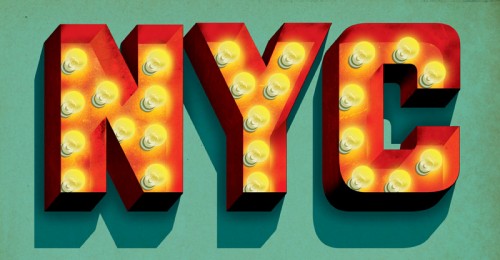
I have a soft spot in my heart for this method of building / filling letterforms with lightbulbs. Though certainly a universal practice in sign fabrication, it’s especially prevalent in New York City. In particular, the Theatre District surrounding Times Square is an epicenter of examples — rivaled only perhaps by The Strip in Las Vegas.

"NYC" lightbulb lettering Illustration by Jeff Rogers
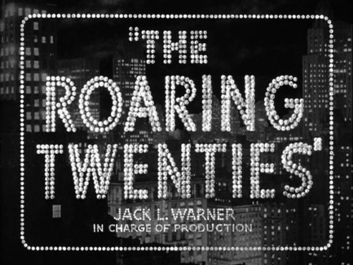
With that said, the decidedly dotted stylization (as opposed to solidly-lit forms or high-tech flatscreen displays) works perfectly in the cultural context of Times Square. It evokes the bright-light lettering tradition that has inspired people to refer to the section of Broadway near Times Square as the “white-light district”, “Street of the Midnight Sun”, “Great White Way”, etc. This lightbulb lettering seemed to parallel New York City’s prosperity in general, reaching a pinnacle during the 1920s — just before the prevalence of neon tube lighting and the Great Depression.

The lightbulb lettering for the title screen of "The Roaring Twenties" (1939) epitomizes a specific time and place in the history of the USA and New York City. Screenshot image via the Movie Title Stills Collection
Similar connections to iconic marquee signage could be pushed even further with the New Year’s display if its lights followed the classic “chase” blinking pattern. Whether or not the designers behind the Times Square numbers consciously consider these kinds of cultural connections… I couldn’t say. Either way, the end product seems to honor relevant lettering traditions, even while using modern lighting technology and being presented in the world’s premiere location for high-tech signage.
The giant digits are currently on view at the Duracell SmartPower Lab in Times Square, where visitors can pedal bikes to charge the batteries that will light the display when the ball drops next week.


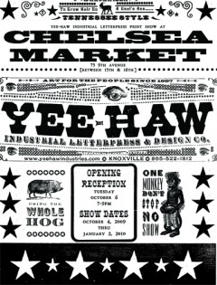
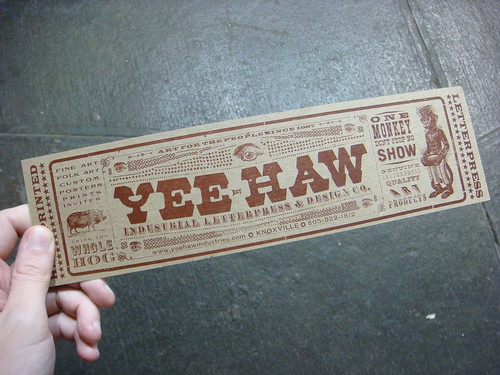
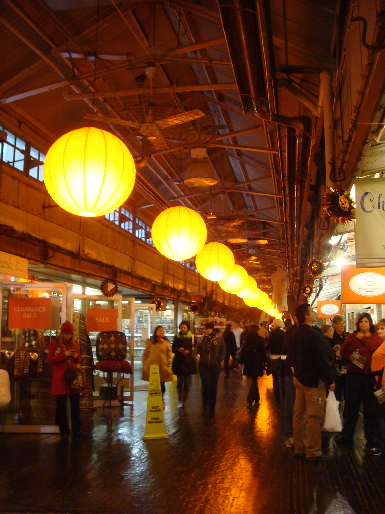
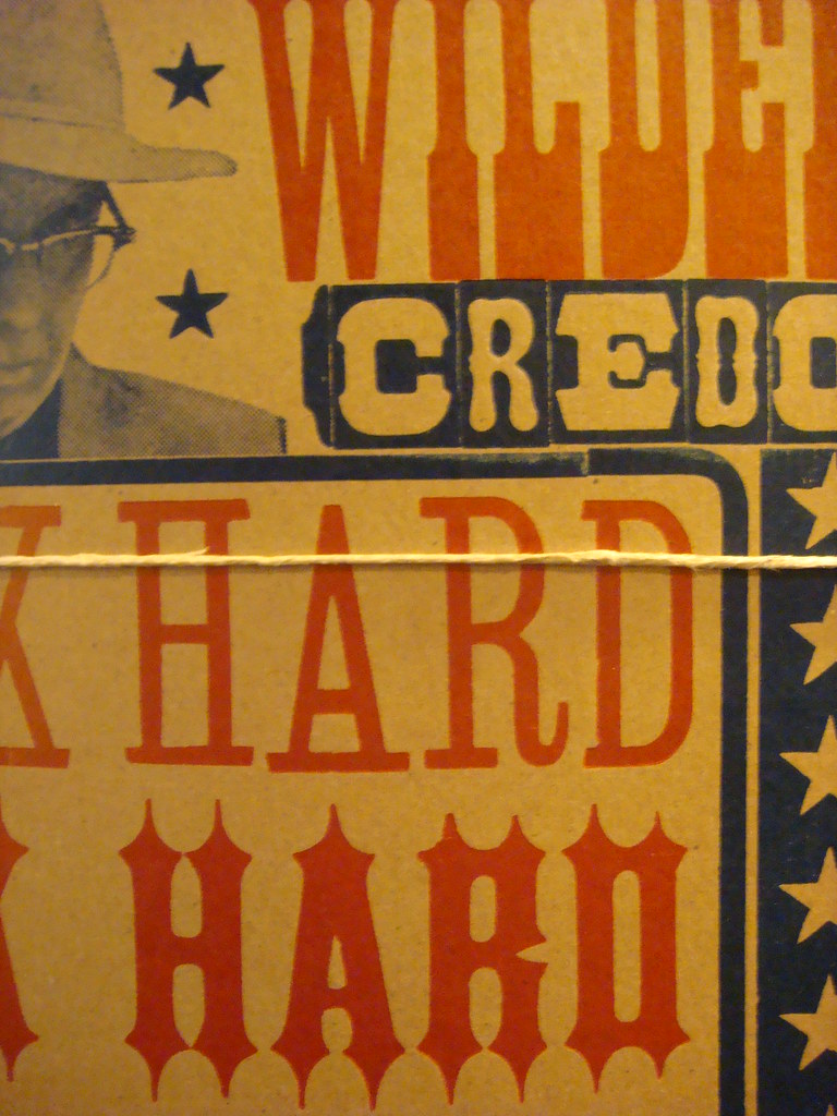
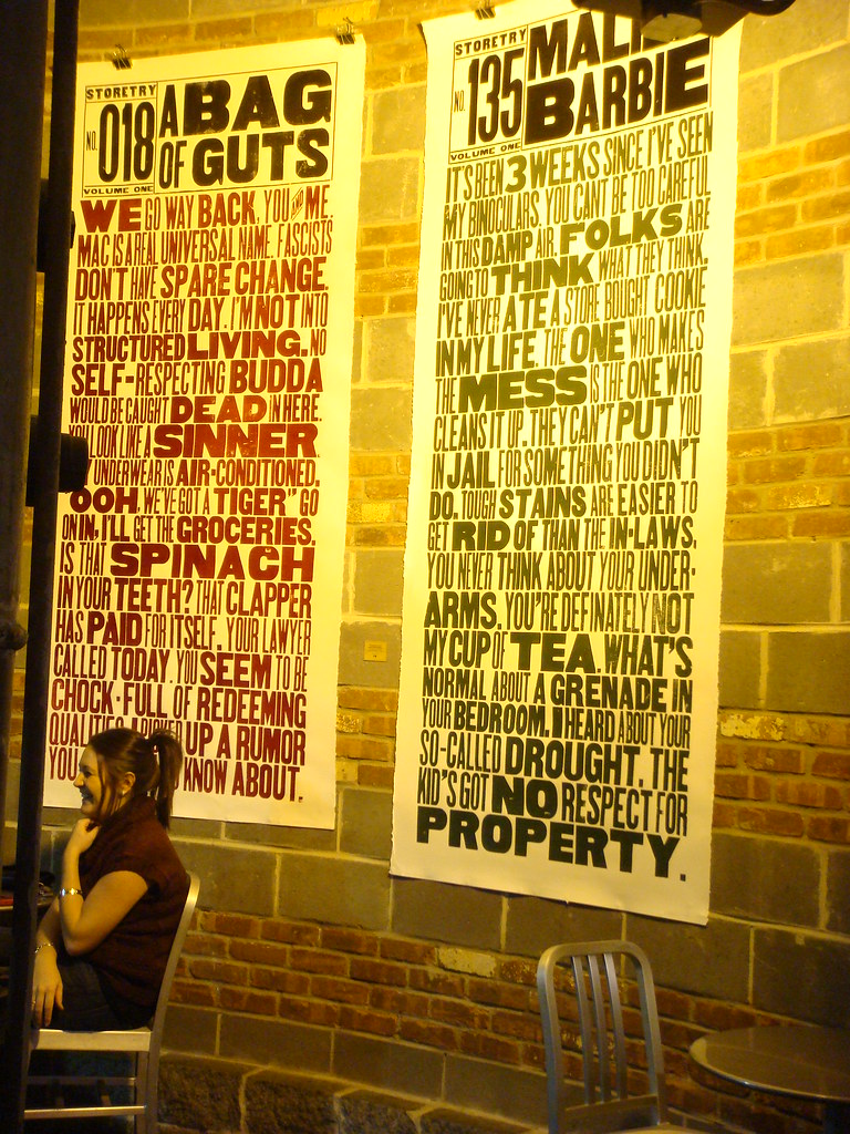
This winter, any typophile finding themselves in the New York City area is advised to make a trip to Chelsea Market to see the exhibition of work by Tennessee’s Yee-Haw Industries, up until January 2. I saw the show just before Halloween and was not disappointed to find the significant presence of wood type printing that I expected.
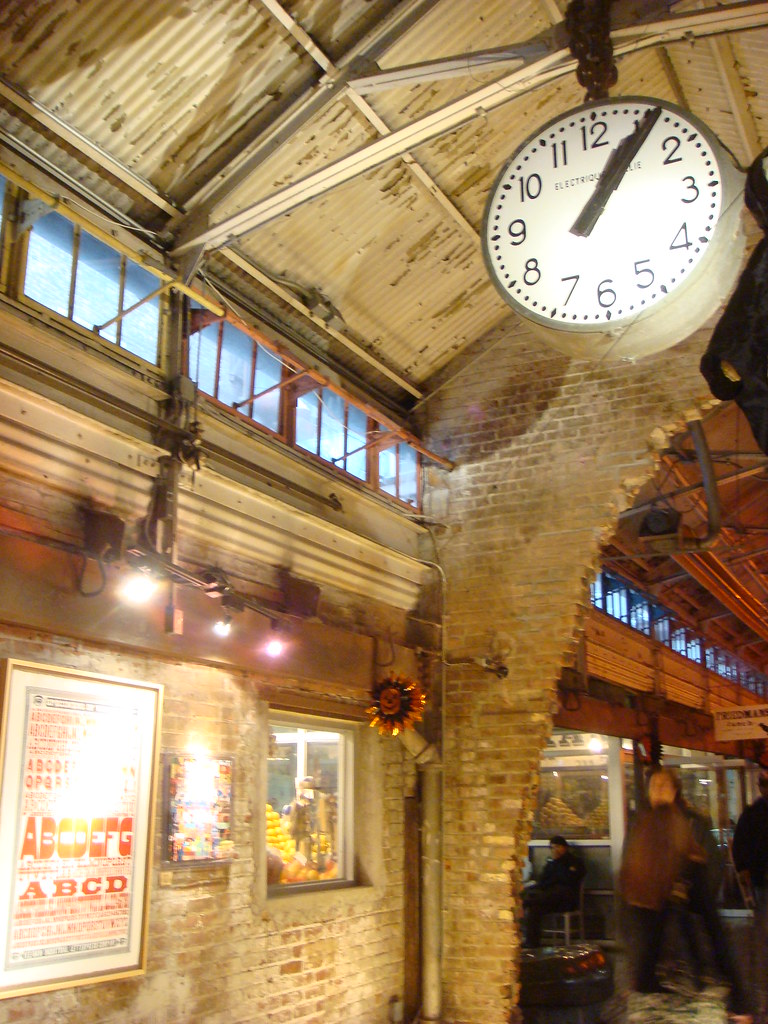
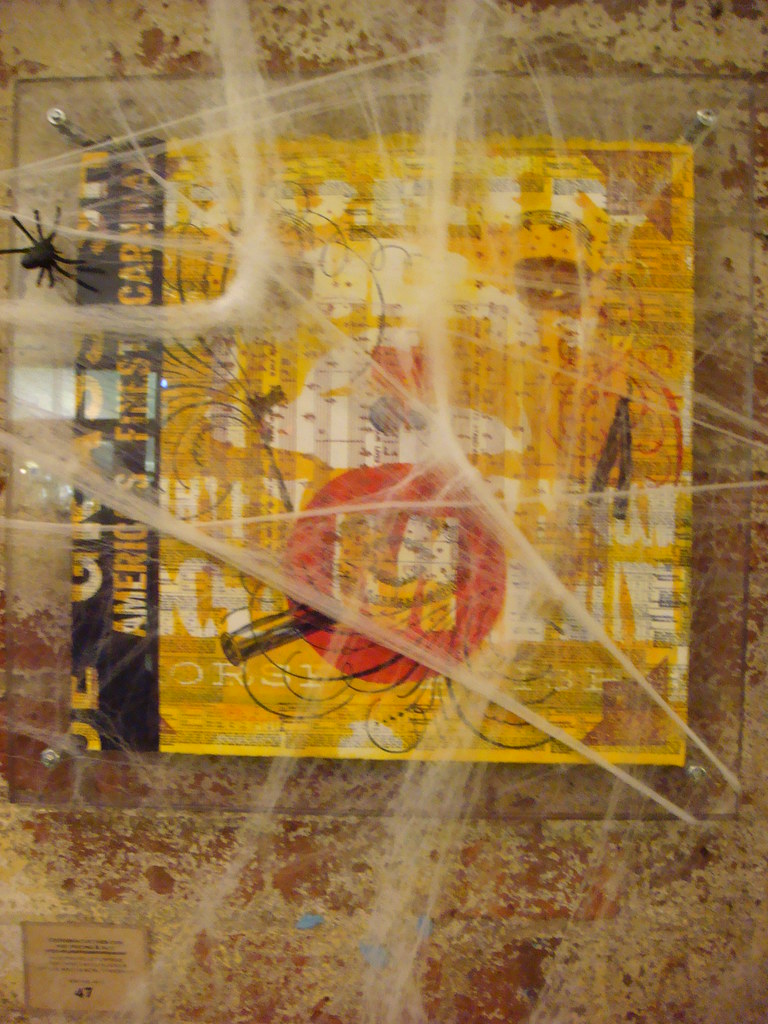
Chelsea Market has retained much of its historical brick-and-iron factory atmosphere, so it acts as a perfect backdrop for the work described as “industrial” letterpress. When I made my visit, there were all kinds of Halloween displays interrupting the show — some ghosts and cobwebs even draped over the art — but perhaps upcoming holiday decorations will be less distracting.
From Yee-Haw’s official announcement:
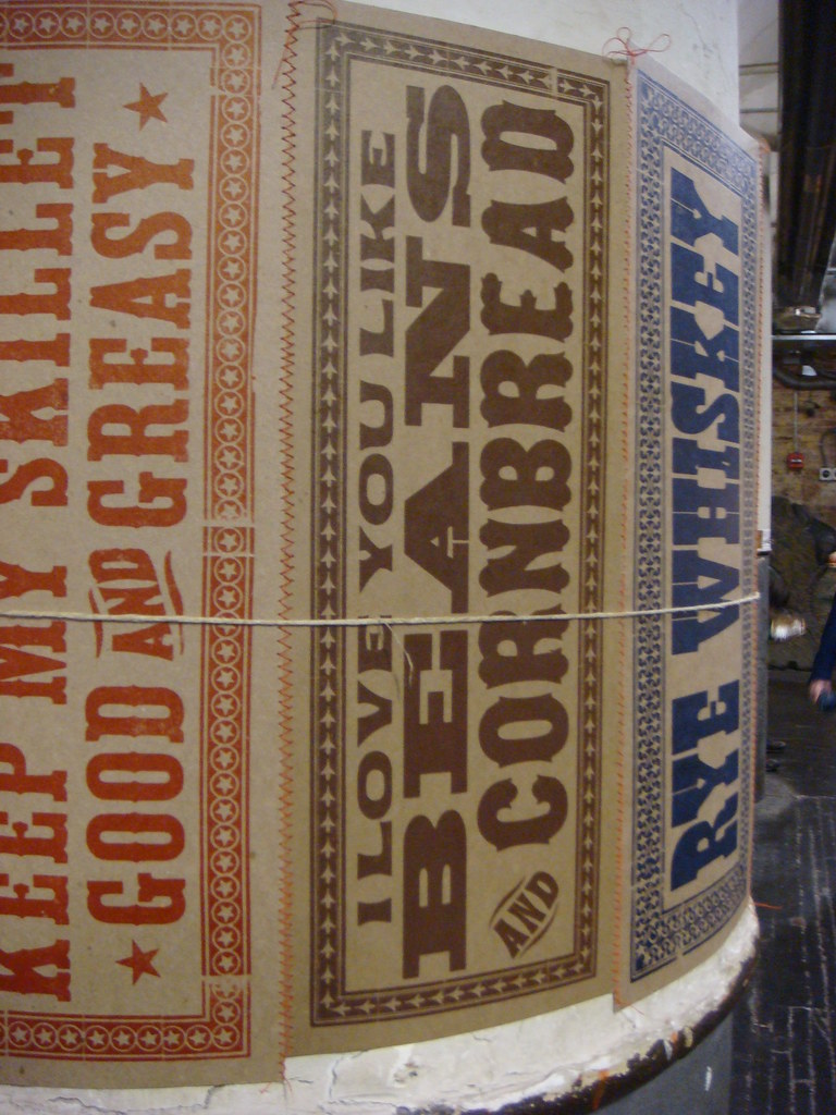
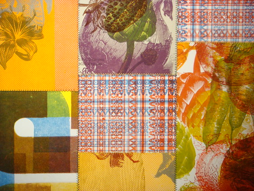
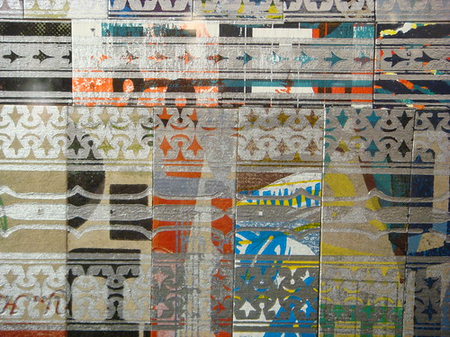
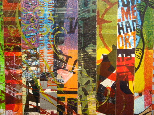
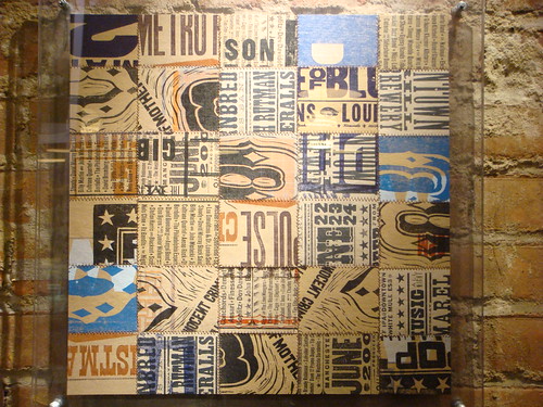
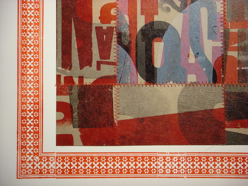
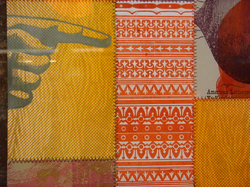
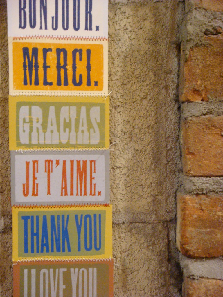
Yee-Haw’s work will adorn the vast and cavernous Chelsea Market, located in the Meat Packing District in Manhattan’s West Village. Over 100 letterpress pieces all hand-printed from our wood cuts & antique type in our Tennessee studio. We made over 50 sewn paper “quilt squares” specifically for this show and brought along some old favorites. Chelsea Market is an enclosed, urban food court and shopping mall in New York City. It is housed within the former Nabisco factory complex where the Oreo cookie was invented and produced. The 22-building complex fills two entire blocks bound by 9th and 11th Avenues from 15th to 16th Street.
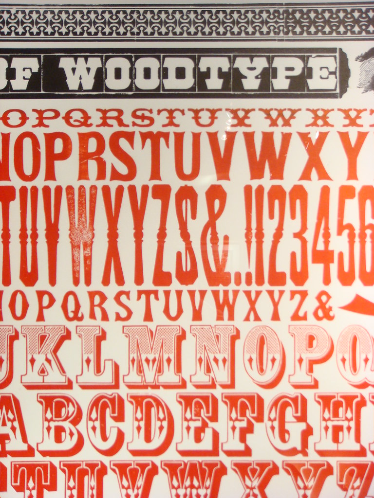
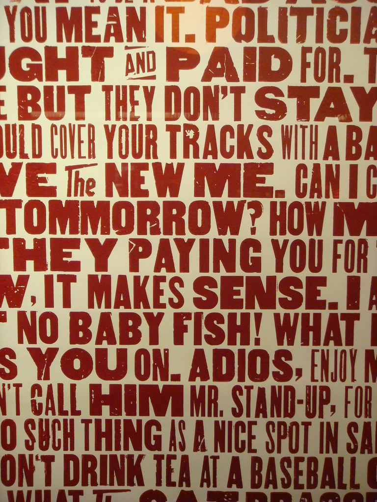
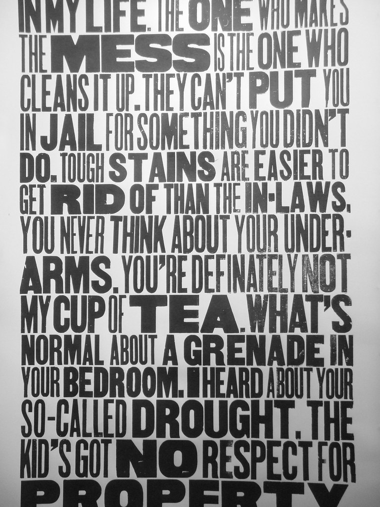
The fact that I haven’t yet mentioned Yee-Haw on Woodtyper is surprising, since they are among the top users of wood type in the world, alongside shops like Hatch Show Print. They clearly embrace the aesthetic and charm of wood type, and even have produced an amazing poster series with specimens from their collection (probably the highlights of the show at Chelsea Market, in my biased opinion).
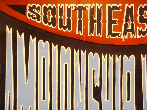
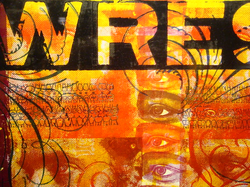
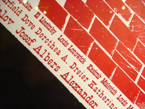
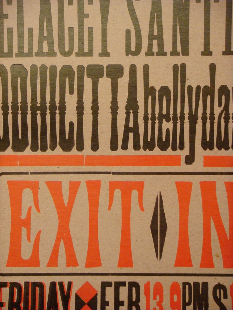
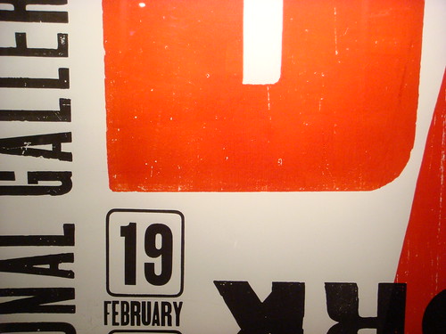
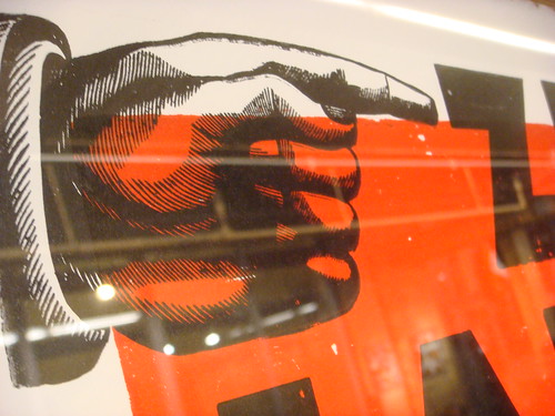
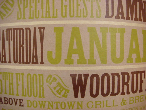
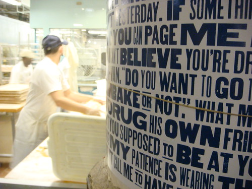
Below you’ll find photos I captured of the work from the show, but I’ve consciously only shown enough of the details to whet your appetite. You’ll have to visit in person to get the full experience of the pieces in this unique setting.
What: Yee-Haw Industries industrial letterpress exhibition
When: October 4, 2009–January 2, 2010
Where: Chelsea Market; 75 9th Avenue, New York, NY 10011 [map]
Admission: Free and open to the public


(These images are also gathered together as a set on Flickr)

