Lettering on Shorpy, part 1
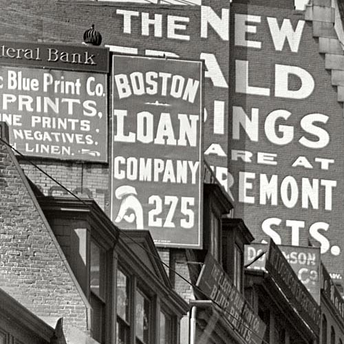
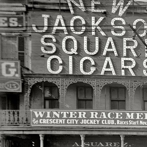
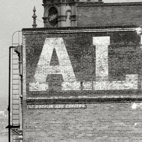
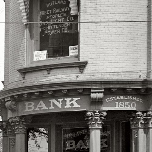
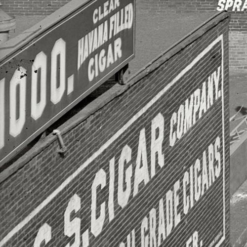
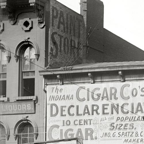
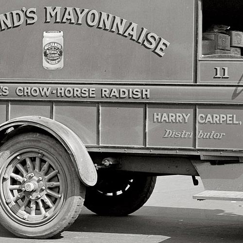
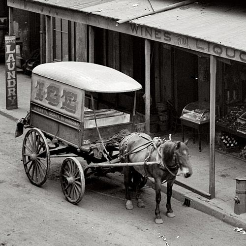
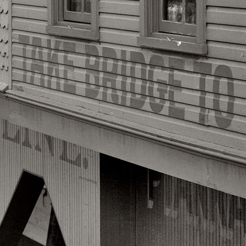
The treasure trove of vintage photography featured on Shorpy provides endless samples of commercial sign painting and architectural lettering from the 1850s through the 1950s. Though the site doesn’t specifically focus on the topic of graphic art, the abundance of lettering isn’t surprising considering the amount of images from the so-called Second Industrial Revolution – a period of dramatic growth in consumer culture, fueled in part by public advertising.
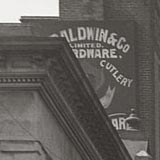
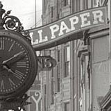
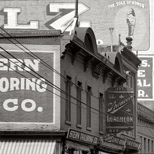
The high resolution of the images (most of which were extracted and adjusted from reference images in the Library of Congress research archive) makes thorough inspection a rewarding task. A surprising number of photographs that appear barren of lettering in their low-resolution form often reveal impressive examples when viewed at full size. In some instances you can even make out the signature of the lettering artist.
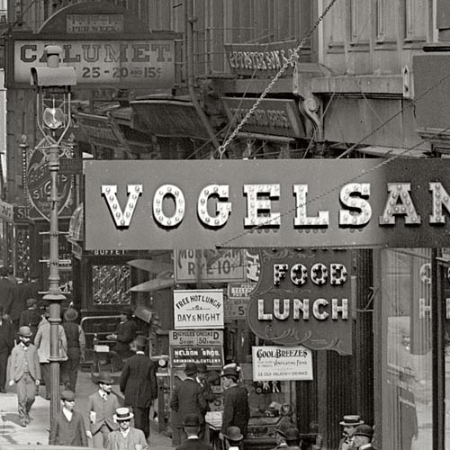
Many images on Shorpy show not only interesting lettering, but a high concentration of it. Any one scene may contain dozens of notable examples, stacked and layered as far as the eye (or camera) can see. This illustrates the volume as well as variety of lettering that was being crafted at the turn of the 20th century. Before mechanized sign production was the norm, lettering artists weren’t tempted by the same shortcuts that so many of today’s sign makers have succumbed to. Templates were used regularly for letterforms and layouts, but the variety of swashy scripts, catchwords, shading, punctuation, lightbulb illumination, and other such techniques added a certain character to the urban landscape which only survives today as ghost signs or in the work of a small number of specialized artists.
This post is the first in a series showing highlights of lettering on Shorpy. Each image links to the original photo page on Shorpy where full-sized, uncropped views can be accessed.











5 comments on Lettering on Shorpy, part 1.
2010/05/24, 5:46pm #
This is nostalgic for me. Not to say that I’m as old as the lettering examples in the photos, but I’ve done the many kinds of sign work shown, often in quite similar vintage styles. The only exception is the electrical stuff. I never had to build and install a sign with letters containing light bulbs.
2010/05/24, 6:04pm #
John, you were one of the people I had in mind when I mentioned “the work of a small number of specialized artists”. I’d love to see how you might approach the task of designing lightbulb lettering!
2010/08/25, 12:48pm #
There are a few faded brick walls around town with lettering that’s so beautiful. They make up some of my favorite places. I can’t wait to check out Shorpy.
2010/12/03, 3:37pm #
Well done! Thanks for hooking me up with your fantastic blog and the invaluable information on Shorpy. You entry nailed it … looking through these images is the closest thing to time travel yet! Just a wealth of inspiration for what I’m currently doing. Thanks again!
2011/09/07, 9:21am #
These old photos are a priceless resource for sign painters like myself who are trying to keep the old traditional work alive, plus they are a lot of fun to look at. We have some we print up and frame and hang in our studio for inspiration.