19th-century gravestones borrowing from concurrent print typography
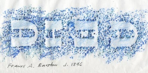
Lettering artist and historian Paul Shaw just posted some gravestone rubbings he made in Maine to his blog, Blue Pencil. He samples one word — “died” — as it appeared on different gravestones in that area to illustrate a radical change in New England gravestone epigraphy that Paul dates as starting sometime around 1820. This shift saw gravestones imitating certain typographic styles common in ephemeral print-based design from that time period.
For a quick example, the lettering in the rubbing shown above directly mimics Caslon & Catherwood’s Italian (an interesting face which I’ll refrain from elaborating on now):

1821 showing of Caslon & Catherwood's "Italian" in five-line pica and two-line great primer sizes, as reproduced in Nicolete Gray's "Nineteenth Century Ornamented Typefaces".
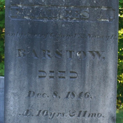
Paul kindly sent me a photo of the gravestone in question which demonstrates how such gravestones were also adopting the layout, punctuation (more on that in the future), and use of multiple decorative types common in broadside and job printing of the time.
This one example shows a combination of “fat face” and “streamer” styles to compliment the previously mentioned Italian. Paul’s other rubbings show a variety of similar decorative styles, many of which were also based directly on decorative printing types.


