Matthew Carter will be introducing his first wood typeface, a chromatic latin-serif face called Carter Latin. The project has been in various states of development since at least 2003, but Hamilton has recently incorporated some digital technologies to solve issues of ink trapping and registration that had delayed previous tests done with less accurate pantograph routers.
Prototype font of Carter Latin, photographed in May 2009
Designer Juliet Shen will also present a Lushootseed alphabet typeface she developed for the Tulalip Lushootseed Native American tribe in Washington state. Hamilton is cutting a new wood font of Juliet’s typeface to help give the “opportunity for this tribe to ‘manipulate’ their language by printing in their own font”. Last month, at the ATypI conference, Juliet presented some of the work she’s done on the typeface for the endangered language, but she didn’t go in to any details about the wood type project. I’ll be interested to see more info on that.
Prototype of a Lushootseed typeface designed by Juliet Shen for the Tulalip Tribes Lushootseed Department
Other than that, type designer Sumner Stone will join the presenters for a round-table discussion; a dinner party will take place at the Lighthouse Inn; the new Typeface documentary film about Hamilton will be screened; and several workshops and presentations using the museum’s amazing collection will be held by Richard Zauft (President of the Boston Society of Printers, Co-editor of Hamilton Wood Type: A History in Headlines, and Associate Vice President for Academic Affairs at Emerson College), Paul Brown (current Printer in Residence at Hamilton and Associate Dean of Art at Indiana University), and Jim Moran (Hamilton’s “Printer and Archivist” — though a more appropriate title would be something like “Director”, or “Guy-Who-Keeps-The-Place-Running”).
Finally, other than an open house, print swap, and general nerdery with fellow woodtypers like David Shields and Allen Stump (among other expected attendees), I am especially looking forward to some quality time with master type cutter, former type shop foreman, and unofficial Hamilton mascot, Norb Brylski.
Norb Brylski and the pantograph routers at the Hamilton Wood Type Museum
What: Hamilton Wood Type Museum’s first ever Wayzgoose Weekend When: November 20–22, 2009 Where: Hamilton Wood Type & Printing Museum; 1619 Jefferson Street, Two Rivers, WI 54241 [map] Cost: $75 ($91 with dinner) Registration: Available online (or via the printable PDF registration form) Accommodations: Available through the Lighthouse Inn, or try 1-Plus Rentals
The documentary presents a succinct history of the empire that James Edward Hamilton started with wood type in Two Rivers, Wisconsin. Included are interviews with David Shields, Greg Corrigan, and Bill Moran. Also, I couldn’t help but notice many of my own wood type photos from Flickr used to illustrate the production. Naturally, I’m glad to have been able to help the cause.
The video acts as a good primer for the feature-length documentary, Typeface, which focuses more on the modern Hamilton Wood Type & Printing Museum (as opposed to the original Hamilton Manufacturing Company). It would make for a great DVD bonus feature.
The documentary can be seen on this page by clicking the Making Headlines thumbnail from the listing of clips. It is also available in DVD format from the Wisconsin Public Television Store.
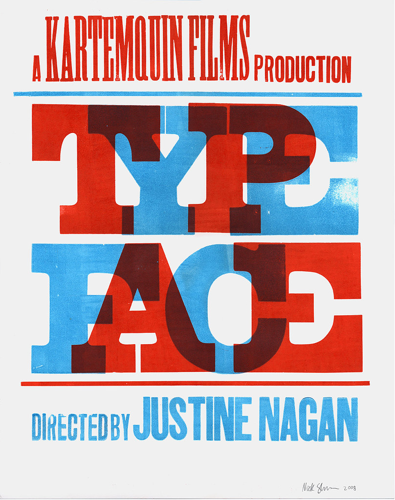
I designed and printed a poster last year (pictured above) to promote the film and help raise money for the production; I’ve also done some advising on rough edits of the film. Justine and the team working on the documentary are dedicated and skilled filmmakers (not to mention great all-around people), and the edits I’ve seen so far are very promising. After having spent much time at Hamilton, I anxiously look forward to a broader public release to help spread the word about the museum.
To get info about when and where to see the film (including a screening next week in Atlanta!), buy limited-edition posters, read news updates and info on the project, and more, see the official Typeface site.
I spent most of the past two weeks (May 27–June 5) in Two Rivers, Wisconsin, at the Hamilton Wood Type & Printing Museum. As I mentioned previously, the museum was holding their 10-year anniversary celebrations over the weekend, which was my main reason for visiting; but I also spent some time working at the museum before and after the crowd of revelers had come and gone.
During this trip — my first time back to the museum since my month-long stay in 2007 — I absorbed all kinds of new ideas, most of which I will hopefully discuss here in more detail over the coming months. For now, I’ll give a general overview of the highlights…
Probably the most notable news regarding the museum is the appointment of its new Director / Printer / Archivist, Jim Moran. Jim is a 3rd-generation printer from Green Bay and, I believe, will be great at unlocking a lot of the museum’s potential. He’s also just a nice guy to get a pizza with. Last weekend marked his first official days as he took over the position formerly held by Greg Corrigan.
Jim Moran at the Hamilton Wood Type & Printing Museum. Photo courtesy of Scott Thomas.
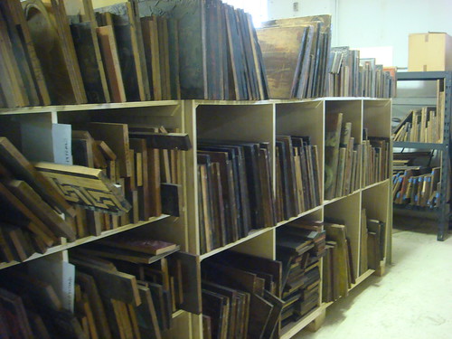
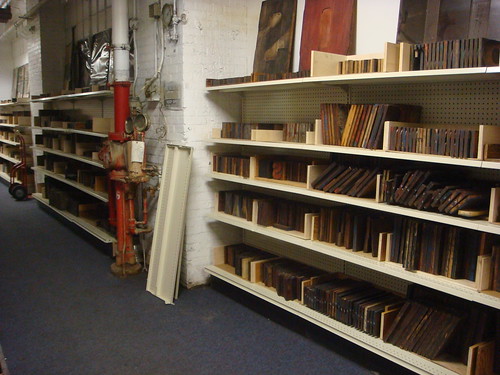
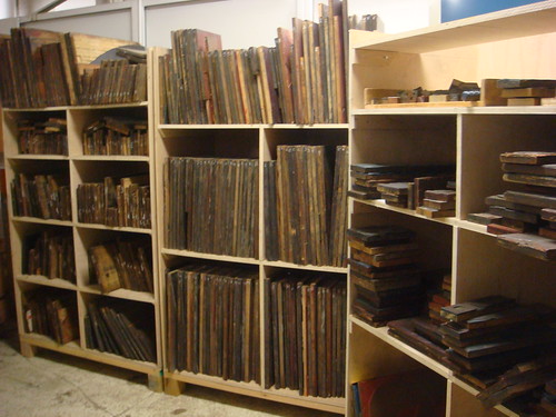
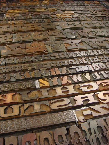
Another big change since I was last at the museum was the amount of work that has gone in to unpacking and organizing the enormous amount of wood type and illustration cuts that came from the Globe Printing Company in Chicago. Hundereds (if not thousands) of feet of shelving are now filled with literally tons of mostly wood printing material — much of the work having been done over the winter with help from some University of Wisconsin-Stout students. While most all of the type from the Globe stuff consists of fairly typical sans-serif grotesques, there are some faces that stand out due to their sheer scale: some cut as large as 26″ and taller. Generally speaking though, the illustrations are really the highlight in this collection (I wish I had taken more photos of them).
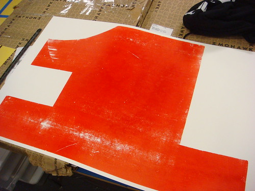
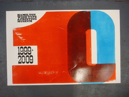
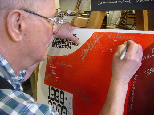
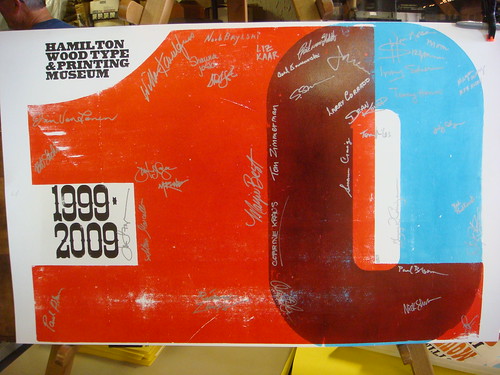
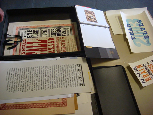
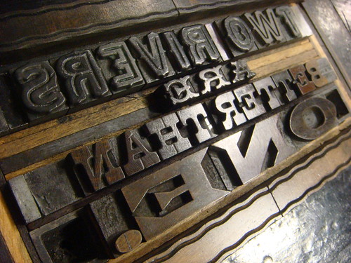
Using some of the huge type from the Globe collection, I printed a poster before the weekend’s anniversary events took place, to both greet visitors and act as a commemorative poster to be signed by all those in attendance.
Norb Brylski
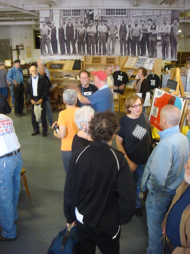
The first day of events (Friday) was a nice experience of meeting and greeting, with some great letterpress show and tell.
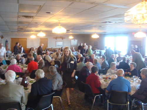
That night there was a dinner event at the nearby Lighthouse Inn, on Lake Michigan.
During the dinner, Irving Silverman — the “grandfather” of the museum — gave a charming talk about his history with wood type collecting, how he helped start the Hamilton Wood Type Museum’s collection, and his new book, A Trilogy: Three Hearts… One Soul (you can see his talk in the video below).
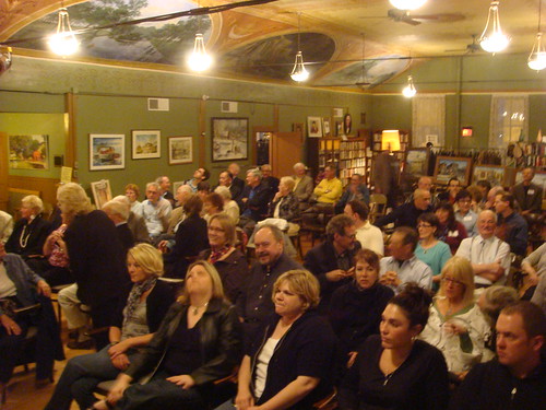
Following the dinner, filmmaker Justine Nagan and a crew from Kartemquin Films presented a screening of their forthcoming documentary about the museum, titled Typeface, across the street from the museum at the historical Washington House. I must say it was interesting to see some residents of small-town Two Rivers watch what is, at least in some ways, an outside interpretation of their community. There was some interesting discussion afterwords to that effect, with some of the most poignant commentary coming from the locals in the audience.
After the film, a crowd of the younger folks made their way over to the local bar for darts and drinks. No photos from that (sorry).
The next day (Saturday) involved an open house at the museum and the opening of an exhibition of posters designed and printed by artists around the country to commemorate the museum’s anniversary (including one from myself, shown previously here). I neglected to make any quality documentation of the poster show, but luckily a visitor with more foresight (Moongirl Productions!) has posted a nice accounting of the featured work on Flickr (see slideshow below).
There was some more hangout / show and tell / other general nerding out about wood type.
Greg Ruffa, Stan Harris, and David Greer crit some prints
Norb Brylski
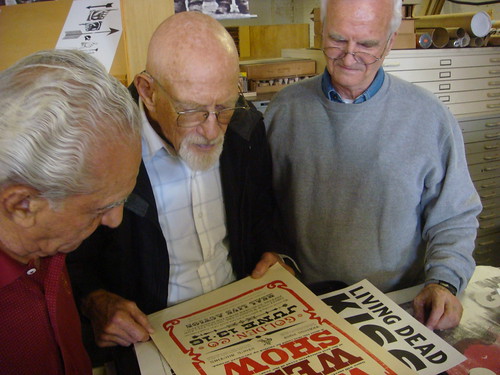
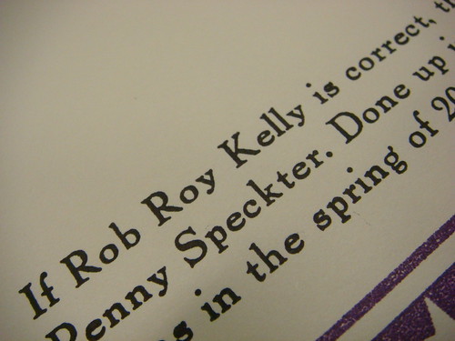
This included a little group detective work on a super-rare wood type at the museum cut by hand in 1828 (perhaps earlier) by Darius Wells, and specifically mentioned by Rob Roy Kelly on page 51 of American Wood Type (more on this face in a future post).
The museum had an amazing lockup on display, originally composed by the Hamilton manufacturing company for the 1893 Columbian World Exposition in Chicago. This display has a great story which I’m hoping to go into at more length in a future post.
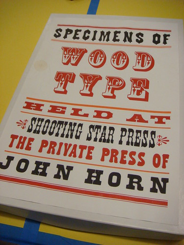
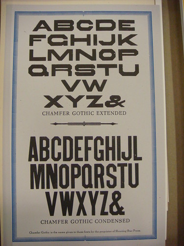
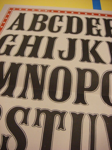
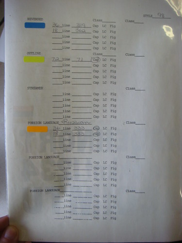
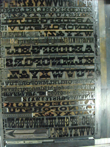
I perused a collection of specimens that was gifted to the museum from the Shooting Star Press. This is a great collection of specimens because, other than beautifully showing the typefaces as complete alphabets, it has notes about each face — some with corrections to information given by Rob Roy Kelly. I’d like to do a more detailed post on this collection of specimens, but it will be tough to do so without actually having the prints in front of me.
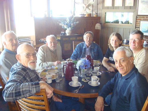
That day, Scott Thomas from Chicago’s Post Family design collective photographed a group of some of the great people who made a trip to Two Rivers for the anniversary (you can see all of Scott’s photos from the weekend on his MobileMe photo gallery).
Group photo courtesy of Scott Thomas
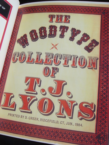
Later on there was some more type nerdery in the lobby of the Lighthouse Inn — this time over a copy of the book about type collector TJ Lyons I brought, written by my former teacher, Al Gowan.
Rick Von Holdt and Irving Silverman discuss TJ Lyons
The next morning, I met up with the wood type collector crew for some breakfast before seeing them off. This was pretty much the highlight of that weekend, if not the entire trip. Hanging out with people more than twice your age (in some cases more than three times your age!) that are as excited as you are about some obscure topic is an odd but great experience. As you might guess, the supply of great stories is never-ending. I can’t say how glad I am to have met all these guys and been able to chew the leather with them, both as colleagues and friends, despite our blaringly obvious age differences.
Clockwise from bottom left: Stan Harris, David Greer, Irving Silverman, Allen Stump, Nick Sherman, Rick Von Holdt, Greg Ruffa
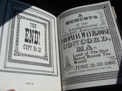
Before he left, David Greer showed me a reduced-scale facsimile of a portfolio of specimens he had printed in 1984 (when I was 1 year old), an original copy of which I had coincidentally photographed just a few weeks before. The specimens show type from the TJ Lyons wood type collection, now in David’s possession. Again, like many of the other things I’ve mentioned in this post, this collection of type and specimen book will probably be getting posts of their own here in the future.
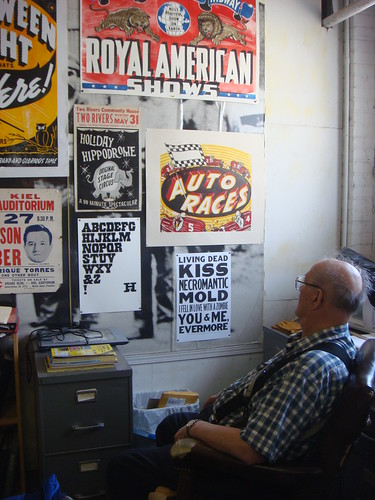
After most of the anniversary-goers had left, I stayed around for the rest of the week to do some work at the museum. One of the great things about Hamilton is that every little corner of the place has little gems just waiting to be explored (and in some cases discovered at all!). A perfect example of such an item is this internal Hamilton reference book I stumbled upon from 1985, with production information about all the faces they produced at the time.
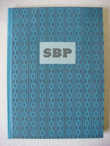
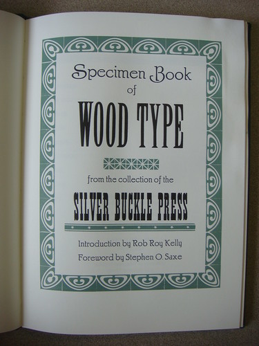
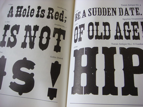
Another perfect example: a specimen book of wood type from the Silver Buckle Press, employing some great sample phrases, with an amazingly interesting forward by Rob Roy Kelly (more on that in the future).
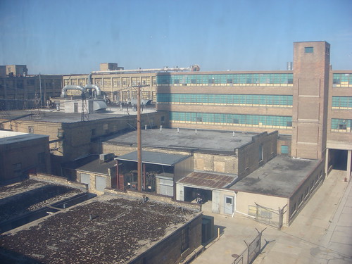
On the way to lunch with Jim Moran and Greg Corrigan that day, I walked past the old building under renovations that used to house Hamilton manufacturing company’s type production shop. I’m not sure what’s going to go in there now.
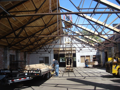
Later, Jim gave me a full tour of the rest of the warehouse that the Hamilton museum is in (most of which is now vacant).
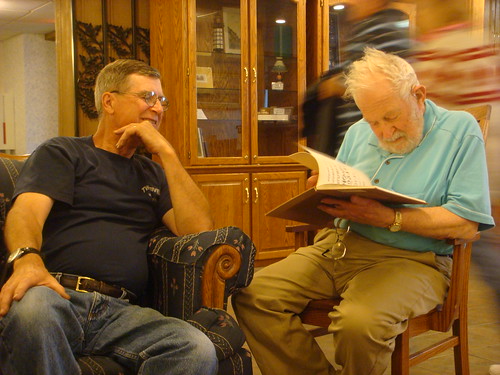
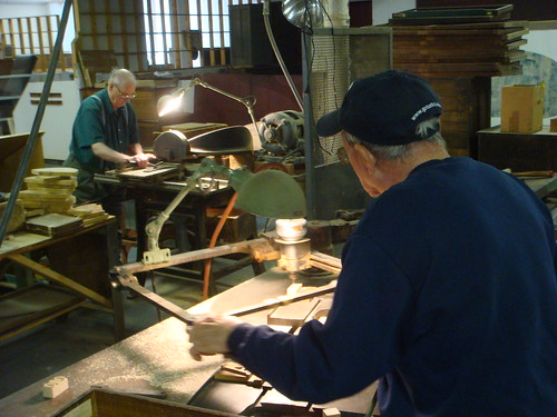
Over the next few days, I did a lot more hands-on work, including learning the finer points of how to operate a pantograph router, and generally produce wood type, from Norb Brylski and Lloyd Dickenshied (both former employees of the Hamilton manufacturing company who now volunteer at the museum).
Norb Brylski and Lloyd Dickenshied cutting new wood type
I didn’t take any photos of the effort, but I also spent some time helping move something like 1,000 linear feet worth of new shelving to the museum from the recently-closed Evans department store up the street. I believe the shelving will be used in a similarly beneficial way to that used to store the Globe collection.
Back to some more print-related activities, I set up a punny postcard for visitors to Two Rivers.
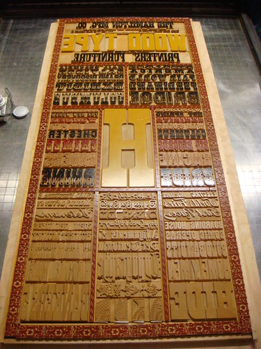
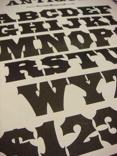
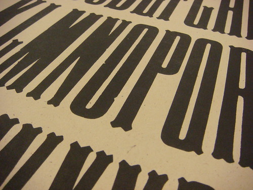
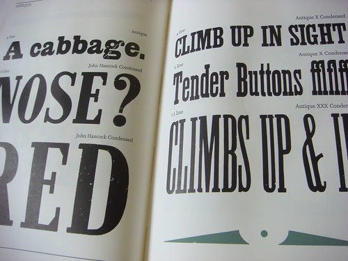
However, I spent most of my remaining time at the museum setting up and printing a giant specimen poster. The poster is 26″ × 40″, and shows 10 full alphabets, with accompanying punctuation, of type from Hamilton’s Gram-Lee collection (more on that collection in the future). I did my best to print the type as cleanly as possible, giving a lot of thought and effort to makeready, etc. Given the number of sorts from different fonts of varying condition, and the generally large scale of the forme, this ended up taking quite a bit of time, and kept me working late into the night for at least three days before I was able to pull even a few prints that I thought were acceptable. The museum will be selling some of these prints (there are only a few) to help raise some money.
There’s something about working in a big empty museum in the middle of the night that is especially calming and conducive to productivity. I’m glad to have had the chance to do so at Hamilton.
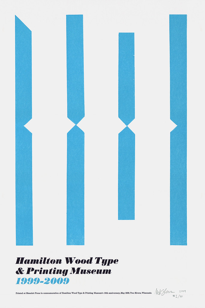
12″ × 18″ poster printed to commemorate the Hamilton Wood Type & Printing Museum's 10-year anniversary.
On the weekend of May 29, the Hamilton Wood Type & Printing Museum in Two Rivers, Wisconsin, is hosting a series of events celebrating their 10-year anniversary. The celebrations include a preview screening of Typeface (the upcoming documentary on the museum), an open house at the museum, a commemorative poster show, and more.
Hamilton asked me to contribute a limited edition of prints for the poster show, and I was honored to oblige. The result is shown above.
I’ll be going out to Two Rivers a week before the show to do some work at the museum, and will probably stick around a bit afterwords too.
For more info, check out Hamilton’s official Events page.