Daily Drop Cap and other versals
Illustrator, lettering artist, and designer Jessica Hische (also the designer behind the recent Buttermilk typeface) just launched a new website project called The Daily Drop Cap, where she aims to post a new decorative initial — or versal — every day. She’s also generously offering them for usage under a Creative Commons license, ” for the beautification of blog posts everywhere”.
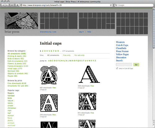
If Jessica’s servings aren’t enough for you, the Briar Press letterpress community website hosts a large collection of digitized initial caps, almost all available for free download.
Historically, some of the earliest decorated letters were large woodcut initials; their use in early printing lead to the first complete ornamented typefaces and, eventually, the entire field of display typography. I won’t get in to the specifics of versal history and terminology (e.g. illuminated manuscripts, historiated initials, inhabited initials, initiums, lettrine, rubrication, drop caps, elevated caps, etc, etc, etc), or how they evolved toward the first decorated typefaces. For those details, see the first chapter of Rob Roy Kelly’s American Wood Type: 1828–1900, the related pages in Robert Bringhurst’s The Elements of Typographic Style, or, for a breezer course, the Wikipedia page on initials.
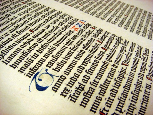
What I will share here is an interesting example of initials that I encountered recently: Last week I had the pleasure of experiencing a page from the Gutenberg Bible first-hand (in the private library of David Rose). As you can see in the photo I took (below), empty spaces were built in to the bible’s printed typography that could later be filled with hand-scribed initials.
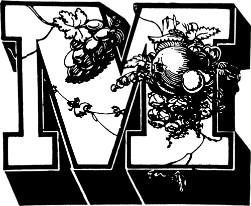
Skipping ahead several hundreds of years to a completely different set of stylistic norms, I figured I would also share an example of a typeface that seems like it’s just asking for the job of the proverbial “ten-gallon hat” [see Bringhurst, §4.1.4] — ornately marking the beginning of text blocks.

1838 showing of Wood & Sharwoods' "Ornamented No. 1" in 16-line size, as reproduced in Rob Roy Kelly's "American Wood Type: 1828–1900".


