
The Princeton Architectural Press recently published a book about the 19th-century ornamental design phenomenon of “artistic printing”. In the spirit of typical Victorian excess, the book’s full title is appropriately verbose: The Handy Book of Artistic Printing: A Collection of Letterpress Examples with Specimens of Type, Ornament, Corner Fills, Borders, Twisters, Wrinklers, and other Freaks of Fancy.
The book was authored by Doug Clouse and Angela Voulangas — both designers in New York City who met as fellow employees “within the venerable halls of The New York Public Library on Fifth Avenue, New York City”. Doug Clouse is also the author of Mackellar, Smiths & Jordan: Typographic Tastemakers of the Late Nineteenth Century, published last year by Oak Knoll Press.
More info can be found on the book’s official site; I also highly recommend subscribing to the new Artistic Printing blog, maintained by Clouse and Voulangas, dealing with related topics. Voulangas also publishes the Parenthetically blog, with notes on art, ornament, ephemera, etc.
I’ve ordered a copy of the book for myself but have yet to receive it, so a detailed personal review here will have to wait for sometime in the future. In the meantime, you can check out some of the promising sample pages made available via Issuu:

For most of June, coinciding with the Story of London Festival, the St Bride Printing Library in London will host Breathing Broadsheets, an exhibition of some of the 19th-century broadside prints from the Library’s collection. Given the both the topic and the host, there are bound to be some prime examples of material printed using large and/or wood type.
The exhibition is tied in with a “promenade” performance titled Broadsheet Ballads created by the Occam’s Razor Theatre Company. I have no idea exactly what a 30-minute long walking play about broadside prints would be like, but it sounds… interesting. As I won’t be able to attend any of the events, I’d be curious to hear from anyone who does have a chance to go.
The Story of London website gives a bit more insight into the exhibition and performance:
A grant of £9,200 has gone to the St Bride Foundation which aims to serve the educational, social and cultural needs of Fleet Street and the surrounding areas. The project focuses on the St Bride Library’s collection of 19th Century Broadsheets. Some 30 young people will research the broadsheet collection, record their thoughts, write contemporary broadsheets and dramatise their findings. The results will feed into a piece of promenade theatre Broadsheet Ballads created by Occam’s Razor Theatre Company. An educational pack will be created in conjunction with the project to promote the use of St Bride Library’s collections and heritage materials to inspire learning in history, literacy and the arts. A small exhibition which will feature broadsheets, historical pictures of the local area, and information on the history of Fleet Street will also be produced. Histories of local inhabitants, Fleet Street and St Bride Church during the late 19th century will all be explored through this project.
When: June 6–July 3, 2009
Where: St Bride Library; 14 Bride Lane, London [map]
Admission: Free; call ahead to check availability
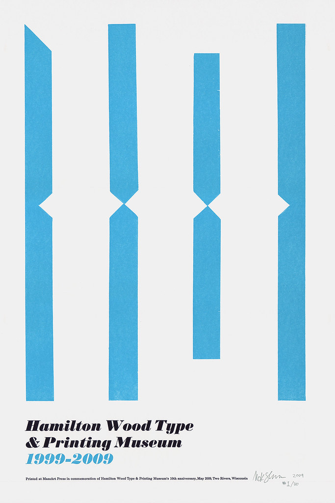
12″ × 18″ poster printed to commemorate the Hamilton Wood Type & Printing Museum's 10-year anniversary.
On the weekend of May 29, the Hamilton Wood Type & Printing Museum in Two Rivers, Wisconsin, is hosting a series of events celebrating their 10-year anniversary. The celebrations include a preview screening of Typeface (the upcoming documentary on the museum), an open house at the museum, a commemorative poster show, and more.
Hamilton asked me to contribute a limited edition of prints for the poster show, and I was honored to oblige. The result is shown above.
I’ll be going out to Two Rivers a week before the show to do some work at the museum, and will probably stick around a bit afterwords too.
For more info, check out Hamilton’s official Events page.
Prolific design author Steven Heller recently interviewed Bill Moran – a letterpress printer, typography teacher, and co-author of Hamilton Wood Type: A History in Headlines – about the Hamilton Wood Type & Printing Museum for Voice, the AIGA Journal of Design.
In 2004 Bill’s studio, Blinc Publishing, worked with type designer Chank Diesel to publish the BlincType Letterpress Fontpak, a set of fonts inspired by wood type from the Hamilton Museum. The most interesting of these (I think) is an experimental typeface design called Hamilton Offset which translates an interesting print effect called “ghosting”.

From Chank’s description of the project:
While working on a poster project, Bill Moran accidentally offset some reject proofs and came up with an effect that could only come from this strange brew of raw materials of the printing and typesetting crafts. Bill translated the ghosted type from press proof into a digital format. He then converted the digital type to a new wood-carved alphabet. Working on equipment used by his grandfather, he respectfully created a worthy addition to Hamilton’s lineage.
Also see the information on the Blinc site about the project.

Portrait of Rob Roy Kelly (from the back flap of “American Wood Type: 1828–1900”, 1969 Van Nostrand Reinhold hardcover edition).
If I had to accredit any one person for inspiring me to begin a journal with such an arcane focus as “large and ornamented type and related matters”, it would be Rob Roy Kelly.
I never had the pleasure of meeting Mr Kelly before his passing in 2004, but his 1969 book American Wood Type: 1828–1900 influenced my initial interest in the topic more than anything else. The book is by far the most definitive source of information on wood type, and I find it hard to imagine anyone else surpassing Kelly’s level of dedication to such research.
Beyond his research and writing on wood type, Kelly is known for his role as a graphic design educator, among many other things. My goal here is not to write his biography though; I am by no means an authority on his life’s work. I only wish to acknowledge his influence on my own interests and endeavors. With that in mind, I’m dedicating this new journal to Rob Roy Kelly.
I’ll be using this platform to record thoughts and observations – both of my own and of others – on topics such as wood type, large-scale lettering, decorative typefounding, sign painting, penmanship, poster printing, engraving, etc. While these subjects are decidedly historic in nature and often lead to research-based projects, part of my goal in beginning this journal is to also frame these things in a contemporary context. The proverbial dust covering traditional graphic arts is being cleared away more and more by changes in technology and how people adapt and reinterpret obsolete design paradigms. As such, it only seems appropriate that this new journal is being published digitally.
Achieving anything even close to the work of Rob Roy Kelly is far beyond my goals; but to honor his memory I will attempt, in my own way, to at least begin to pick up where he left off.
