Bethany Heck and End Grain
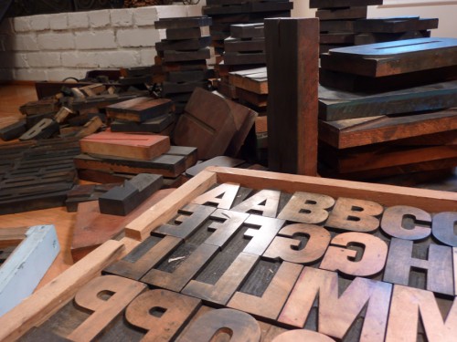
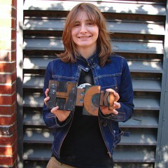
Bethany Heck is a student currently in her senior year in the Graphic Design program at Auburn University in Alabama. She has been collecting wood type since her freshman year there — a fact that seems to make sense considering her design pedigree (her father teaches graphic design). To date, she estimates her collection at about 600 wood type blocks — some as part of complete fonts and some as miscellaneous sorts.
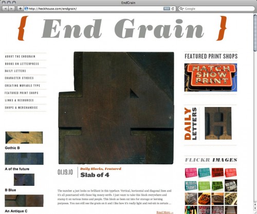
End Grain is Bethany’s new website which showcases her collection, as well as other letterpress-related content. She describes its inception thus…
The End Grain was born out of my desire to have some sort of letterpress website […] I was frustrated by the lack of sites dedicated to letterpress and I wanted a place I could go and just get lots of great examples of letterpressed works and hear from others who shared my passion for wood type.
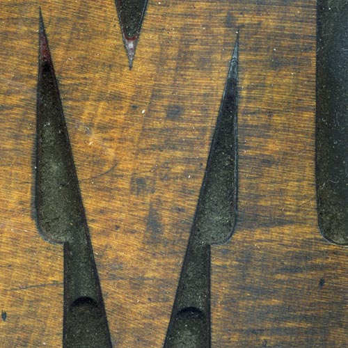
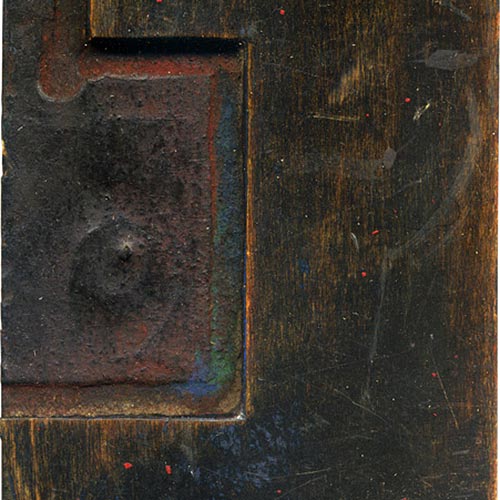
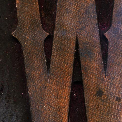
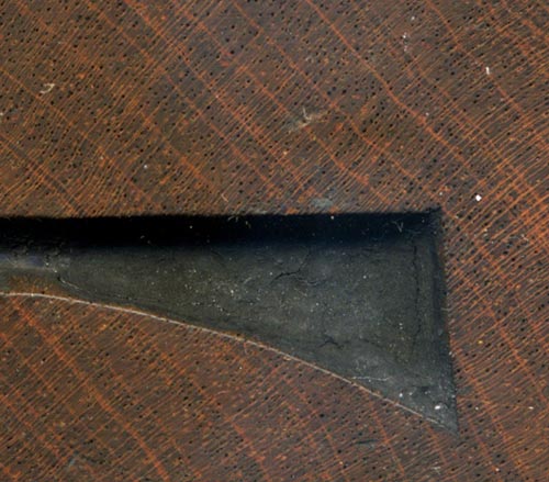
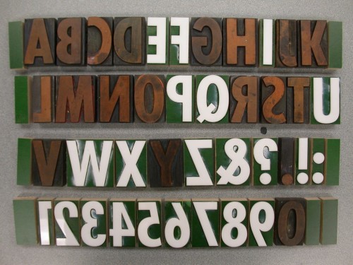
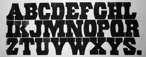
I have been advising Bethany with some of her work on the site so far, which includes several distinct features. First, the Daily Letters and Character Studies series of posts highlight Bethany’s growing collection of type, piece by piece. She provides historical details about the typefaces and manufacturers, but the most prominent and interesting aspect of the write-ups is her attention to the details of each particular block as its own unique object. Her reflections on specific scratch marks, manufacturing irregularities, specks of dried ink, etc often border on archaeological examinations. The posts are appropriately accompanied by high-resolution scans to show all the details.
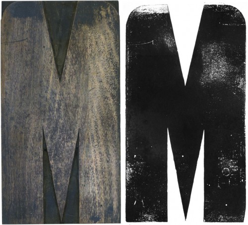
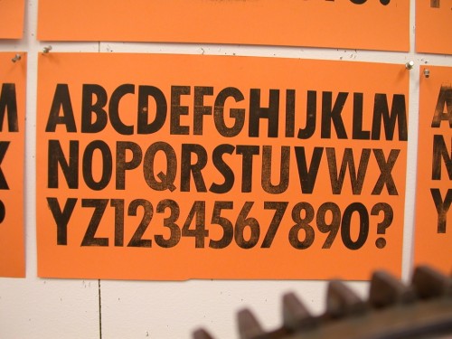
Some blocks are also presented side-by-side with their prints for comparison. The prints aren’t necessarily the cleanest proofs possible, but this is partially forgivable considering the limitations of Bethany’s on-press experience so far.
Beyond showing Bethany’s type collection, the site functions as a resource for others interested in letterpress printing, with growing reference info on print shops, websites, retail stores, etc. Relevant content is also aggregated from sites like Flickr, Etsy, eBay, and Twitter.
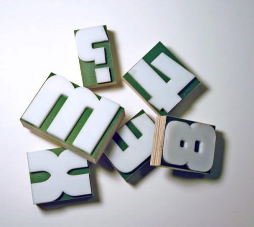
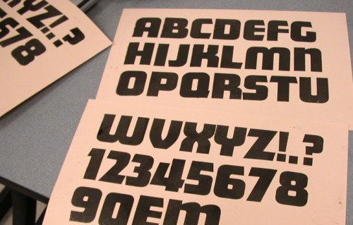
Another element of interest on End Grain is a series of posts documenting Bethany’s experiments with movable type production. The projects so far have ranged in scope from replacing missing characters in an incomplete font, to creating blocks of a digital typeface that hadn’t previously been available as movable type.
Up until now, all of the projects have been executed by affixing thin laser-cut plexiglass to a wooden base, emulating the veneer type production process.
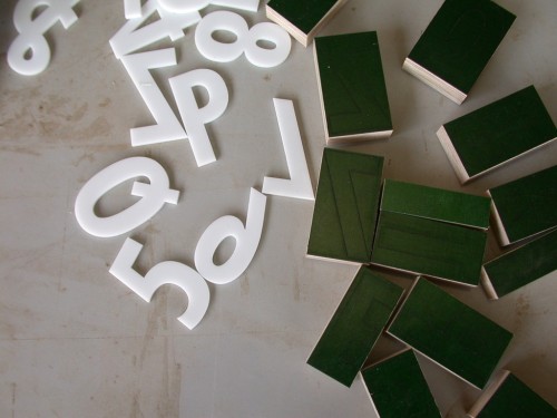
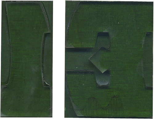
Plexiglass veneer cuts and wooden base blocks for a set of Futura Condensed printing type. Note the guidelines inscribed on the base blocks to assist in aligninment when affixing the veneer cuts.
These projects on their own are enough to warrant recognition, but the fact that they’re all done by the same student and presented the way they are makes them that much more notable. Furthermore, knowing that Bethany’s printing experience has been relatively limited, it’s impressive that she’s enthusiastic enough to initiate her own projects. This comes as no surprise though, knowing her strong personality and enthusiasm. It’ll be interesting to see what other things she does in the future and beyond graduation.

