July, 2009
Any fan of lettering will enjoy The Movie Title Stills Collection, curated by designer Christian Annyas. Specifically relevant to the focus of wood type though is the page there featuring title screens from Western films.
The relationship between wood type styles and the modern interpretation of the “Wild West” is an interesting one, deserving of more elaboration than I’ll provide now. Suffice to say that the connection has provided a reliable device for designers attempting to evoke that particular chapter of North American history.
To be accurate, many of the examples from The Movie Title Stills Collection were hand-painted, but even among those it’s easy to see the influences of wood type with the use of styles like tuscan, latin, various slab serifs, etc, with allusions to typographic devices like catchwords, streamers, and generally intense letter decoration.


See more examples at The Movie Title Stills Collection.

I recently came across the Star-cooked blog by Johanna Knox, where she discussed her realization that she prefers lead type over wood:
I was talking to another woman about how using wood type feels very different from using lead type. Without thinking why it was so, I told her I was enjoying working with the lead type a lot more. She said she was the opposite; she was naturally attracted to working with wood type — and loved its comparative warmth and smoothness.
After the course was over, I wondered more about why I had fallen in love with working with lead type (because that’s how it did feel), and why for days afterwards all I wanted to do was hop back into that studio and get my fingers into those lead type cases again.
She goes on to relate her love for metal to her past experiences in life with metalworking and jewellry making.
Knox’s ponderings, as well as Alan Brignull’s related inquiry of “what gives woodletter its continuing mystique”, got me thinking about how my personal experiences with wood might have led to my interest in wood type. When I was growing up, my father built and restored classic wooden sailboats. At our house, we had a boat shed and woodworking shop on the property, and I was constantly working on my own wood projects — tree houses, toy swords, skateboard decks, etc. As a teenager, my friends and I built a fairly massive wooden half-pipe in my back yard, and I have since been involved in the construction of countless other such skateboard ramps.
But is the connection to my later interest in wood type just a romantic notion? I have similar experiences that might just as easily counter my current preference. For example, some of my childhood experiences with metal are more relevant to type production than anything mentioned above: I vividly remember casting lead paperweights of my handprint in molding sand while my father cast blocks of sailboat ballast.
Thinking more on the topic, I don’t fit the profile of the typical 21st-century wood type enthusiast at all: unlike the wood type protagonist in Johanna Knox’s story above, the “warmth” and “smoothness” now associated with the medium don’t have much to do with my specific interest in it. On the contrary, I am more drawn to type — wood or otherwise — with crisp, hard, and sharp edges. If I exhibit any of the “post-industrial treen fetish” alluded to by Brignull it is only coincidental. I don’t hold any particular affection for the rough “distressed” design aesthetic. I generally aim to eliminate the imperfections inherent in wood type from my printing. I don’t embrace the “debossed” effect achieved by excessive impression of type into paper… Most of the modern stylistic stereotypes (no pun intended) of wood type don’t excite me much; and, to be totally honest, I even see the underlying design of many typefaces developed for production in wood as downright grotesque (again, no pun intended) — like 19th-century equivalents of the “grunge” typefaces from the 1990s, when advances in technology seemed to encourage people to design the most garish typefaces they could.
So what is it about wood type that intrigues me? First of all: the extreme scale. For whatever reason, I am drawn to large graphic forms. Visual figure-ground interaction, subtlety of contour, and solid, broad, flat shapes all become so potent with increases in scale. Despite the comparison with digital grunge fonts above, even the most naïve or gimmicky wood typefaces can be oddly hypnotizing in their boldness. There is something about the hyper-graphic, ornate, and novel letterforms common in wood type that I can only describe as fascinating.
Another major factor in my love for the topic is the history involved. Wood type is one of relatively few graphic arts phenomena identified as being specifically American in nature. It wasn’t invented here, and it certainly existed elsewhere, but — like so many other industries — it was in 19th-century USA that the wood type industry really came into its own. As an American, this is something that I can identify with, and perhaps even hold a sense of heritage for. Learning the obscure stories of no-nonsense wood type industrialist entrepreneurs (often with giant mustaches) is a perfect window into the larger view of the USA as it grew after the Industrial Revolution and came to be the culture in which I now reside.
Additionally, on a topic related to scale, wood type is a great tool for teaching. Its blunt tactility makes it much easier to convey ideas about typography and letterpress printing to students. The increased margin for error inherent in its large size and flexibility make it ideal for use by beginning printers. Similarly, due to its relative simplicity, wood type has a lower technical threshold than metal type as far as production. In more ways than one, it is easier for someone interested in making their own type to do so with wood at a large scale (as I did with my Intercut project) than it would be to master the intricacies of casting with molten metal at smaller sizes. As such, it presents more room for adaptation and experimentation.
With all that said, I do believe my interest in wood type has something to do with my personal upbringing, but it’s much more complicated than that and probably involves a whole slew of other factors I haven’t considered yet. Please also note that I have nothing against metal type, and am just as happy to nerd out about it when given the chance.

A remarkable new website for the Rob Roy Kelly American Wood Type Collection has just been launched, built on research and work by David Shields.
First, an abbreviated history of the collection: Rob Roy Kelly, throughout his many years of dedication to the study of wood type, amassed an invaluable collection of wood printing material. In 1966, when Kelly could no longer maintain his massive collection, it was sold to the head librarian of the Museum of Modern Art in New York. Later that year it was again sold to the University of Texas at Austin, where it now remains (for the full story, see the official history). David Shields, who is currently the main caretaker of the RRK collection, has spent considerable amounts of time researching the history of the wood type industry in America, focusing specifically on information related to the collection.
David summed up the newly launched site to me via e-mail as “a history of the collection, a list of Kelly’s publications, as well as a portfolio of specimen pages for all of the types in the collection with updated history of each of the types cross-referenced with all manufacturer names and final Hamilton production numbers” … In other words, this resource presents the kind of information that type historians wish existed for every type collection.
Those that are interested can browse the site themselves, but I figured I’d point out some of the more notable elements here…

The specimen pages with detailed, updated, and cross-referenced information about each typeface present a vast improvement in the quality of collected information about any of the often-elusive histories of these designs than has ever been available before in one place. This is no doubt one of the largest aspects of David’s research so far.

Two industry-wide timelines are also invaluable resources: one summarizing the history of American wood type manufacturers, and another exhaustive listing of wood type specimen catalog publications. The manufacturers timeline is available in an interactive web-based format, and the catalog listing is presented in a standard text list (complete with bibliography), but the most informative presentation of both sets of information is as printable, high-resolution timelines, both included in a PDF document.
Given the obscurity of so much of the history of wood type, there is surely the possibility of information missing from both timelines (if you know of anything, I’m sure David would love to hear about it), but I can’t express how remarkable it is to see a collection of information like this with such a broad contextual scope. It’s the only presentation to date showing such succinct snapshots of the entire industry.

Another element of the site worth noting is the section discussing various methods of wood type production. The descriptions and comparisons of end-cut, die-cut, and veneer type don’t go into too much detail about the technical processes involved, but they do present a considerable amount of the history associated with each method.
Finally: One of, if not, the most notable aspects of this resource, is the fact that it was published digitally, online, and made freely available for all to access. Research materials and information are so often limited by physical location and various administrative access restrictions. There are certainly good reasons for this — indeed, certain parts of the RRK collection will probably never be available online — but I think that by making a substantial chunk of his research so accessible, David can only inform a larger number of people, and perhaps, in turn, inspire them to address things he hasn’t yet been able to.
When founding Woodtyper, I dedicated the journal to Rob Roy Kelly with the stated mission of “attempt[ing], in my own way, to at least begin to pick up where he left off”. However, if any one person in the world could be named as the upholder of Rob Roy Kelly’s legacy right now, it would undoubtedly be David Shields.

Attendees of this year’s TypeCon at the Grand Hyatt in Atlanta next week will have a chance to attend a few wood type related events.
First, on July 15 from 7:00 to 10:00 PM, the new Typeface documentary about the Hamilton Wood Type & Printing Museum — which I posted about yesterday — will have its Atlanta premiere event. After a screening of the film, “a discussion with luminaries follows: Typeface director Justine Nagan; James Moran, Printer/Archivist at the Hamilton; educator David Shields, an expert in the wood type collection housed at UT Austin; Nick Sherman of MyFonts, a graphic designer specializing in experimental letterpress techniques [that’s me!]; and type designer, historian, and sign painter John Downer, designer of several popular Emigre typefaces evoking the feel of wood type”.
The screening and premiere are open to the public, and free for conference attendees. Non-TypeCon attendees can purchase tickets through the AIGA Atlanta chapter.
On July 16, Jim Sherraden from Hatch Show Print officially opens the conference with a keynote presentation about the historic print shop in Nashville, Tennessee, which I’m venturing to guess is currently the number one user of wood type in the world. For those interested in some hands-on experience, Jim will also be running the Hand Printing With Hatch Show workshop earlier that day (9:00 AM to 5:30 PM, cost: $100) at the Atlanta Portfolio Center, where attendees will have the chance to print from some of Hatch’s wood type and illustration blocks.
Later in the conference, on July 19 from 5:45 to 6:30 PM, Craig Malmrose and Gunnar Swanson from East Carolina University in Greenville, North Carolina, will give a presentation about their experiences with making wood type. I’m especially looking forward to this presentation, as I’ve also had some experience / experiments with wood type production. I’ve e-mailed with Malmrose (who also runs the Trade Union Press) in the past and we’re tentatively planning to publish some details about his work here on Woodtyper in the future.
Wood type events aside, TypeCon is obviously a great event for anyone interested in such stuff. I’ve attended every year for the past four years and always have a great time nerding out with other like-minded folks.
For more information, visit the official TypeCon site.
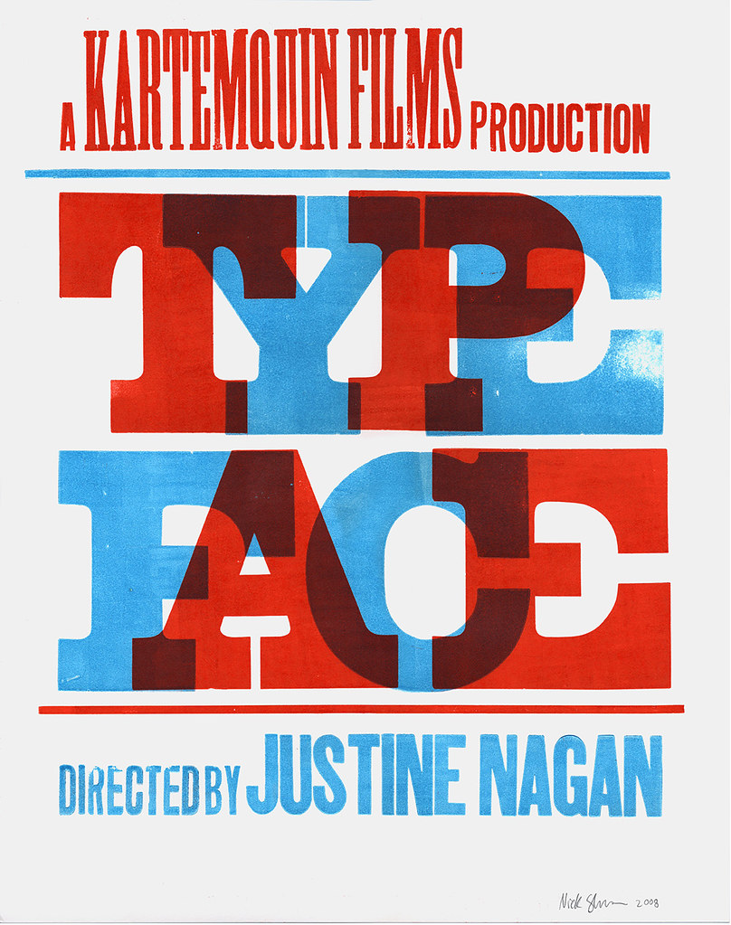
Director Justine Nagan is now putting the finishing touches on Typeface, a feature-length documentary film about the Hamilton Wood Type & Printing Museum. The film is a production of Chicago-based Kartemquin FIlms (of Hoop Dreams fame).
I designed and printed a poster last year (pictured above) to promote the film and help raise money for the production; I’ve also done some advising on rough edits of the film. Justine and the team working on the documentary are dedicated and skilled filmmakers (not to mention great all-around people), and the edits I’ve seen so far are very promising. After having spent much time at Hamilton, I anxiously look forward to a broader public release to help spread the word about the museum.
To get info about when and where to see the film (including a screening next week in Atlanta!), buy limited-edition posters, read news updates and info on the project, and more, see the official Typeface site.

