Entries filed under
Events
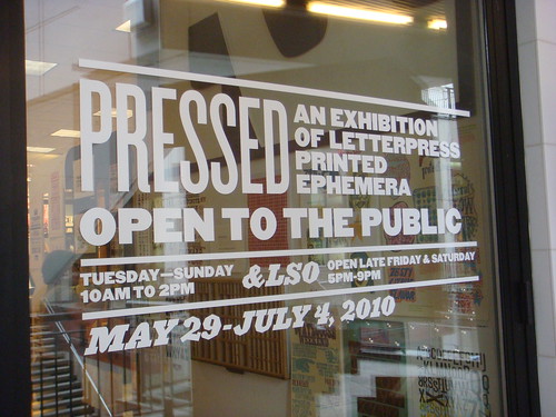
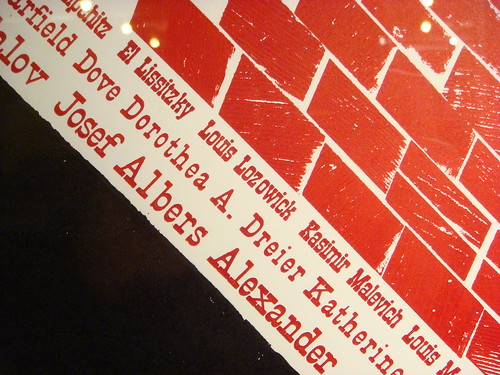
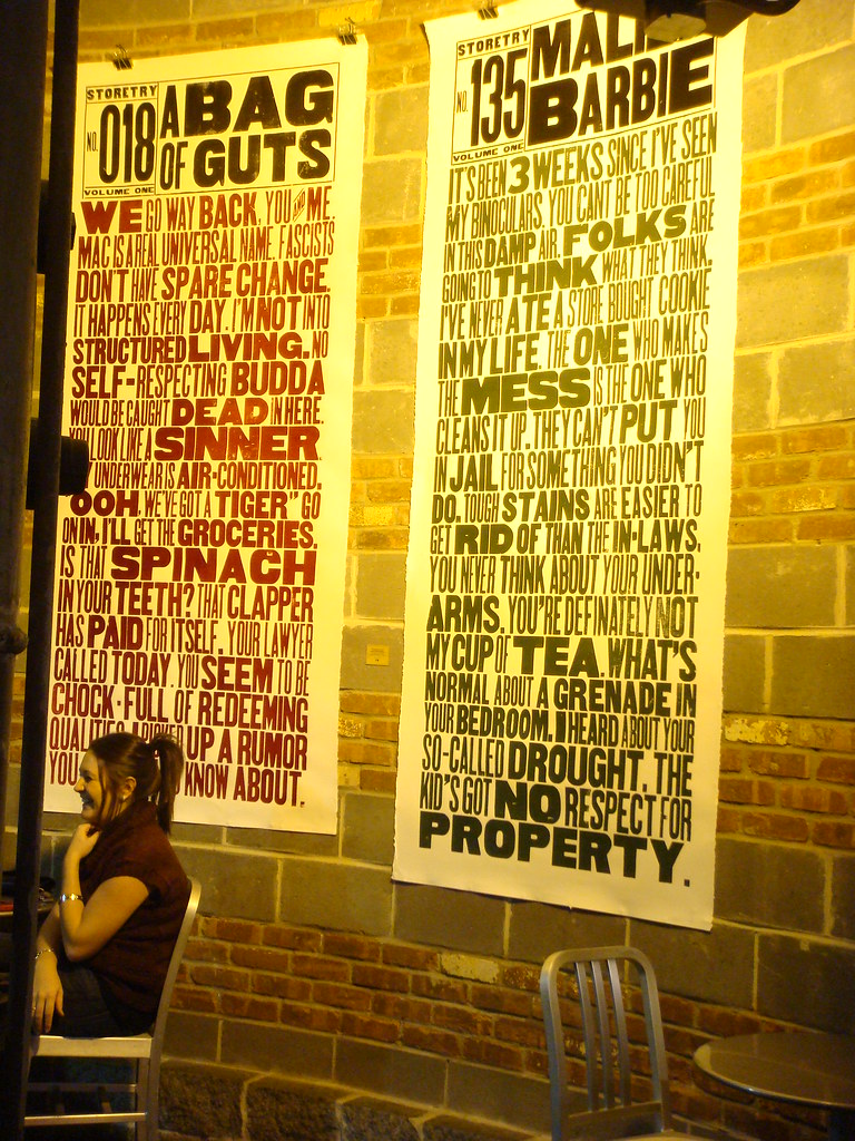
Denver, Colorado, has been a hotbed of activity related to typography and letterpress printing this month, with a series of type-centric events and exhibits. Designer and printer Rick Griffith of Matter has worked with the Design Council at the Denver Art Museum, AIGA Colorado, and Mohawk Paper, to organize Pressed, an exhibition of letterpress printed ephemera.
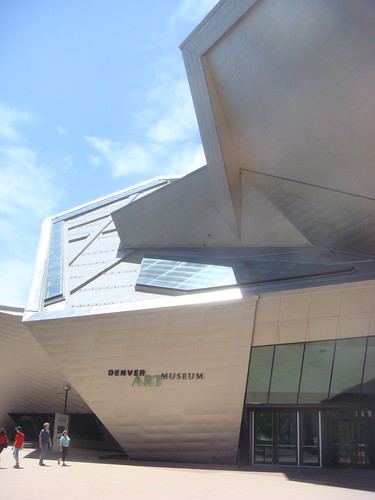
The Denver Art Museum's Frederic C. Hamilton building
To kick off the show, the Denver Art Museum hosted two events, including a night of printing demonstrations and a “letterpress typography symposium” with screenings of Jack Stauffacher, Printer about the San Francisco publisher Jack Stauffacher; and the recent Typeface documentary about the Hamilton Wood Type Museum.
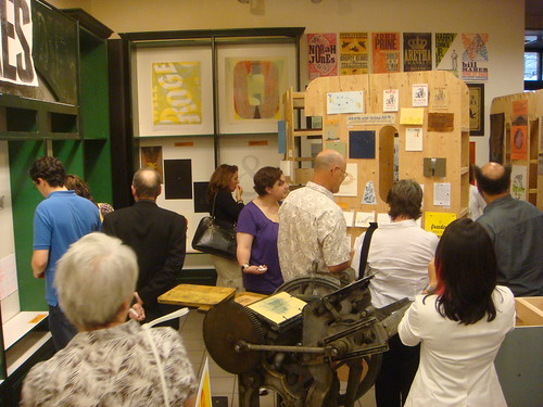
I was honored to speak after the screenings on a panel with Jim Sherraden & Brad Vetter from the much-loved Hatch Show Print, Denver’s resident letterpress guru, Tom Parson, and Rick Griffith as moderator. As you might imagine, the discussion covered a variety of typographic topics, but seemed to have an emphasis on the history and culture of letterpress as it relates to contemporary typeface design, design education, and poster printing.
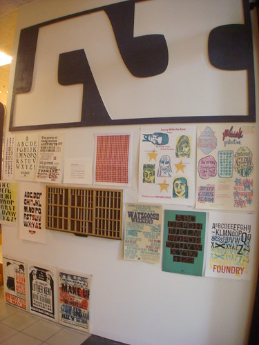
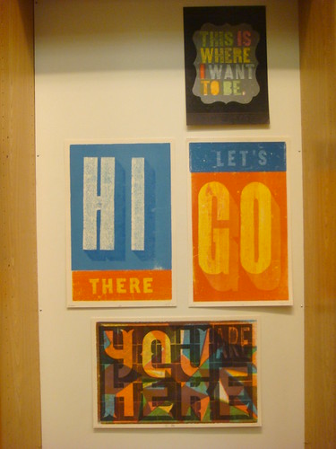
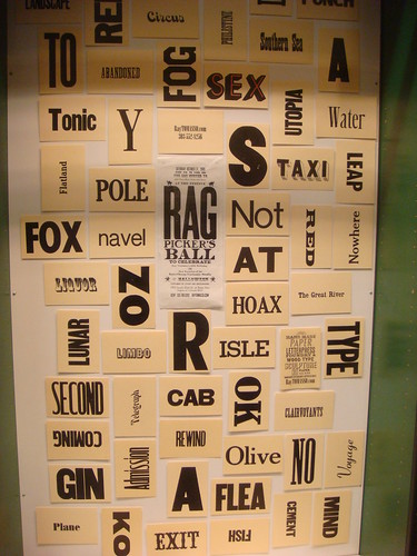
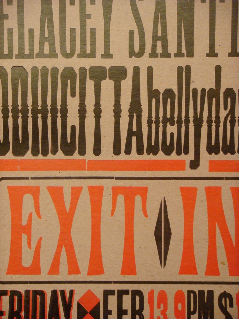
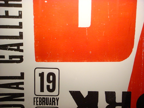
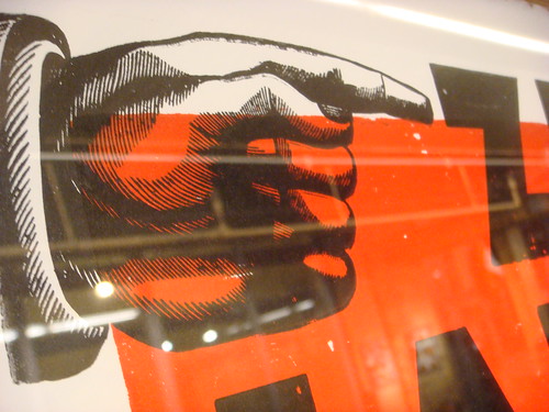
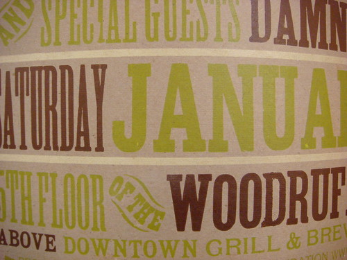
The highlight of the weekend was the opening of the Pressed exhibit and store in the Denver Pavillions. Rick and his team have collected a huge amount of contemporary letterpress work from all over the US and beyond, and presented it in an impressive gallery with giant 8-foot-tall wooden letters. Just about every inch of wall space is covered with colorful prints from Hatch Show Print, Amos Paul Kennedy Jr, the Hamilton 10th Anniversary Show, Yee-Haw Industries, and many, many, more artists/designers/printers.
The show will remain up in Denver through July 4th, after which it will continue on as a traveling show. A catalog is also being produced for the show. For more information and updates check DesignArtArtDesign, the Pressed project page on Kickstarter, and Matter on Twitter.


One week from today, the Type Directors Club in New York will host a lecture by Adrian Wilson about his collection of ephemeral lettering artifacts from the English textile trade of the 1800s and early 1900s. Wilson was kind enough to provide me with some sample images (below) and an interesting PDF describing the collection.
The topic of fabric merchant labels is an obscure one, but there seem to be many parallels with similarly intriguing fruit crate labels from roughly the same period. The text from the PDF gives some background on what Wilson will be discussing…
The 1842 Design and Copyright Act required that all pieces of cloth had to be clearly stamped of labeled with a “faceplate” that included the supplier’s identifying mark, and the cloth’s type and length.
Wilson’s collection — which he salvaged from cotton warehouses in Manchester, England — includes “over 2,000 hand-made wood and copper stamps used for printing the marks, around 4,000 unpublished printed stamp designs, and around 800 paper shippers’ tickets”. He was a guest on BBC’s Antiques Roadshow in 2005, but the collection has still yet to be shown publicly at any significant level.
Even after seeing all the background info and sample images, I’m still not 100% sure what to expect from the lecture. I am pretty confident, though, that it will include a lot of ornamented 19th-century lettering; and that’s enough for me.
What: TEXTile, a lecture about the typography of the 19th century textile trade
When: January 28, 2010; 6–8 PM
Where: Type Directors Club; 347 W 36th St, #603; New York, NY [map]
Cost: Free for TDC members; $20 for non-members; $15 for students
Registration: E-mail director@tdc.org or call 212-633-8943


19th century textile trade ephemera courtesy of Adrian Wilson

Hamilton Wayzgoose Weekend poster by Celene Aubry on Flickr
Next weekend, November 20–22, the Hamilton Wood Type & Printing Museum will be holding its first ever Wayzgoose Weekend, with an impressive line-up of guest speakers and events…
Matthew Carter will be introducing his first wood typeface, a chromatic latin-serif face called Carter Latin. The project has been in various states of development since at least 2003, but Hamilton has recently incorporated some digital technologies to solve issues of ink trapping and registration that had delayed previous tests done with less accurate pantograph routers.

Prototype font of Carter Latin, photographed in May 2009
Richard Kegler (founder of the P22 type foundry) will be sharing “his thoughts on the state of type” (according to the official program). In conversations I had with Richard recently, he said he’d probably also be talking a lot about the Western New York Book Arts Collaborative that he started in Buffalo, New York.

Designer Juliet Shen will also present a Lushootseed alphabet typeface she developed for the Tulalip Lushootseed Native American tribe in Washington state. Hamilton is cutting a new wood font of Juliet’s typeface to help give the “opportunity for this tribe to ‘manipulate’ their language by printing in their own font”. Last month, at the ATypI conference, Juliet presented some of the work she’s done on the typeface for the endangered language, but she didn’t go in to any details about the wood type project. I’ll be interested to see more info on that.

Prototype of a Lushootseed typeface designed by Juliet Shen for the Tulalip Tribes Lushootseed Department
Other than that, type designer Sumner Stone will join the presenters for a round-table discussion; a dinner party will take place at the Lighthouse Inn; the new Typeface documentary film about Hamilton will be screened; and several workshops and presentations using the museum’s amazing collection will be held by Richard Zauft (President of the Boston Society of Printers, Co-editor of Hamilton Wood Type: A History in Headlines, and Associate Vice President for Academic Affairs at Emerson College), Paul Brown (current Printer in Residence at Hamilton and Associate Dean of Art at Indiana University), and Jim Moran (Hamilton’s “Printer and Archivist” — though a more appropriate title would be something like “Director”, or “Guy-Who-Keeps-The-Place-Running”).
Finally, other than an open house, print swap, and general nerdery with fellow woodtypers like David Shields and Allen Stump (among other expected attendees), I am especially looking forward to some quality time with master type cutter, former type shop foreman, and unofficial Hamilton mascot, Norb Brylski.

Norb Brylski and the pantograph routers at the Hamilton Wood Type Museum
See the official program for a full schedule of the weekend’s events (also available as a PDF).
What: Hamilton Wood Type Museum’s first ever Wayzgoose Weekend
When: November 20–22, 2009
Where: Hamilton Wood Type & Printing Museum; 1619 Jefferson Street, Two Rivers, WI 54241 [map]
Cost: $75 ($91 with dinner)
Registration: Available online (or via the printable PDF registration form)
Accommodations: Available through the Lighthouse Inn, or try 1-Plus Rentals

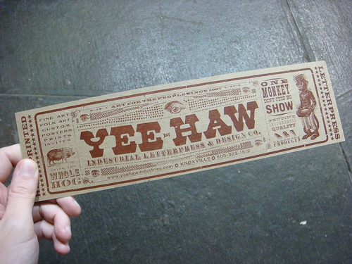
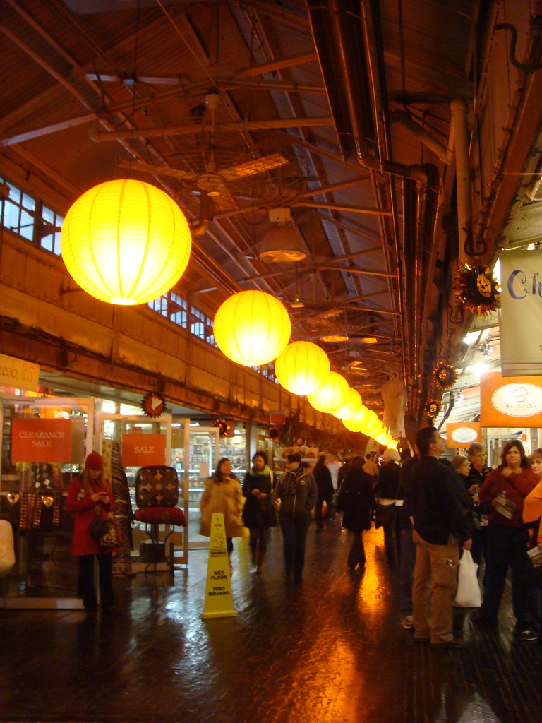
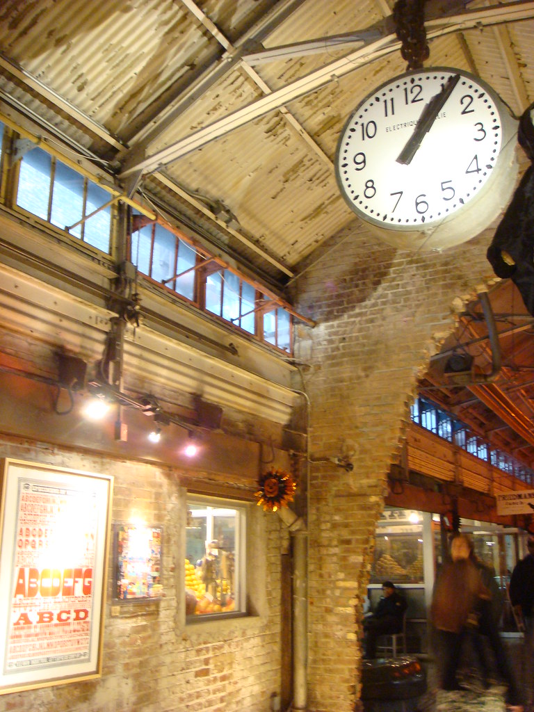
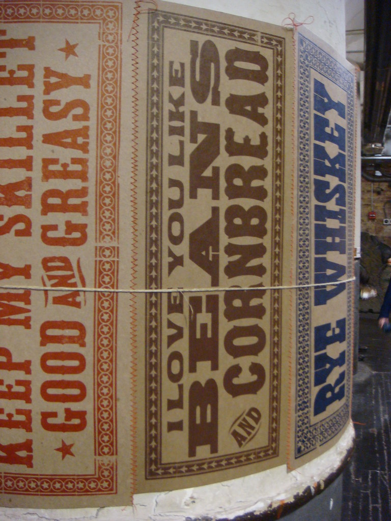
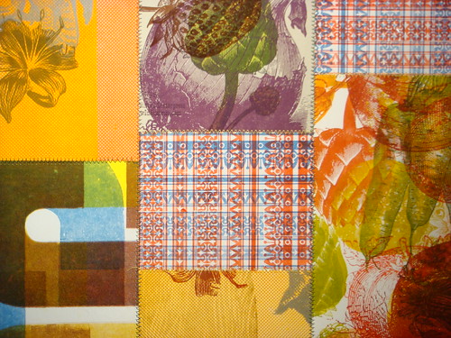
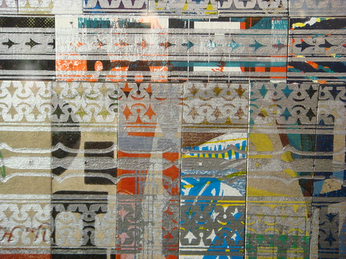
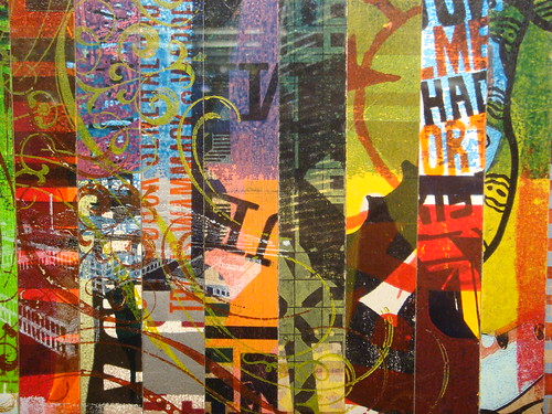
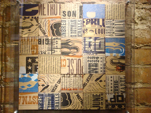
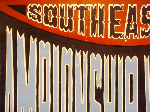
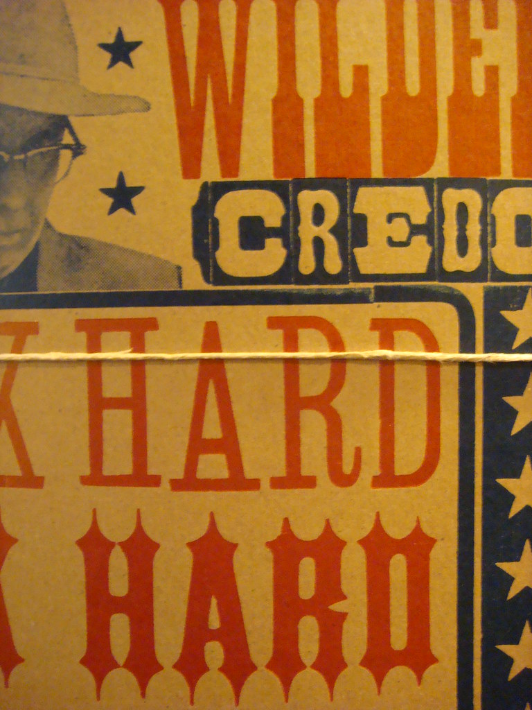
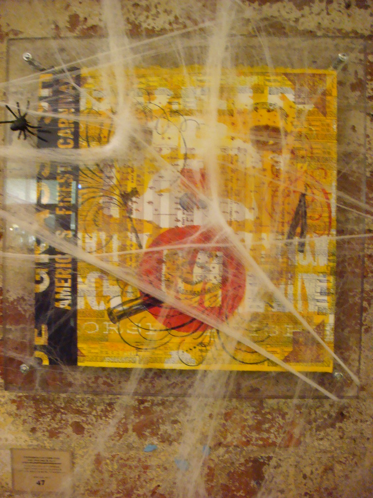
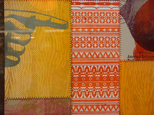
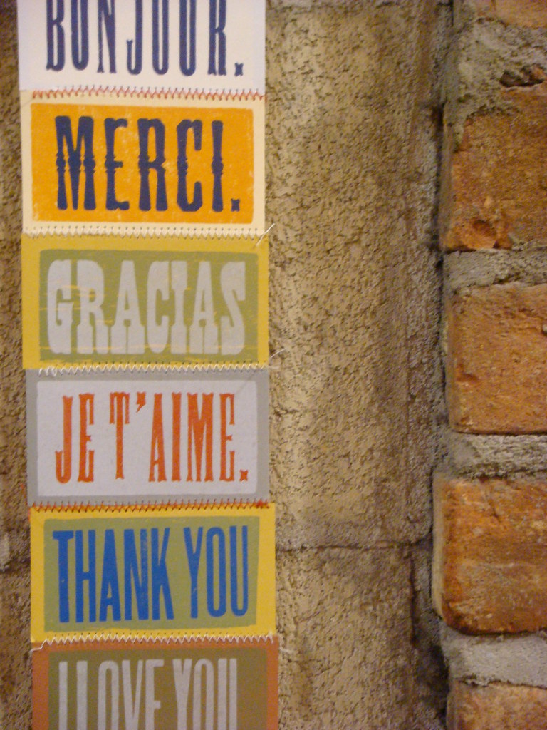
This winter, any typophile finding themselves in the New York City area is advised to make a trip to Chelsea Market to see the exhibition of work by Tennessee’s Yee-Haw Industries, up until January 2. I saw the show just before Halloween and was not disappointed to find the significant presence of wood type printing that I expected.
Chelsea Market has retained much of its historical brick-and-iron factory atmosphere, so it acts as a perfect backdrop for the work described as “industrial” letterpress. When I made my visit, there were all kinds of Halloween displays interrupting the show — some ghosts and cobwebs even draped over the art — but perhaps upcoming holiday decorations will be less distracting.
From Yee-Haw’s official announcement:
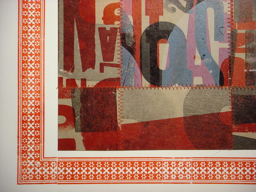
Yee-Haw’s work will adorn the vast and cavernous Chelsea Market, located in the Meat Packing District in Manhattan’s West Village. Over 100 letterpress pieces all hand-printed from our wood cuts & antique type in our Tennessee studio. We made over 50 sewn paper “quilt squares” specifically for this show and brought along some old favorites. Chelsea Market is an enclosed, urban food court and shopping mall in New York City. It is housed within the former Nabisco factory complex where the Oreo cookie was invented and produced. The 22-building complex fills two entire blocks bound by 9th and 11th Avenues from 15th to 16th Street.
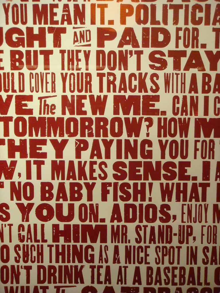
The fact that I haven’t yet mentioned Yee-Haw on Woodtyper is surprising, since they are among the top users of wood type in the world, alongside shops like Hatch Show Print. They clearly embrace the aesthetic and charm of wood type, and even have produced an amazing poster series with specimens from their collection (probably the highlights of the show at Chelsea Market, in my biased opinion).
Below you’ll find photos I captured of the work from the show, but I’ve consciously only shown enough of the details to whet your appetite. You’ll have to visit in person to get the full experience of the pieces in this unique setting.
What: Yee-Haw Industries industrial letterpress exhibition
When: October 4, 2009–January 2, 2010
Where: Chelsea Market; 75 9th Avenue, New York, NY 10011 [map]
Admission: Free and open to the public
(These images are also gathered together as a set on Flickr)
Though not as abundant as the wood type offerings from TypeCon 2009, attendees of this week’s ATypI conference, Typ09: The Heart of the Letter in Mexico City will have the chance to attend at least one wood type related event.
On Monday, October 26 (that’s tomorrow!) from 4:35–4:55 PM, Professor David Shields from the previously mentioned Rob Roy Kelly American Wood Type Collection will present Engaging Abundance: Physical Research & the Rob Roy Kelly American Wood Type Collection:
The goal of cataloging the Rob Roy Kelly American Wood Type Collection is to expand upon the historical information previously collected. Central to my research is physical engagement of production processes, providing direct knowledge of the type forms. Investigating wood type blocks directly, reveal unique planing patterns produced during manufacturing, providing a strategy to identify manufacturers of un-stamped wood type. Through this engagement, I have been able to chart the impact the tools themselves had on driving the derivation of styles throughout the 19th century, and investigate the impact wood type manufacturing processes might have on contemporary digital type production.
When I visited the Rob Roy Kelly Collection almost exactly one year ago, I saw some of the preliminary work David was doing in relation to this topic, where he was printing and examining the sawblade marks from milling on the back of type to see if there were any patterns that might help in providing extra information.
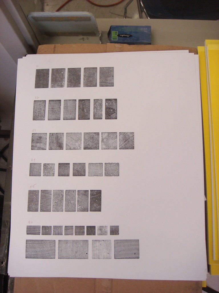
Comparison of milling patterns from the back of wood type at the Rob Roy Kelly American Wood Type Collection.
I’ll be attending the talk, short as it is, and hope to report back here afterwards with a summary.
The following day, Tuesday, Oct 27, from 4:20–4:40 PM, Dr Catherine Dixon (senior lecturer at Central Saint Martins College of Art and Design and curator of the bi-annual letterpress conference at St Bride Library) and Henrique Nardi (founder of Tipocracia) will present Lambe-lambe Letters: Grafica Fidalga, São Paulo:
Lambe-lambe (literally ‘lick-lick’) is a vernacular printing tradition once popular for promoting theatre and spectacle in Brazil. Long in decline the city of São Paulo still boasts a working lambe-lambe printshop, Grafica Fidalga. Here is found a rich history of hand-generated letterforms carved as wooden blocks used to print vibrant poster series. While the persuasive aesthetic of these posters and the nostalgia of Grafica Fidalga has been celebrated by some, this presentation sets out a fuller account of the remarkable process underpinning the work, the joy of documenting it through hands-on engagement and the filmed and printed results of this collaboration…
Grafica Fidalga has seen quite a bit of coverage in the design press recently, including a cover for Creative Review, so it will be interesting to see what other information Dixon and Nardi have to share about the decidedly rough and ready print shop.

Cover of the Jan 2009 issue of "Creative Review", designed by Grafica Fidalga
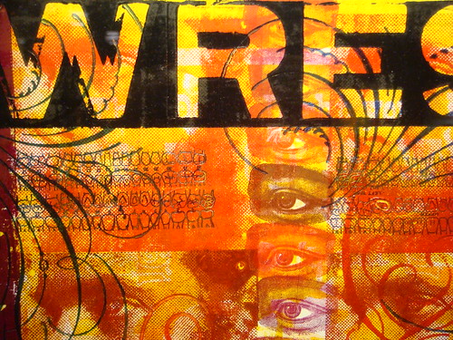
Other than that, conference attendees have the opportunity to experience a genre of wood type printing in Mexico City (though not officially part of the conference) that is less prevalent in other parts of the world: promotional posters for “lucha libre” Mexican wrestling events. One of the largest wood type lock-ups I’ve ever seen was for such a poster at the Sensational!: Mexican Street Graphics exhibition that came through MassArt back in 2007.
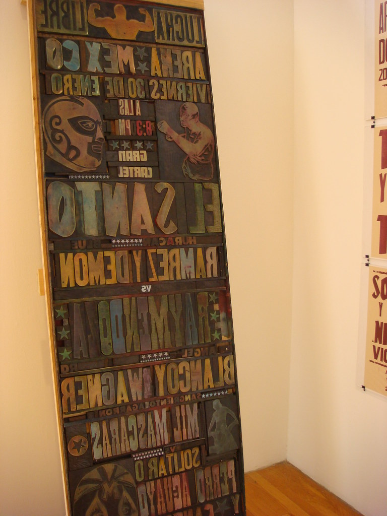
Large wood type forme for a lucha libre poster in the "Sensational!: Mexican Street Graphics" exhibition at MassArt, October 2007
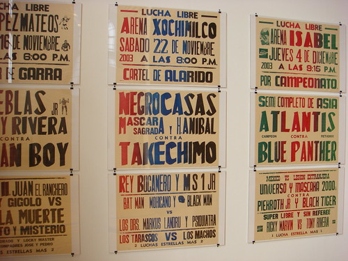
Lucha libre posters in the "Sensational!: Mexican Street Graphics" exhibition at MassArt, October 2007


